


Alice Hope: Tab
Ricco/Maresca Gallery, New York City
3 April – 24 May 2014
by NATASHA KURCHANOVA
This outward resemblance to practical things is deceptive though, because rarely – if ever – can these things be used in everyday life. Hope’s creations exist rather like exuberant elaborations of either an art style – Minimalism, Pop Art – or an actual object – a curtain, a chandelier, a pendant – but they are never unequivocal about their identity. If Hope works with an art style, what is important to her is the way she alters it rather than the dogmatic following of the precepts. If it is a thing that resembles an object, it is deliberately non-functional. What counts in the end is not so much the actual finished object, and not even its many parts, but the way in which they all stay together without falling apart. One can say that Hope’s work explores connections that make things what they are. The artist’s current exhibition at Ricco/Maresca Gallery exemplifies this principle. It is dedicated to a tab, a can-opening device, an object as ubiquitous in our culture as it is lowly and invisible. The exhibition presents multiple ways in which Hope transforms this common thing and makes it run the show. On the occasion of the exhibition, she gave an interview to Studio International.
Natasha Kurchanova: Thank you for agreeing to speak with Studio International, Alice. My first question is about your use of materials. From about 2007 until this exhibition, you used materials rather consistently – they are industrial; they are even specifically military. In your work in general, you transform these materials into objects of beauty. This was a persistent trend for a while: the conversion of industry and menace not only into an object of beauty, but also often into a sublime object. Can you say something about this?
Alice Hope: Experiencing beauty can be terrifying – so overwhelmingly sublime that it’s blinding. There is also mystery in beauty – how it is magnetising, seductive, sustaining of desire. For example, when I first saw a picture of the Aids virus, its overlay of beauty and menace stunned me. I do like conflicting metaphors, which is evident in my work – taking something that is a weapon or used as ammunition and transforming it into a benign thing. I am thinking of the work in which I transformed BBs [pellets from a BB airgun] into a jewel box of a room. I like the tension that it creates.
NK: This visceral tension you mention, does it relate in any way to your love of magnets? Are they used not only as materials, but metaphorically as well?
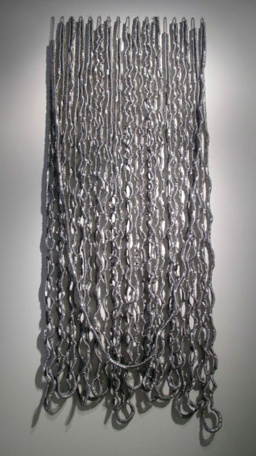
AH: Yes, I think that the strongest part of my magnet work – for example, the one on this wall [the five-piece Untitled, 2014, ferrite magnets and magnetic film] – is manifesting the omnipresent magnetic force that is invisible but measurable, with an iPhone, for example. That presence provides not only visceral experience, but also the subject matter.
NK: My next question concerns your relationship with Minimalism. Your use of industrial materials, the serial nature of your objects, and their site-specific installation (I am speaking about the Camp Hero installation at the Parrish Art Museum) also point to your interest in Minimalism. Could you expand a little more on this connection? Who were the most influential artists for you in this respect?
AH: Minimalism was definitely my aesthetic upbringing, but I think my work has evolved into a Baroque Minimalism, because of its over-the-waterfall numeracy. I am dedicated to minimising means – for example, in this show, I am paring it all down to a tab. Then the work explodes into excessiveness when I use one thing over and over and over again.
NK: In one interview, you compare yourself to Yayoi Kusama and her obsessiveness. Why did you compare yourself to that particular artist?
AH: Well, that was because of the repetition. I find not only the act of repeating, but the resulting accumulation, tireless and never enough. I love scale, which can be experienced within density as if there were miles of footage.
NK: Another work that intrigued me was your installation at Nick and Toni’s because it is obviously ornamental and decorative – almost the opposite of Minimalism. It looks very playful. I wanted to ask you about that installation, because I am interested in the conflation of site-specificity and interior design in that work.
AH: The installations at Nick and Toni’s are a branching out from Parrish Art Museum’s Road Show and my installation at Camp Hero State Park. The idea of the road show is to have the audience discover art in atypical places. The first summer, this installation happened at the same time as my installation at Camp Hero, which is very much about the military and a monument to a certain era. It was perhaps my most political work. The Nick and Toni’s project pushed my aesthetic to a very playful place, while respecting my captive audience.
NK: Nick and Toni’s is a restaurant, correct?
AH: Yes, it’s a restaurant in East Hampton. It’s the first time I have ever installed a work in a restaurant. I’ve made a ceiling installation there for two seasons, and I will be installing another one this summer, transforming the same materials. I put it up in the beginning of the season and take it down after Columbus Day [the second Monday of October]. There is a continuous audience from summer to summer and the thread of evolving work is playful and impermanent.
NK: I want to ask you about this Tab exhibition. There seems to be a switch in the use of material: instead of the Minimalist, industrial, it is clearly related to Pop Art. This changes the mood of your work from the tension between industry and play to consumption. What prompted you to choose the theme of the show and how did you come up with an idea of an exhibition devoted to such a lowly thing as a tab?
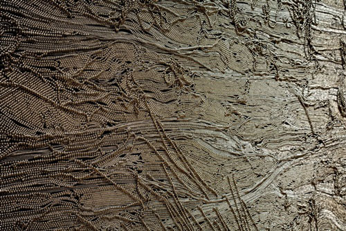
AH: Last year I was given a tour at a metal recycling centre, where I came across a 700lb [317kg] box of tabs. I was not looking for tabs and, when I first saw them, I doubted I could use them because they are immediately recognisable. In the end that became my attraction to this material: everyone recognises tabs because everyone uses them. The immediate recognisability proves how democratically iconic the tab is – of desire, consumption and obsolescence. It is challenging to transform a material that is so easily dismissed, because what I like to do is to sustain curiosity and mystery instead of specifying what’s being used or how it is made. But then, the more I investigated the tab, I discovered it to be rather well-defined. Also, I found its formal beauty, its golden proportion, the balancing of positive and negative spaces, its gorgeous ergonomics.
NK: So, in a way, the tab was a found object?
AH: It’s a found object that I’ve objectified to exploit its “object”-ness while specifying its transience. Tabs are very useful, but only for a second, and then they join the immense bittersweet field of obsolescence. This functional tab turns into a relic in a second.
NK: Could you tell me a little more about the objects in this exhibition? I am intrigued particularly by your magnetic piece [Untitled, 2014, ferrite magnets and magnetic film].
AH: That’s the most metaphorical work in the show. I fused the shape of the tab with that of an aeroplane window and installed the five works to resemble a row of windows in a plane. Being in the aeroplane can be compared to being in an aluminium can. When you are in a plane, you are buckled in. Then the aluminium cans come rolling down the aisle. The distinctive sound of cans being opened, drinking from an aluminium cans, breaks up the monotony of the plane time. Perhaps on a plane, like nowhere else, there is an entrapment into drinking. But overall I am thinking more generally about the Pavlovian response we all have when we see a tab or hear its sound.
NK: So, every object in this exhibition either has a tab or is a tab?
AH: Yes.
NK: Is there anything else that you want to say about your work that you feel is important?
AH: The tab is a perpetuating unit of recyclable garbage. It is made out of aluminium, a fluctuating commodity. And, in turn, in some work in particular, I am commodifying the tab to fit it into the context of a fluctuating art market.
NK: Yes, the colouring of your work is beautiful. In general, beauty is a distinctive feature of it.
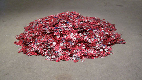
AH: Yes. Sometimes I push it to the point when it becomes almost grotesquely beautiful. [Beginning to walk around the exhibition] In this work [pointing to a pile of coloured tabs on the floor], it’s all the Budweiser tabs from the collection that I found in that box. It is very simple. It refers to the most American “King of Beers”.
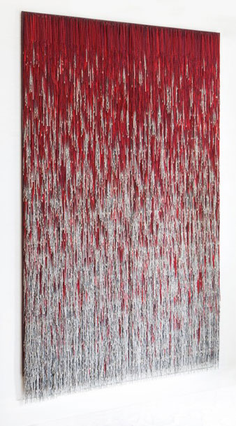
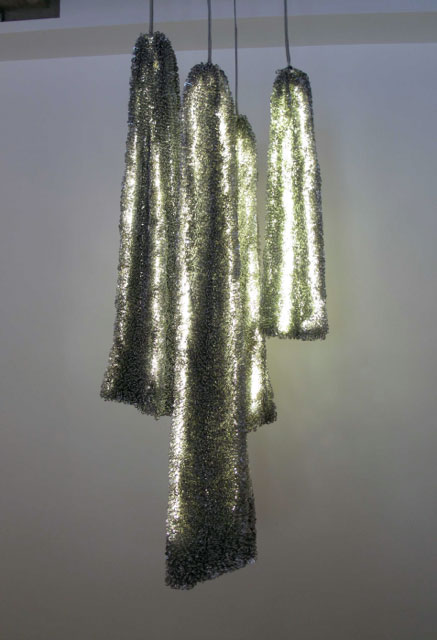
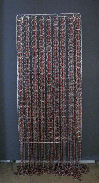
NK: What about this work here [a curtain made of tabs and double-stranded ball chain]?
AH: Here I transformed the tab more than in any other piece in the show – the material is no longer immediately recognisable. I amassed the tabs to play with linearity, curvature and reflectivity of the material.
NK: So, how long did it take you to do this work?
AH: I was at a residency in Vermont and was up 14 hours a day stringing these for a couple of months. I did not finish it there, but it was my major focus. I double-stranded them, which made the work look more like an enlarged piece of Egyptian jewellery.
NK: Yes, this piece looks very much like a multilayered necklace. Speaking about the jewellery-like look of your work, I was also thinking about the installation at Nick and Toni’s where several hanging pieces look like earrings and pendants.
AH: Also, double-stranding built a vertebrae-like infrastructure that allowed the work to assume its own malleable patterned form. The use of ball chain in this work is significant also because of its utilitarian references in our culture – we see it used for light switches, dog tags, connecting pens on bank counters – but it is also so gorgeous in its luminescence.
NK: You use ball chain a lot.
AH: Yes, like for example in this work [Untitled, 2014, found nickel-plated box spring, anodised aluminium tabs and ball chain]. I connected each of the anodised tabs with a loop of ball chain. I think of this box spring as a canvas, but basically I found it at a dump, then had it nickel-plated. I made precious something that was considered garbage. It is jewel-like, but I hope this isn’t the only reference. The shadows contribute to this piece as well – the mirroring and multiplying images of springs and tabs on the wall.
NK: This hanging piece [made of LED lights, turtle net and aluminium tabs] is magnificent. It looks like a chandelier.
AH: I have a hard time with this piece morphing into functionality. Yes, it resembles a chandelier, but I prefer to think of this as emanating colonising forms. But, again, in this piece I address the division of functionality and art.
NK: When you create an object like this, do you have an idea and realise it, or how does it work?
AH: When I found the box of tabs in the recycling centre, I acquired them without knowing immediately what I was going to do with them. So the first few months I was figuring out the language of attachment: I believe that the way these small parts are attached forms the meaning of the work. Also, with this lit installation, it was important to find the kinds of nets [the support holding the tabs together] that have cultural resonance. I chose to use the nets, because I find the turtle’s vulnerability – and the fact that we are still catching them – heartbreaking.
NK: And then you lit the piece. Earlier you said that light was important for you.
AH: Light creates the infrastructure or skeleton for the piece. Using LED lights allowed me to make the overall form. So, light in this work has several purposes.
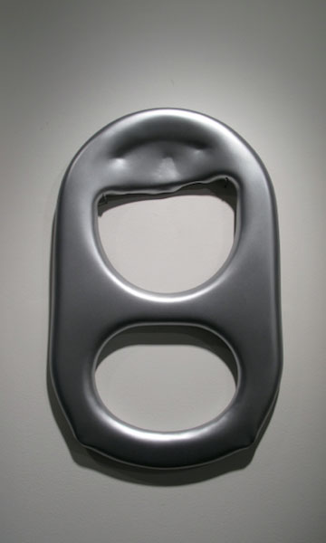
[Walking to an oversized replica of a tab hanging on a wall] This is a 3D printed polymer tab. In this work, I mirrored tab’s mass production with 3D printing’s potential for mass production. I made only one though to single out and objectify the tab form.
[Walking to the five anodised aluminium pieces with the words “drink me” engraved on to them] These pieces are die cut, anodised and engraved with the Alice in Wonderland quote. This is one of the works in which I address commodification of the tab directly. But I also find specific qualities of material interesting. Aluminium is the only metal that can be anodised, a chemical colouring process that is so beautiful.
NK: Why are the quotations in different types?
AH: Some are quieter with lower-case font, and others shout at you, pointing to desire, choice, marketing.
NK: You do have a mixture of styles in this exhibition: from Minimalism to Pop Art and found object, you seem to have cast a wide net.
AH: I deliberately used a wide range of styles. The subject and material led me to the divergent styles to assert the tab’s various emblematic references.
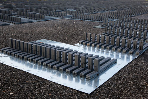
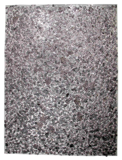
[Walking to the acrylic Plexiglas box quarter-filled with aluminium tabs installed on an aluminium palette] This work rarifies my first encounter with the tabs – 700lb of mixed tabs in a cardboard box on a wooden pallet in a metal recycling centre. It evolved into this piece – a highly reflective transparent Plexiglas container on a custom aluminium pallet with doormat dimensions. The box is filled with Coke tabs. The light reflects not only off the objects themselves, but also against the Plexiglas, so that the tabs and effects multiply.
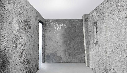
[Walking to a rectangular canvas-like shape on a wall covered with tabs in various stages of being squashed and misshapen] In this last piece, I distressed the tabs on railroad tracks with a 10-ton hydraulic press. Some corroded naturally over time. This work contrasts with the preciousness and wholeness of the tabs in the other works. The height of this work – 60in [152cm] – matches the dimensions of the minimum allowed width of a sidewalk in Manhattan.
NK: I find it interesting that you use “low” metaphors in your work, which, in the cases of the last two works you mentioned, concern things that you walk on – a doormat and a sidewalk. The tab as an object also has this “low” status. So, by working with the “low” objects and concepts, you elevate them to art. It’s been extremely interesting for me to learn about your creative process. Thank you for sharing your work with me and with the readers of Studio International.
Click on the pictures below to enlarge

Copyright © 1893–2026 Studio International Foundation.
The title Studio International is the property of the Studio International Foundation and, together with the content, are bound by copyright. All rights reserved.


 The Armory Show 2018
 Alge Julija Kavaliauskaitė: ‘There is something about glass that I am continually drawn to’
 Art Basel Miami Beach 2017
 Yayoi Kusama Museum opens in Tokyo
 Yayoi Kusama: In Infinity