


Waddington Custot, London
1 March – 22 April 2017
by SAM CORNISH
At Waddington Custot is an exhibition “on the wide-ranging and sometimes contradictory investigations of colour by artists from the mid-20th century to the present”. Although largely drawn from stock, the exhibition provides an interesting survey of 1960s abstract art and its legacies and suggests a few intriguing connections.
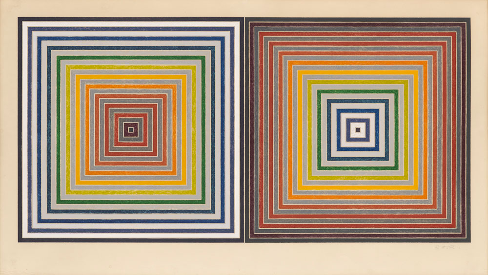
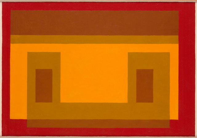
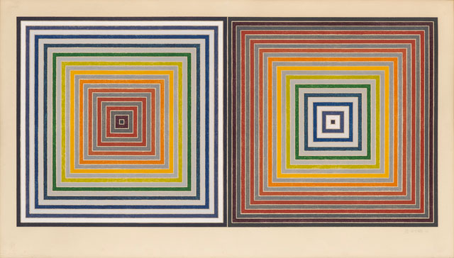
Colour is begins with a pair of instantly recognisable Homages to the Square by teacher and colour theorist Josef Albers. Following Albers, literally in the case of Kenneth Noland, his pupil at Black Mountain College, are British and American artists most associated with the 60s, some represented by later work. Alongside Noland appear Donald Judd, Frank Stella, William Tucker, John Hoyland, David Annesley, Anthony Caro, Jeremy Moon, Paul Feeley and Sam Gilliam. Albers was shown by Waddington Galleries for a number of years before the 2011 merger with French dealer Stéphane Custot, while many of the others showed with Leslie Waddington in the 60s. This more or less coherent central group is supplemented by the varied approaches of Joseph Kosuth, Etel Adnan, Hélio Oiticica, Peter Halley, David Batchelor, Ian Davenport and Yuko Shiraishi.
The exhibition’s beautifully produced brochure includes a booklet of aphoristic quotes on colour, edited by Batchelor. Most are by European thinkers or writers of the late-19th and 20th centuries. Many are arranged in direct opposition to each other.
“Colour exists in itself.” Henri Matisse, 1908: “Colour cannot stand alone.” Wassily Kandinsky, 1911.
“Colour becomes significant only when it is used as an attribute of form.” Clive Bell, 1914: “Colour is an autonomous event that does not require form.” Carlos Cruz-Diez, 1989.
Without context or further explanation the gulfs between these statements seems unbridgeable. Colour is presented as a phenomenon in which investigations hit a philosophical rock bottom, a conundrum without answers. The sense of colour as opposed to knowledge or intellect is borne out in many of the other statements Batchelor has assembled: “Colour … is the peculiar characteristic of the lower forms of nature” (Charles Blanc, 1867); it “is suited to simple races, peasants and savages” (Le Corbusier, 1923); it “has nothing in common with the innermost essence of a thing” (Naum Gabo and Antoine Pevsner, 1920); it “has always been seen as belonging to the ontologically deficient categories of the ephemeral and the random” (Jacqueline Lichtenstein, 1989).
For other thinkers, the resistance of colour to knowledge and intellect is positive, offering freedom, pleasure and sensuality. “Colour must be thought, imagined, dreamed” (Gustave Moreau, 1893); it “is a means of liberation” (Matisse, 1945); it “is a human need like water and fire” (Fernand Léger, 1946); it is “the first revelation of the world” (Oiticica, 1960); it “is a kind of bliss” (Roland Barthes, 1979); it “is the sign of the existence of life (Adnan, no date given); it “is a pleasure that exceeds discursiveness” (Lichtenstein, 1989).
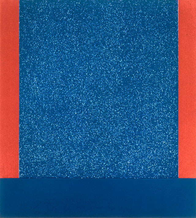
Across most of the exhibition itself, colour is flat, clear and bright. Almost nowhere do we find individual colours internally modulated and merged together by tone, by the control of light and dark that was fundamental to post-Renaissance, pre-modernist western painting. A number of works are monochrome: the simple form of Judd’s Untitled (1977) and the more complex structure of Caro’s Floor Piece Hè (1972) are both unified by being painted a single colour. Colour gives these sculptures a presence in wider space that they might otherwise lack – it allows them to be seen from distance. As Judd is quoted in the catalogue: “Colour to continue had to occur in space.” In the Caro, colour binds together a slightly weak overall image. It is at its best when viewed close-up, when its structure elegantly opens up, and then its colour seems much less important.
Elsewhere, different colours are neatly separated from each other by a sculpture’s physical structure or the geometric or graphic divisions of a canvas. Even the exceptions, such as the more fluid, painterly paintings of Hoyland and Gilliam, are still ordered by an underlying geometry. Hoyland and Gilliam also have a sense of colour analogous to that experienced within the everyday world – that is, as atmospheric, existing within space and responsive to changes in light. This is also felt in the more tightly geometric paintings of Albers and Adnan. Despite being painted in 2017, Adnan’s work (Le poids du monde 29) almost seems to belong to a prewar modernism. Her semi-abstract landscape is reminiscent of Klee’s miniatures, although perhaps without his lightness of touch. The colour in Kenneth Noland’s striking Acute (1977) is more certainly abstract. It pushes colour relations to the edge of its irregular diamond shape, with thin stripes holding what might otherwise be a very unappealing pink in ambiguous, if compelling, tension. The clinical handling accords well with Noland’s desire to get “colour down on the thinnest conceivable surface, a surface sliced into the air as if by a razor”.1
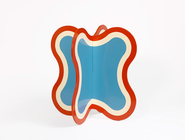
Even at its more atmospheric, the colour in the exhibition feels at least partly artificial, part of a continuum with modernity’s never-ending production of consumer goods – clothes, furniture, cars, phones etc. This is undeniably an aspect of the effect of the 60s works by Annesley, Moon, Tucker or Feeley. Yet, despite this, and an accompanying cool detachment, their works have a freshness and unaffected clarity. The show emphasises the debt artists such as Halley, Davenport and Batchelor owe the 60s. But in this later work a line is crossed and artificiality becomes too dominant, and the life squeezed out of colour. This is a consciously achieved effect in Halley’s overtly self-conscious, overly theorised art. The disjunctive black, white and red in Batchelor’s Colour Chart 58 (2012) imply that being an anthologist of the history of colour is not the same as being a colourist.
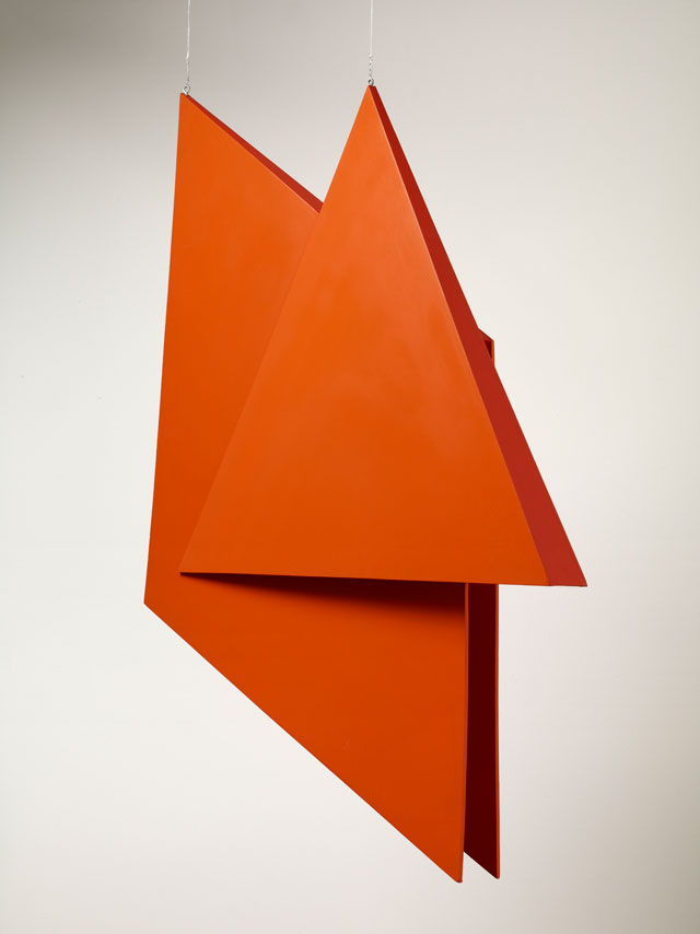
The star of the show is Annesley’s Orinoco (1965). Two stiffly curving yellow ribbons of colour flow through space. The upper is lighter in tone than the lower and the sculpture seems to bounce with an angular jauntiness. Orinoco is unexpectedly large, much larger than it appears in photographs, and joyfully expands into the space that surrounds it. At the same time, its effectiveness stems from its ability to maintain contact with the ground, to be weighty as well as gravity defying. The effect of being both physically present and somehow mirage-like is fundamental to the new generation sculpture produced by Annesley and his contemporaries, and is also seen in Tucker’s low-lying Karnak (1966). Across from Orinoco hangs Oiticica’s V6 Spatial Relief, Red (1991), a posthumous remake of a work from 1959. The two works share a relation to painting, based on coloured planes cutting through space; they also both favour a subjective, optimistic, even hedonistic art, far removed from the ascetic pieties of much previous geometric abstraction. They both want to make a dramatic impact on their immediate environment. One important difference is that Annesley remained attracted to weight, whereas Oiticica aspired to an almost completely unrestricted weightlessness. However much new generation sculpture was indebted to painting, it also maintained an identity as sculpture.
Ben Wiedel-Kaufmann has recently suggested that the Situation-type painting produced in Britain in the 60s could be worth comparing to Brazilian neoconcretism.2 The juxtaposition of Annesley and Oiticica at Waddington Custot suggests that an exploration of the similarities and differences between new generation sculpture and neoconcretism could be even more fruitful.
References
1. Quoted in Colour and Culture: Practice and Meaning from Antiquity to Abstraction by John Gage, published by Thames & Hudson, 1995, page 266.
2. Radical Geometry? The Patricia Phelps de Cisneros Collection at the RA, by Ben Wiedel-Kaufmann, abstract critical, 2014.

Click on the pictures below to enlarge

Copyright © 1893–2026 Studio International Foundation.
The title Studio International is the property of the Studio International Foundation and, together with the content, are bound by copyright. All rights reserved.
-300.jpg)
-300.jpg)

-18-300.jpg)
-Tate-(Larina-Fernandes)-(12-1000)-300.jpg)
 The Enlightenments. Edinburgh International Festival 2009
 Tom de Freston: Deposition, Christ’s College Chapel
 Mark Rothko: the 'end of philosophy, the beginning of art'
 Colour Chart: Reinventing Colour, 1950 to Today
 Starting at Zero: Black Mountain College 1933-57