


Tate Britain, London
5 June – 1 September 2013
by CELIA WHITE
Moving back and forth between these two states, Caulfield nonetheless established a clearly recognisable, even rigid formal language in his paintings. Yet as Tate Britain’s recent retrospective of his work showed, experimentation was key to the artist’s practice, albeit within a relatively narrow set of motifs, influences and techniques.
The opening room of the show offered a taster of each of these influences. Caulfield’s 1963 Portrait of Juan Gris, with its flat, dampened yellow and angular surface decoration, introduced us to Caulfield’s abstraction: he reduces Gris and his surroundings to their basic elements, paying homage to Gris’s own role in the development of abstract painting in the early 20th century. With this portrait, Caulfield also offers us an initial glimpse into his own unique conception of both time and space as a thick, stolid mass; by conflating the two, he allows the abstract and the figurative to sit side by side, so that every object featured in the picture can be absorbed without the distraction offered by a flowing narrative.
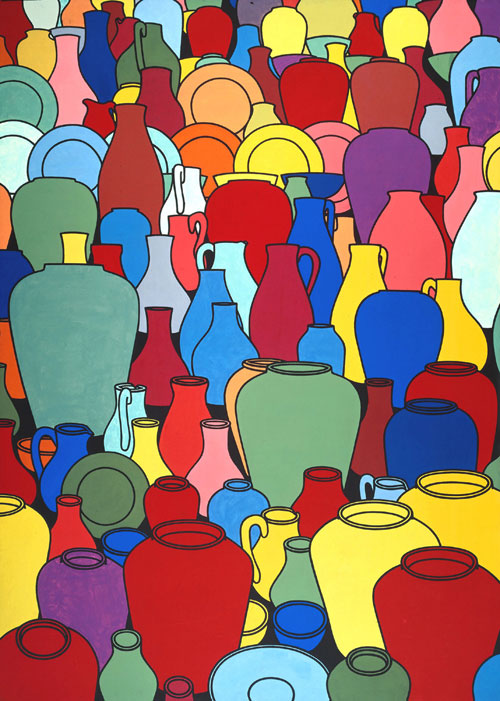
In the same gallery space, the well-known painting Pottery (1969) recalled the impact of Pop Art’s bright colours and thickly hewn outlines on the artist’s work. Here Caulfield crowds our vision with a relentlessly pulsating surface that implies the viewer’s position through the gradually shifting perspective of the pots, but the painting remains sufficiently flat and frontal to forbid true depth perception. Adjacent to Pottery was a painting that might just allow us in: Santa Margherita Ligure’s(1964) postcard-like prettiness offers a frame – perhaps even a window – through which a semblance of a world, albeit an idealised one, begins to materialise. And yet Caulfield builds in mechanisms designed to cut through any presumed reality: the vase of roses and the pot plant flanking the view reach into our space, overlapping with the edge of the canvas. Being both within and without the “postcard”, these “natural” interruptions help to present a collage-like formulation of space, one inspired by the Cubists’ (Juan Gris included) earlier multi-plane visual experiments.
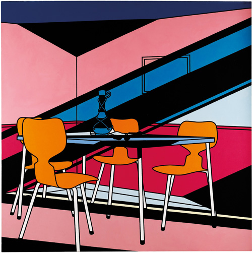
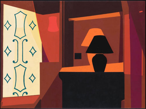
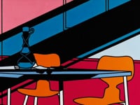
Caulfield’s fascination for the intricacies of inanimate objects has been the stimulus for some of the artist’s most captivating canvases. And yet it is when turning his attention to architecture and interiors that we see him mastering the language of space in a way that is both accurate and unnerving. Clarrie Wallis, curator of the Tate Britain exhibition, devoted a substantial amount of it to Caulfield’s large-scale paintings of “settings” – perhaps a more apt word than “interiors” given the feeling that these scenes elicit of a recently abandoned room or stage. These settings simultaneously invite and exclude us, not least through Caulfield’s use of apparently never-before-seen hues to represent accurately the light falling through a window from a particular viewpoint, as is seen in Window at Night (1969). In this painting, the viewer is cast in an ambiguous role: are we voyeur, investigator, or mere passerby? A comparable level of suspense is created in Dining Recess (1972), this time through the emanation of a dull light from an electric orb, which fails to cast the chairs, table and walls in anything more nuanced than the same muddy, melancholy purple.
The most intriguing interiors on show were the colourful, almost kaleidoscopic views of cafes, restaurants and foyers. The promise of these commercial spaces is at once heightened and deadened by Caulfield’s obscenely bright depictions of them, as if surface and sensation were all that concerned their proprietors. There is a sense that these eyes through which we look are not our own: when viewing Tandoori Restaurant (1971), a filtering or layering effect seems to have been applied, allowing us to perceive only certain elements of the scene in certain tones. Meanwhile, every detail is revealed: a frustrating silhouette that offers everything and nothing. This kaleidoscopic appearance is also seen in Foyer (1973), in which the bottles and glasses of the red-bathed bar area in the background are rendered enticing by their contrast with the flat yellow wall and handrail of the bar’s entryway.
During the 1970s, Caulfield began to introduce hyper-real elements into his abstract settings, a change to which the Tate’s exhibition did justice without over-emphasising. The entire exhibition, in fact, could be lauded for its lack of dictatorial wall texts: the accompanying booklet provided scant but sufficient information, leaving the show itself to celebrate the pure act of looking – rare for a retrospective of such a well-known artist, and a native one at that. The result is that epic canvases such as After Lunch (1975) were left without interpretation, allowing us to wallow in their ambiguity. Once again, this painting sees Caulfield reducing all depth to a single plane by means of blanket colour – two blues, one pastel and one deep and striking. Light relief, and perhaps the painting’s pièce de résistance, is offered by the fish tank that dominates the central part of the picture: a realistically rendered landscape sits behind the plump orange blobs that stand in for the bodies of the goldfish in the tank’s water. To their right, a figure broods at an oddly described window or hatch, rendered in the standard blue of his surroundings. Just as the fish and the landscape cannot be comprehended on the same visual plane, nor can this figure be considered “real” – for if he is real, then what literal, metaphorical or pictorial purpose is left to the conventionally “realistic”, as embodied by the landscape-painting-within-a-painting?
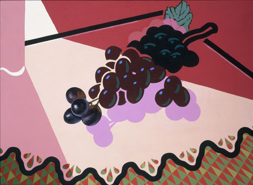
It is arguable that Caulfield’s many paintings that combine abstract with realistic settings or objects are little more than an exercise in style, or proof that Caulfield was able to paint in the traditional, figurative manner. An almost tongue-in-cheek embodiment of this suggestion is offered by Selected Grapes of 1981, in which the grapes become more solid and credible as the eye moves down the vine: an analogy, perhaps, for the evolution or corrosion of talent, or artistic conviction, over time. It is appropriate, then, that one was required to leave the exhibition the way one entered: reviewing Caulfield’s so-called “development” backwards, and concluding that, as Caulfield himself noted in 1999, he bounced around at will between levels of realism and abstraction, of complication and simplicity, throughout his career.
Exiting via the entrance gave the viewer a chance to revisit the very first work in the show, Concrete Villa, Brunnof 1963. Here, a piece of architecture that has come loose from its foundations hangs in the air, a white, grey and black spectre that is unusually drab for a Caulfield painting. Atop the villa sits a lone man, unaware of his being observed: he is colourless, inaccessible, the very definition of solipsism. This painting summarises the vast appeal of Caulfield’s painting: namely its combination of interiority with an absolute lack of intimacy. His empty scenes are post-apocalyptic, seeming to offer an exemplar of how humans “used to live” as dreamed up by future beings, or reconstructed by them based on surviving yet fragmentary descriptions. Yet these scenes remain relevant to contemporary, pre-apocalyptic audiences through their plasticky, unsentimental, show-home quality, which offers that much-coveted feeling of the uncanny – of palpable absence, but with life potentially hovering just off-screen.
References
1. Exhibition guide. Patrick Caulfield, London: Tate Publishing, 2013, p2.
2. Patrick Caulfield in conversation with Bryan Robertson in 1998. In Clarrie Wallis, Patrick Caulfield, (exhibition catalogue), London: Tate Publishing, 2013, pp7–8.
Click on the pictures below to enlarge
Click on the picture below to watch the video

Copyright © 1893–2025 Studio International Foundation.
The title Studio International is the property of the Studio International Foundation and, together with the content, are bound by copyright. All rights reserved.


-4-300.jpg)

-300.jpg)


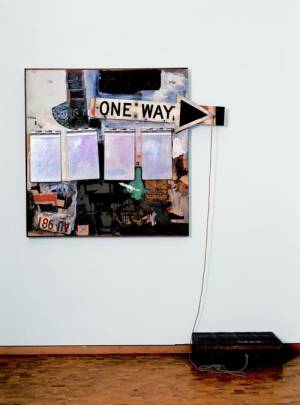 Robert Rauschenberg: Combines
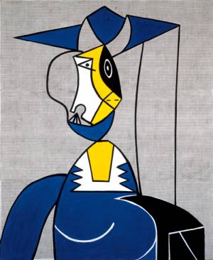 Documenting the Obvious: Picasso and American Art
 Breaking the Myths
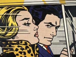 Roy Lichtenstein
 Home and Garden: Paintings and Drawings of English Middle Class Urban Domestic Space 1914 to the present