


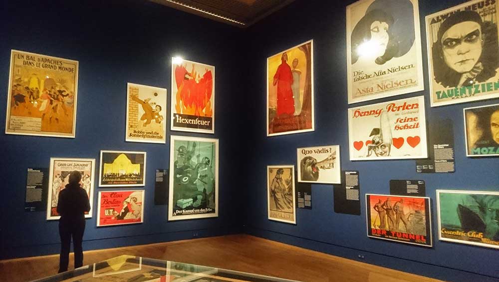
The Big Screen: Film Posters of All Time, installation view, early years gallery, Kulturforum, Berlin, 3 November 2023 – 3 March 2024. Photo: Sabine Schereck.
Kulturforum, Berlin
3 November 2023 – 3 March 2024
by SABINE SCHERECK
Film posters are part of everyday life: we see them on platforms while we are waiting for a train, they flash past us on buses crisscrossing cities, they loom over us from billboards. But seeing a vast selection of them, dating from the turn of the 19th century to the early 2020s, displayed like a vast panorama across the large walls of two exhibition halls reveals aspects of them that are usually not visible.
The Big Screen: Film Posters of All Time at the Kulturforum in Berlin brings them into view and offers a comprehensive insight into the film industry and how it has changed over the decades. At the same time, the posters mirror the evolving fashions in graphic design and the different audiences for which they were conceived. The three curators, Christina Thomson, Christina Dembny and Kristina Jaspers, point out that the 300 posters on display were selected not for their significance within film history but for their artistic values. Most come from the Graphic Design Collection of the Kunstbibliothek, the inhouse collection of the State Museums of Berlin comprising more than 5,000 film posters. The exhibition is a cooperation with the Berlin International Film Festival and the Deutsche Kinemathek.

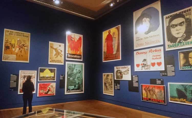
The Big Screen: Film Posters of All Time, installation view, 1910-1930s, Kulturforum, Berlin, 3 November 2023 – 3 March 2024. Photo: Sabine Schereck.
The chronological overview is complemented by walls at the centre of the room, where aspects of the film poster are explored, such as those for re-releases of film classics. The journey through time is compelling. The posters vary in size and are often much larger than those we see today. Some are in landscape format, but they are mainly in portrait format. The earliest treasure the curators found in the collection is a brightly coloured French poster from 1905 advertising the film Russian-Japanese War and showing three illustrated scenes from it. It was produced by Pathé Frères Paris and announced a sensation – although the film was only a few minutes long, it documented the war as it was raging in 1904-05. The poster was designed by the Brazilian-born Cândido Aragonez de Faria, who had emigrated to France in 1882. It is no coincidence that this poster, like many early ones in the collection, hails from France: the country dominated the film industry at that time and, before 1914, 90% of the films shown in Germany came from abroad. In the era of silent films, film language was international by default.

The Big Screen: Film Posters of All Time, installation view, late 1920s, Kulturforum, Berlin, 3 November 2023 – 3 March 2024. Photo: Sabine Schereck.
In the early years of cinema, a few features of the posters can already be traced: as well as reflecting different genres, such as comedy, adventure, romance and documentary, and advertising individual films, they were also used to advertise specific cinemas and “brands”. A colourful 1908 lithograph by the Belgian graphic artist Gus Bofa is not strictly a film poster but an advert for the films of the Paris production company Cinématographe Théophile Pathé. Bofa’s massive 1.30 metre by 2 metre print shows a crowd looking at film billings to see what is coming up. Paul Leni’s 1910 lithograph has a simpler and more effective design: a black night sky arches over an imposing cinema illuminated in yellow, in front of which are the silhouettes of elegantly dressed people and cars. Leni’s poster captures the glamour of the Lichtspielhaus Wittelsbach in Berlin (Lichtspielhaus is in German an old term for cinema). The selected posters trace the trend from detailed illustrated scenes to more striking motifs with one or two distinct figures. In addition, portraits of stars, such as Asta Nielsen or Henny Porten, became popular. The styles vary from art nouveau to expressionism. Later, photographs and montages enter the imagery.

Boris Bilinsky, Metropolis, 1927. © Staatliche Museen zu Berlin, Kunstbibliothek / Dietmar Katz.
Taking a prominent position in the exhibition is Boris Bilinsky’s poster for the film Metropolis (1927); at more than 2 metres by 3 metres, it is the largest on view. His blue monochrome cityscape with rows and rows of high-rises reminiscent of New York tells of a further development in design: the fascination with graphics devoid of figures. This is echoed in Alfred Herrmann’s artwork for the film Asphalt (1929), in which the steep arrangement of the letters evokes an urban setting. The poster for Metropolis signifies another facet of the film industry of the period: it was made for the French market. It was common at the time to tailor posters to each country in which the film was shown. A dedicated wall on this subject collates several posters for the film Planet of the Apes (1968), showing the different designs for different countries.

Gerda Dassing, Solo Sunny, 1979. © Staatliche Museen zu Berlin, Kunstbibliothek / Dietmar
Katz.
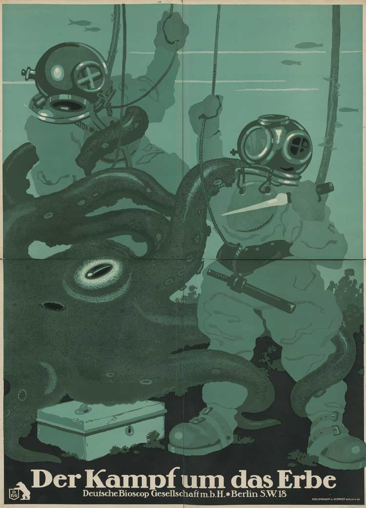
There were even different poster designs for East and West Germany. The East German film Solo Sunny (1980), about a young female singer in East Berlin with a bohemian lifestyle, won a Silver Bear at the International Film Festival in West Berlin. The poster on display, by Gerda Dassing, was made for the West German market. It shows a photo of the main character in front of a light-blue and black graphic and is not particularly remarkable. Its East German counterpart by Klaus Herrmann, on the other hand, which unfortunately is not presented here, is much more powerful: set against a white background is a black figure of a singer in profile singing her heart out on stage. The red cable of her microphone swirls around her legs like a lasso. It suggests entanglement and hints at the fact that her freedom is fragile. One pull of the cable, which resembles a string, and she would fall and possibly be within the grip of the East German authorities, who viewed a bohemian lifestyle with suspicion. It was a surprise that this film passed the censors. A further curiosity is the 1985 poster for Star Trek, designed by Regine Schulz and Burckhard Labowski for the film’s limited release in East Germany. The basis is a black-and-white portrait of Spock wildly covered with rainbow colours like graffiti, conveying a strange sense of space. Each imported film was accompanied by a new poster designed in East Germany. This ensured the motif conformed to the country’s guidelines and it also saved image licence fees, which would otherwise have had to be paid.

Regine Schulz, Star Trek, 1985. © Staatliche Museen zu Berlin, Kunstbibliothek / Dietmar Katz.
In contrast, in the 1970s in Hollywood it became common practice for the same poster design to be used across all the countries in which a film was distributed. This is illustrated here with the poster by Tony Seininger and Roger Kastel for the 1975 Hollywood blockbuster Jaws. Sticking to the same design created a visual identity like a brand, which ensured worldwide recognition. This was taken a step further with posters consisting only of a certain typeface or a symbol, almost like a logo, such as Michael C Gross’s design for Ghostbusters (1984) and Anton Furst’s for Batman (1989). In this context, the exhibition points to a colour code that only a few cineastes may have detected: the plain white background for comedies. By placing posters for Forrest Gump (1994) by Bemis Balkind/InSync PLUS and The Devil Wears Prada (2006) by Arne Rümmler next to each other this becomes obvious.

Kurt Geffers, Rotation, 1949. © Staatliche Museen zu Berlin, Kunstbibliothek / Dietmar Katz.
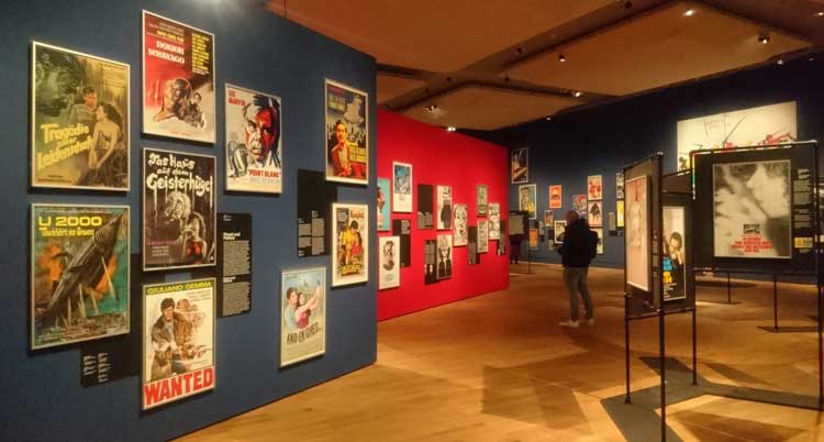
Parallel to this streamlining marketing strategy by Hollywood, there are myriad styles reflecting counter movements to the mainstream, among them the new wave cinema in Europe after the second world war and the independent film movement in the US. In addition, one wall is dedicated to posters for film festivals, which also differ from posters for films on general release. Particularly in this section, posters from across the globe, including south-east Asia, South America and Africa are brought together. Posters for arthouse films dominate the exhibition.

Hans Hillmann, Panzerkreuzer Potemkin, 1967. © Staatliche Museen zu Berlin, Kunstbibliothek / Dietmar Katz.
The show is impressive and insightful, considering films sit within a complex framework of art, society, politics and commercial aspirations. Yet, it is the posters from the early years that are more arresting and enjoyable to explore. Towards the end, the narrative path of the exhibition becomes difficult to follow as it diverges into too many sidetracks with similar themes. Also, although the focus is on the artwork and some “players” on the scene are mentioned, such as the film distribution company Atlas, which is responsible for the creation of many posters, the introduction of more of these players would have helped to give a clearer picture of which companies and people have shaped the visual world that unfolds here. After all, what viewers take from this exhibition is what a poster told them about time and place and not necessarily an individual image of the poster itself.
Click on the pictures below to enlarge


Copyright © 1893–2024 Studio International Foundation.
The title Studio International is the property of the Studio International Foundation and, together with the content, are bound by copyright. All rights reserved.


-Saul-Leiter-Foundation-1000-300.jpg)
-Hank-Morgan-300.jpg)
-Rob-Battersby-9-300.jpg)


 'Destricted': sex as performance art
 The Deformation Man: David Lynch's Chimerical Universe of Metamorphosis
 The Apparitions of a Surrealist Eye: Dalí & Film
 AfterShock: Conflict, Violence and Resolution in Contemporary Art
 Up Against Jeff Wall