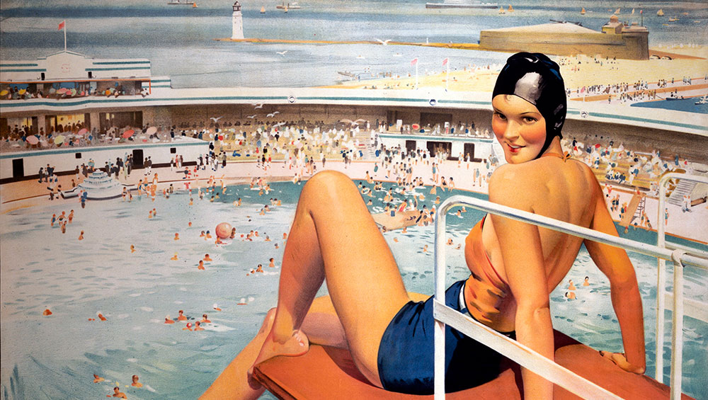
New Brighton & Wallasey. Poster, 1923-47 (detail). Artwork by Septimus Edwin Scott, published by London Midland and Scottish Railway Company. © National Railway Museum/Science & Society Picture Library.
Sainsbury Centre, Norwich
9 February – 14 June 2020
by VERONICA SIMPSON
Few decades coalesce into a particular aesthetic across so many disciplines - and define such a shift in social and cultural norms - as clearly as art deco; a fact illustrated nicely in this show at Sainsbury’s Centre for Visual Arts.
Liberated from the horrors of one world war, unaware they were about to be catapulted into another, Britons of the 1920s and 30s found comfort and inspiration in a style that nodded to the clean, streamlined curves and mass production of modernism while embracing traditional decorative crafts; that celebrated the uncomplicated joy to be found in nature while rushing to embrace the commodities and pleasures of the modern age. And there was a lot more rushing to be done, with advances in rail travel and individual car ownership, and a lot more fun to be had, thanks to the introduction of the Holidays with Pay Act in 1938.
-National-Railway-Museum,-Science-Society-Picture-Library.jpg)
Southern: Camping Sites in Southern England. Poster, 1935. Published by Southern Railway. © National Railway Museum/Science & Society Picture Library.
“It was a style of pleasure and escape, and reflected the plurality of the contemporary world, embracing all forms of design, from art and architecture to fashion and funfairs,” says the curator and acting director of the Sainsbury Centre, Ghislaine Wood.
So, how does this eclectic mix translate into an exhibition? It certainly is not helped by the rather disjointed spaces of the lower ground floor galleries of this iconic building, one that helped to put the young practice formed by Norman Foster and his wife and business partner, Wendy Cheesman, on the map.
-National-Railway-Museum,-Science-Society-Picture-Library.jpg)
The Four Streamliners. Poster, 1937. Artwork by Tom Purvis, published by London and North Eastern Railway, printed by Jarrold & Sons Ltd. © National Railway Museum/Science & Society Picture Library.
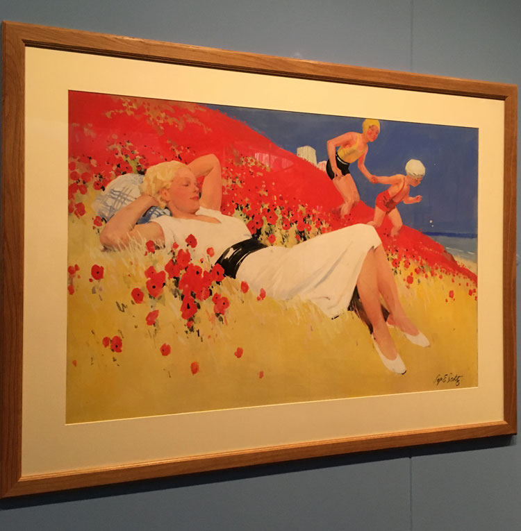
The curatorial team has done its best to enliven the opening gallery - a small lobby at the foot of an austerely beautiful spiralling metal staircase - and lure us down the long corridor that leads to the main exhibition spaces. The walls throughout are splashed in a pigment-rich palette reminiscent of the classic 20s railway posters that are arranged, in rich blues, oranges and yellows, in sequence next to the show’s title wall, at the foot of the stairs. These railway posters have become symbolic of a golden age of rail and the birth of the UK’s holiday industry. Their utopian, sun-drenched depictions of lidos, coastal campsites, rolling hills and beaches draped in daringly swim-suited crowds are icons of early 20th-century graphic design. And the artists who designed them were often highly regarded painters in their own right. But their association with advertising cannot help but diminish their impact as artworks. That whiff of sentiment verging on hard sell is writ large in a picture glowing, centre stage, against the adjacent, sky-blue wall: an idyllic scene painted by Septimus Edwin Scott. Great drifts of golden sand are juxtaposed with (somewhat unlikely) clusters of red poppies, framing a stunning young, blond woman in a white dress, with two children in swimming hats running towards the blue of the sea in the distance. The fact that this scene represents Cleethorpes – a dour coastal town in Lincolnshire – only intensifies the feeling of cognitive dissonance.

Cleethorpes by Septimus Edwin Scott. Installation view. Photo: Veronica Simpson.
More paintings in this vein line the ensuing corridor, all of them expertly executed, pleasing images of coast and rolling countryside that now seem more appropriate for greetings cards or book covers than art galleries.
Without the losses and deprivations of a recent war to colour our responses, we can’t blame the artists – or their patrons - for their leanings towards rose-tinted, sentimental and unchallenging views of those parts of the UK untouched by bombs and postwar poverty. As Wood says in her introduction to the accompanying catalogue: “For many European nations, the horrors of the first world war precipitated a profound re-evaluation of national traditions and characteristics, which informed the search for a reassuring, accessible and above all, national modern style in many countries.” Britain was no exception, though it chose a more conservative, restrained aesthetic than the florid embellishments favoured in art deco’s first flourishing in France; the term originates from the 1925 Paris Exposition Internationale des Arts Décoratifs et Industriels Modernes, though Wood informs us it was applied across the arts of that era only retrospectively, in the 1960s.
-The-Estate-of-Dod-Procter-Bridgeman-Images.jpg)
Dod Procter. Early Morning Newlyn, 1926. Oil on canvas. Lent by Glynn Vivian Art Gallery, Swansea, Wales. © The Estate of Dod Procter / Bridgeman Images
What is interesting is that this realist style of painting, which informs art and advertising, continued to be celebrated in the US – through artists such as Grant Wood (b Iowa, 1891-1942), Thomas Hart Benton (b Missouri, 1889-1975) and Edward Hopper (b New York, 1882-1967) – as well as Germany, through Otto Dix (b Untermhaus, 1891-1969) and George Grosz (b Berlin, 1893-1959) and their Neue Sachlichkeit (New Objectivity) cohort. British painters, many of whom were regulars at the Royal Academy summer shows of the 20s and 30s, were not so lucky; from the 40s onwards, most were thoroughly forgotten - or even “obliterated”, as Wood declares.
-by-Leonard-Campbell-Taylor-VS-pic.jpg)
Restaurant Car by Leonard Campbell Taylor, c1935. Installation view. Photo: Veronica Simpson.
An atmospheric painting by Leonard Campbell Taylor (1874-1969), Restaurant Car (c1935), is the main exhibit in a section of corridor flagging up the glamour of holidaying by rail. There are certainly Hopper-esque elements in its cinematic use of colour and light and the intriguing narratives his composition suggests. At the time, Taylor – who attended Ruskin School of Drawing in Oxford, then the Royal Academy – was one of the most successful artists of his day, with his style compared to that of Vermeer.
After the second world war, there was no room for sentiment as Britain was reshaped into a more egalitarian society, and the abstract charms of Ben Nicholson, Barbara Hepworth and Henry Moore gained precedence and prestige. And it is precisely because this style was so quickly discarded postwar for the “shock of the new”, that the experience of viewing these optimism-drenched paintings and posters is so deeply, richly nostalgic. They really do evoke a particular era. And it was an era of enormous change, as Wood reminds us.
-RIBA-Collections.jpg)
Designs for Midland Hotel, Morecombe Oliver Hill & John Dean Monroe Harvey Drawing, 1932. © RIBA Collections.
These shifts are most clearly communicated in the main galleries, especially the first, which focuses on “designing the seaside”. Here, we have photos, drawings and paintings of art deco as the architectural style of the day - specifically its impact on the British coast, as the land was cheap and developers and councils were keen to get in on the exploitation of coastal land to meet the rising appetite for leisure and recreation. This resulted in a blossoming of art deco hotels, villas, apartments and leisure buildings, such as the Midland Hotel at Morecambe and the De La Warr Pavilion at Bexhill-on-Sea, which also stars in a dedicated lightbox display, shown in a darkened room off to the right.

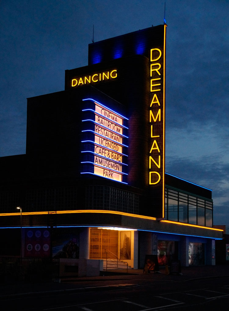
The Odeons, Dreamland Cinema, Margate. Iles, Leathart & Granger.
Photographed by George Arthur, 1935. Photograph lent by the Bruce Peter Collection.
This new style was perfect for celebrating the emerging art of cinema – we have here images of Margate’s Dreamland Cinema and Norwich’s Carlton, built in 1932. And these new, egalitarian, social settings – which articulated and reinforced the aspirations of both working-class and middle-class consumers – needed a new kind of furniture, all ergonomic curves and contours, devoid of frills. On various platforms and room-sets around this gallery, we have some iconic examples – using the modern materials of plywood, wicker, tubular steel – by legends from Marcel Breuer to Alvar and Aino Aalto and Wells Coates.
-John-Clark.jpg)
Wells Coates. ECKO AD-76 circular radio. Bakelite, 1935. © John Clark.
During the 20s and 30s, the seaside also became a place for a particular kind of industry, embracing tradition and modernism. At the far end of this first main gallery, we have a triple showcase section, framing a selection of Ekco radios – their cutting-edge curves a pioneering exercise both in broadcasting and the use of Bakelite – Poole Pottery and Crysède silk. Looking at the delicate patterns on the silk-blouse exhibits, made in Cornwall, they are redolent of an idyllic seaside past that endures – if not for much longer – in living memory.
-National-Fairground-And-Circus-Archive.jpg)
Fairground Scene, 1930s. Willsons Printers, Leicester. © National Fairground And Circus Archive, University of Sheffield.
The postwar flourishing of interest in the outdoors was also accompanied by a wave of enthusiasm for healthy living and fitness, as a whole new world of leisure and pleasure was embraced by the working masses. Cheap and cheerful hotels, holiday parks, amusement parades, fun fairs and lidos flourished, as did the new US craze for golf. All of these are explored in the final gallery, which greets us with a staged vignette of swimsuited mannequins in a simulated pool at its centre, backlit by the classic fairground festoon lights draped over a section of an original 1920s carousel to the rear.
This is the gallery of fun and frolics. Beyond the pool, a troupe of slender mannequins display the gorgeous evening dresses of the day, to be worn to parties and hotel dances. A soundtrack of the period’s popular music plays nearby over vintage film footage of the fun to be had once at Butlin’s holiday camps – the footage showing guests of all ages, shapes and sizes playing organised games or following keep-fit routines at its Cromer and Clacton camps. Facing this is a whole section on Blackpool – the most popular resort in Britain in the late- 30s, with seven million visitors in 1937.
-National-Railway-Museum,-Science-Society-Picture-Library.jpg)
New Brighton & Wallasey. Poster, 1923-47. Artwork by Septimus Edwin Scott, published by London Midland and Scottish Railway Company. © National Railway Museum/Science & Society Picture Library.
There is a wonderful selection of posters here, glamorising those destinations that would now be considered far from aspirational. At the time, they would have been striking for their use of athletic, young women in the latest leisurewear. The 30s woman is portrayed here as modern, independent, athletic and sophisticated. My favourite is a poster by Scott, for London Midland and Scottish Railway, depicting New Brighton and Wallasey (c1934). It celebrates the pleasures of Britain’s largest new lido with a coquettish, swimsuit-clad maiden on a diving board; by the crowd of scantily clad bathers in the distance, and the colour of sky and pool, you would think it was the south of France.
This era has had little attention paid to it since the V&A’s Art Deco 1910-1939 exhibition in 2003 (also curated by Woods); though the Ocean Liners: Speed and Style exhibition (2018, Wood again), shown at both the V&A London and Dundee, drew on some of this material. There have been a couple of recent exhibitions of paintings of this period, however, including True to Life – British Realist Painting in the 1920s and 1930s, at the Scottish National Gallery of Modern Art, in 2017. At the time of that show, the director of the gallery, Simon Groom, was quoted as saying: “Realist art of the interwar period constitutes one of the high points of British art of any era. It is unashamedly beautiful and technically superb.”
In today’s era, though, saturated as it is with airbrushed or Photoshopped images of aspirational bodies, relationships, lives and homes, we need something more from our art; a critical perspective has become essential.
-Manchester-Art-Gallery.jpg)
Thomas Martine Ronaldson. Summer, 1928. Oil on canvas. © Manchester Art Gallery, purchased from the artist in 1929.
There is, however, a painting I find myself wanting to linger over: Summer (1928) by Thomas Martine Ronaldson (1881-1942). A young woman stares out of the frame, her sun-kissed cheeks glowing, the contours of her head beautifully evoked, in its white, rubber bathing hat, a soft beach cape draped around her shoulders. You can practically smell the sun cream and the iodine-rich, salty air. In 1928, she must have seemed the epitome of a modern young girl, the provocation being how different the life that lay ahead of her, compared with the generation before.
So, as an experience, it is a show of conflicting emotions and reflections, including sadness that the British seaside - so celebrated in these images - is struggling; so many of the coastal towns built for pleasure in the 30s are now in terminal decline thanks to cheap air fares and the allure of more reliably sun-drenched beaches in Spain, Thailand or the Caribbean. But there is also a strong whiff of, if not contrition or remorse, perhaps sympathy for lost opportunities – that the evident talents of so many of these painters and the visual pleasures of this style came to be viewed as artistically inferior because of a seismic shift in tastes, and the overexposure of such imagery for commercial applications. A whole movement was rendered anodyne by the bracing winds of later 20th century modernism and minimalism.