by VERONICA SIMPSON
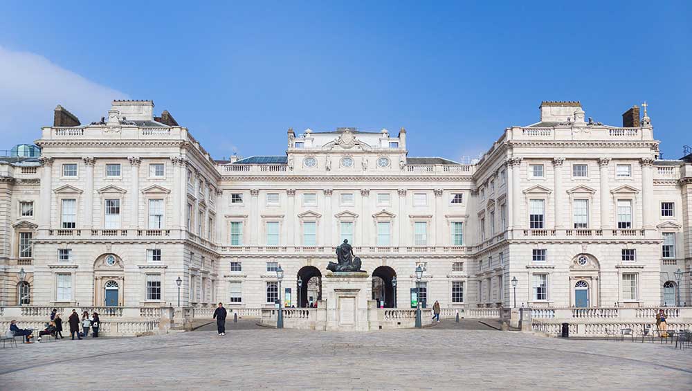
One of the greatest achievements for any architect in a really skilful restoration of a treasured building is to achieve tangible, physical improvements while leaving the experience of it – to the untutored eye – pretty much as people remember. Such is the transformation that the Stirling Prize-winning practice Witherford Watson Mann (WWM) has brought about at the Courtauld Institute’s 1770s, Grade I listed structure, arguably the most significant building in the long and illustrious career of its original architect, Sir William Chambers.
The Courtauld Gallery at Somerset House, London. Photo © Alastair Fyfe.
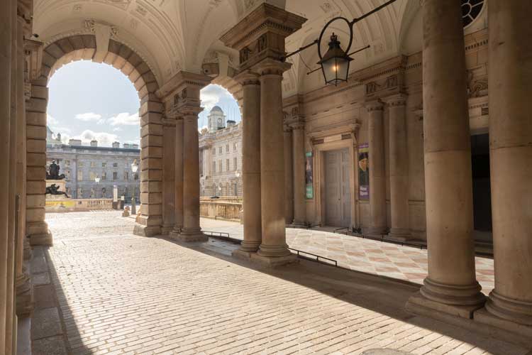
To leave the building feeling so quintessentially intact is no small undertaking: the three-year, £57m project involved the raising or lowering and occasional replacement of floors at 50 different points, the comprehensive replacement or restoration of period plaster embellishments around walls and ceilings, the addition of multiple doorways and the reinstatement of many windows. Last, but far from least, came the excavation and underpinning of the entire vaulted basement with newly poured concrete pillars - while keeping the delicate timber and masonry structure of the floors above intact; it’s a feat that WWM’s director, Stephen Witherford, describes as “the most challenging thing we have done to date”. Yet, walking into the Courtauld’s wide, stone-floored lobby, and through the older exhibition rooms, it feels like the same, fine neoclassical Georgian gallery interior as before, just noticeably fresher and better.
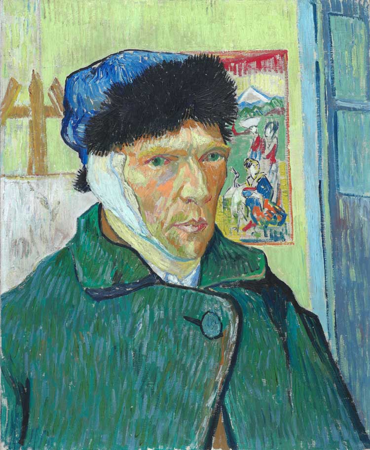
Vincent Van Gogh, Self-Portrait with Bandaged Ear, 1889. The Courtauld, London (Samuel Courtauld Trust) © The Courtauld.
Witherford describes Chambers’ project as a “battenberg cake” of a building (referencing the disconnected squares of coloured sponge that travel horizontally through this distinctive British confection). He says: “From the outside it looks like a singular structure. Inside, it’s more like a folded Georgian terrace of five houses. Each house had its own entrance and circulation. It was designed to accommodate nine different institutions, including the Royal Academy, the Royal Society and the Society of Antiquaries, separately. What this project has really been about is to create a connective circuit around the rooms - culminating in a tunnel all the way through the vaults below us – to allow all the different voices and activities within the Courtauld to become more visible. To the public, it’s sort of an infrastructure issue, facilitating movement around nearly 200 rooms. What we have done allows these rooms to talk to each other but doesn’t dictate how they talk to each other.”
In short, WWM has surgically and comprehensively adapted a 240-year-old building designed for a different age and a multitude of diverse clients to suit a singular client and its contemporary audiences. The Courtauld Institute was founded in 1932 by the textile industrialist and impressionist art collector Samuel Courtauld (along with two of his friends, politician Viscount Lee of Fareham and lawyer Sir Robert Witt, both of whom also gave their private collections). Courtauld had a particular ambition, according to the gallery’s director, Ernst Vegelin van Claerbergen: “For him, art was life-enhancing and he saw it as crucial to find a way for art to be more central to everyday life and experience.”
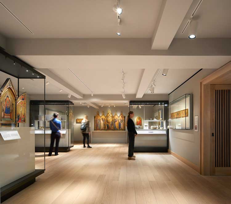
The Medieval and Early Renaissance Gallery at The Courtauld Gallery. Photo © Hufton+Crow.
Combining exhibition and archives with education, the Courtauld has become one of Europe’s elite academies for fine art studies and research, from curation to conservation. The institute only moved into this remarkable building, however, in 1989. And, despite this prominent location, on the banks of the Thames, occupying the north wing of Chambers’ grand Somerset House quadrant, it has remained largely off the radar of the casual gallery-goer, perceived as a kind of art insider’s secret, known for having the UK’s foremost collection of impressionist and post-impressionist paintings along with some medieval and Renaissance masterpieces. But its assets now – after multiple additional bequests - amount to so much more than that. As Vegelin said at the press view: “We care for one of the greatest collections in the UK. We have over 600 paintings from the late medieval to the 20th century, with some of the great impressionists. We have 7,000 drawings, including works by Rembrandt, 550 sculptures and decorative arts objects and over 25,000 prints.”
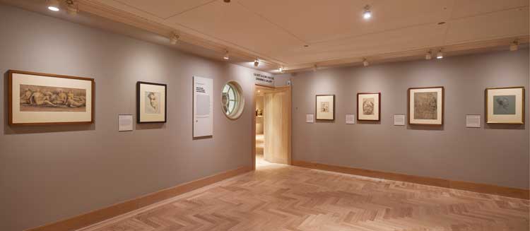
The Gilbert and Ildiko Butler Drawings Gallery at The Courtauld Gallery. Photo © David Levene
Only small portions of these riches were visible before, in the historic labyrinth of rooms. However grand, they were gloomy, often subdivided, with circulation confusing both horizontally and vertically, the latter reliant on a handsome but vertiginous circular staircase the stone treads of which are of such narrow dimensions that, in the 1770s, when the Royal Academy hosted its annual summer show in the Grand Room at the top, the crush of would-be spectators could inspire riots. So, really not fit for 21st-century purposes.
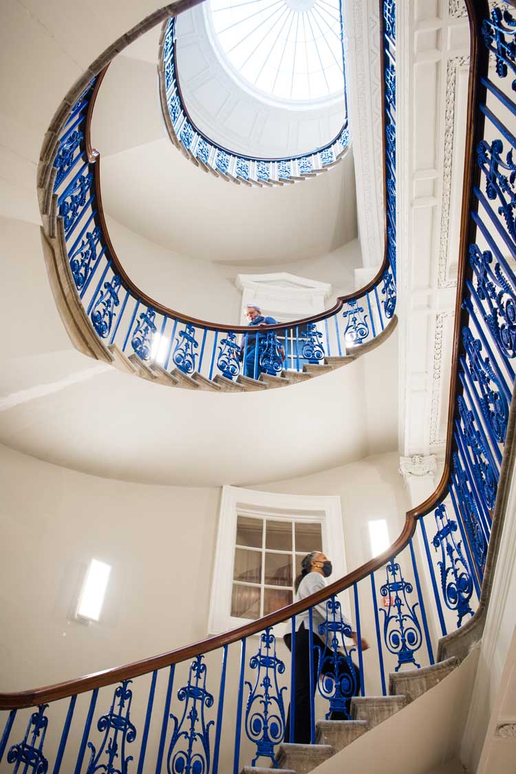
The Courtauld Gallery. Photo © Jim Winslet.
Now, that handsome staircase with its distinctive Prussian blue painted metalwork still greets the visitor across the same Portland stone lobby, but there is no clunky ticketing desk. Reception and ticketing activities are in their own dedicated room created next door, with a new timber floor leading to a wide and elegantly cantilevered staircase – its treads using Swedish limestone to complement the Portland stone in the entrance hall - down to the vastly improved basement area where an expanded retail area and cafe occupy the newly excavated vaults.
The programme up the main stairs progresses chronologically, with a few exceptions. On the first floor, there are two new galleries. One, for medieval works, is accessed via a timber-alcove, the modest dimensions of which prepare you for the low ceilings in an area that had previously been occupied by storerooms and staff toilets. There is the delicious smell of fresh timber and an intimacy to the spaces and lighting that conjures an atmosphere entirely in keeping with the idea of domestic worship or private chapels, where these exquisite paintings, carvings and altar pieces would originally have been displayed. The other is dedicated to drawings and watercolours, currently hosting the exhibition Pen to Brush: British Drawings and Watercolours.
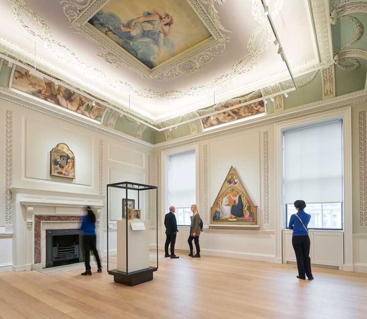
The Blavatnik Fine Rooms at The Courtauld Gallery. Photo © Hufton+Crow.
On the second floor, we find the great, glamorous rooms we think of as classic Courtauld, filled with treasures – paintings, ceramics, sculptures and silverware - from the Renaissance to the 18th-century, now called the Blavatnik Fine Rooms. Six galleries, occupying the entire first floor, contain masterpieces such as the iconic Adam and Eve (1526) by Lucas Cranach the Elder, a glowing Landscape with the Flight into Egypt (1563) by Pieter Bruegel the Elder, one room is devoted to a remarkable group of 20 paintings and oil sketches by Peter Paul Rubens (1577-1640), and there is Sandro Botticelli’s The Trinity with Saints Mary Magdalen and John the Baptist (1491-94). This latter has been transformed through a painstaking conservation process that stripped away centuries of yellow varnish to reveal a background far quirkier and more vibrant than before.
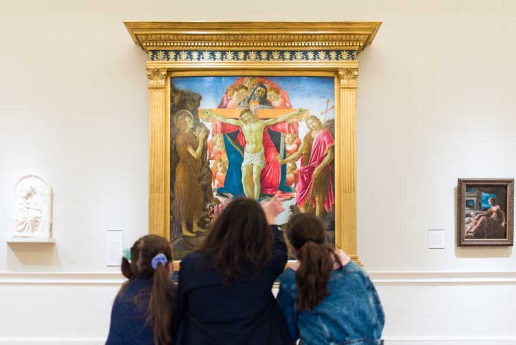
Botticelli in The Blavatnik Fine Rooms at The Courtauld Gallery. Photo © Jim Winslet.
In fact, everything looks more vibrant, as if painted afresh. This is partly thanks to the infinitely improved lighting – a collection of individual picture spotlights is now directed from on high, from a lightweight, suspended rig that punches as gently as possible into the historic plaster and frescoed ceilings. But the works also benefit from generous spacing between each one. As Vegelin says: “We wanted to show single isolated works really beautifully by themselves to invite close contemplation.”
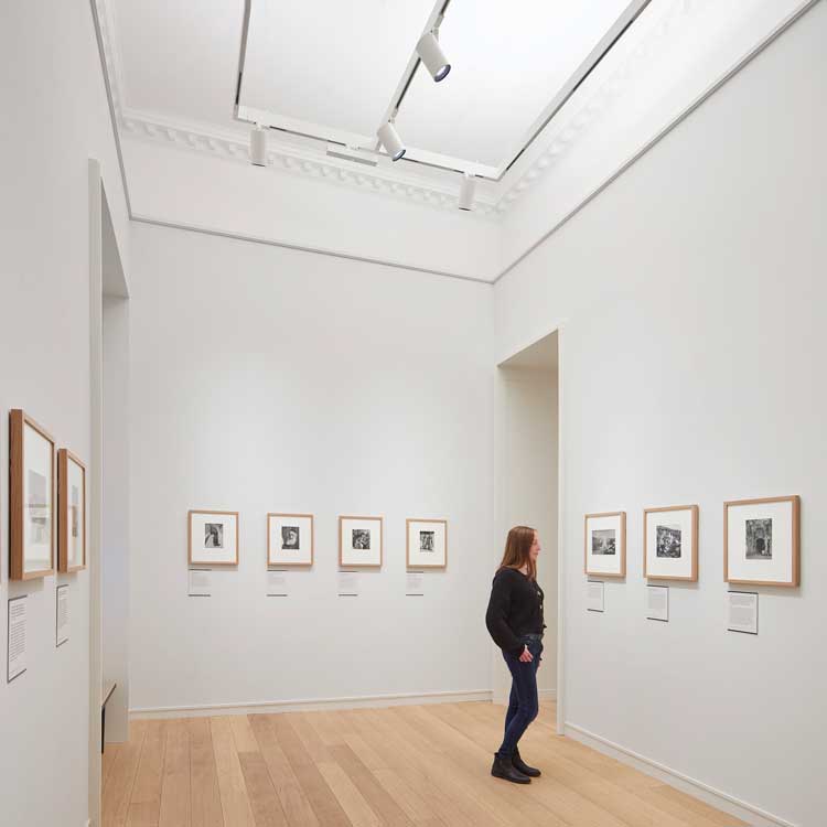
The Project Space at The Courtauld Gallery. Photo © Hufton+Crow.
In the staircase lobby at second floor level there is a two-sided lift for the transportation of works and people. Over the other side of this lift are two new display rooms that were previously inaccessible. Referred to as the Project Space, they are for showcasing photographs or prints from within the collection or displaying conservation projects. Currently, it hosts a striking exhibition of photography of Kurdistan’s people, cities and landscapes. Black-and-white images taken in the 1940s by one of the 20th century’s leading and most widely travelled architectural photographers, Anthony Kersting, are shown alongside contemporary photographs by Richard Wilding, and made all the more haunting by the fact that most of the ancient architecture he photographed has since been destroyed.
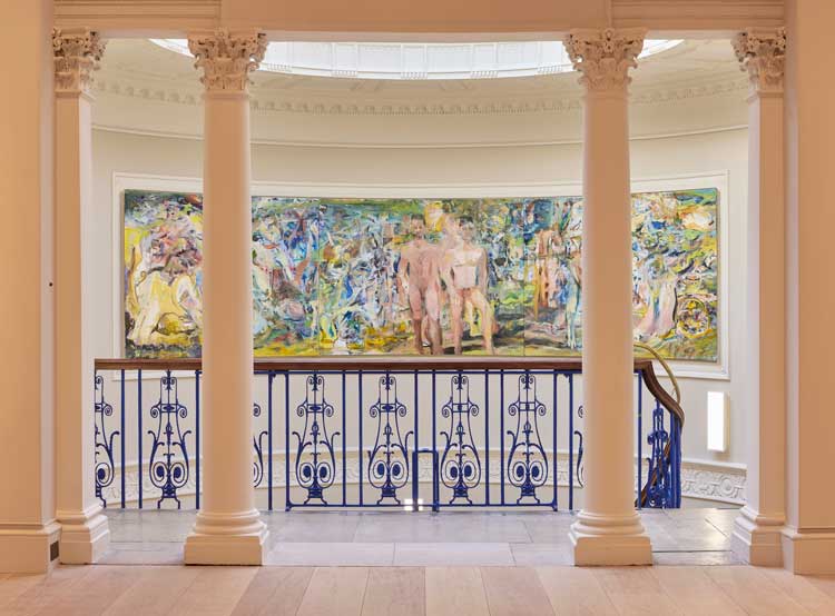
Cecily Brown, Unmoored from her reflection, 2021. Oil on linen, 149 x 539 cm © Cecily Brown. Courtesy the artist, Thomas Dane Gallery. Photo © David Levene.
Up towards the top of the stairs a new fresco painted by Cecily Brown occupies the curving wall opposite the top floor entrance to what was the Royal Academy’s Great Room. A special commission, Unmoored from Her Reflection (2021), it is five metres wide, and offers a contemporary take on the typical impressionist palette and subject matter, subverted by two male nudes at its centre.
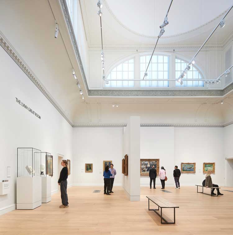
The LVMH Great Room at The Courtauld Gallery. Photo © Hufton+Crow.
It sets up a dialogue across the centuries with the works in the Great Room, a lofty, voluminous space amply lit – even on a grey day – by two huge rooftop “lanterns”. This was the first purpose-built exhibition space for art in London. But where the Royal Academy would arrange its Summer Exhibition exhibits thickly across the entire wall, from knee level upwards, now there is much more restraint which – as elsewhere – really intensifies the impact of each work. Here we have Édouard Manet’s A Bar at the Folies-Bergère (1882), Van Gogh’s Self-Portrait With Bandaged Ear (1889), seven works by Paul Cézanne, and several by Gaugin, Monet, Degas and Modigliani.

Claude Monet (1840 - 1926), Antibes 1888. The Courtauld, London (Samuel Courtauld Trust).
Beyond the undoubted pleasure of seeing these famous works in the flesh, displayed with new dazzle and luminosity thanks to the substantially daylit space, I was struck by a sequence of several small oil paintings by Georges Seurat (1859-91), progressing chronologically across one decade, revealing the stages in his experimentation towards pointillism. That revelatory, scholarly touch is evident across the whole of the curatorial programme - a sense of helping us to unlock the secrets of these artists and their art, which I found particularly enriching and appropriate. The presence of drawings, watercolours and prints either alongside the relevant works or in smaller side galleries gives us a richer appreciation of the artist’s craft. Two rooms behind the Great Room, for temporary exhibitions, support this endeavour, showing 24 modern drawings by European and American greats, including Georg Baselitz, Wassily Kandinksy, Paul Klee, Gerhard Richter and Cy Twombly, assembled by the late collector Howard Karshan and given to the Courtauld by his wife, the artist Linda Karshan.
.jpg)
Helen Saunders (1885-1963), Vorticist Composition with Figures, Black and White, about 1915. The Courtauld, London (Samuel Courtauld Trust), © The Courtauld, The Estate of Helen Saunders.
Speaking of female artists, inevitably the displays are massively light on women. You can’t change the cultural and educational injustices and collecting habits of four centuries (and the rest) retroactively. The commission of Brown’s mural is presumably one small gesture to try and redress that overwhelming imbalance.
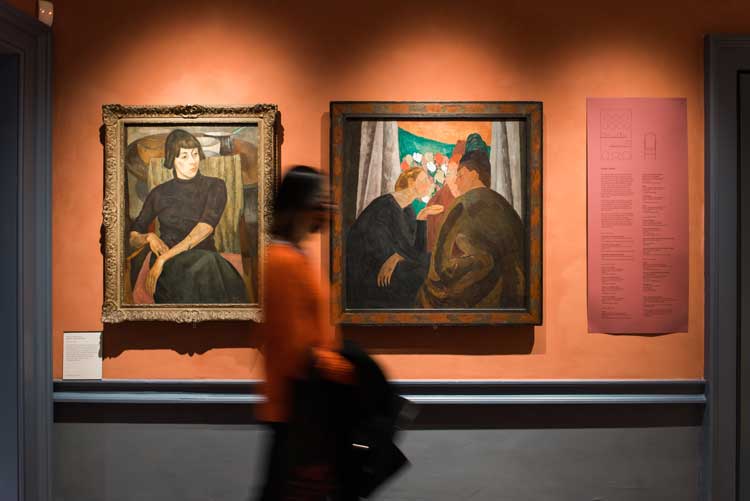
The Bloomsbury Room at The Courtauld Gallery. Photo © Jim Winslet.
To the right of the stairs, there is female company for Brown, in the form of Vanessa Bell (1879-1961), whose work joins those of her fellow Bloomsbury Group alumni in a dedicated space whose walls and furnishings use a palette inspired by the damson and sage hues so beloved of these artists. It has a domestic feel enhanced by the presence of a large, colourful rug, one of four commissioned by the Courtauld from Christopher Farr Rugs, inspired by original designs from The Omega Workshops, of which Bell was a director (now available as limited editions from the Courtauld website).
.jpg)
Oskar Kokoschka (1886-1980), The Myth of Prometheus, 1950. The Courtauld Gallery. Photo © Hufton+Crow.
To the left of the staircase and completing the circuit through the Great Room and its tributaries is the last display room, a separate space currently dedicated to Oskar Kokoschka’s) Tryptich The Myth of Prometheus (1950). On the wall opposite is another leading lady of her time, Lee Miller (1907-77), showing her photographs of Kokoschka at work on this painting.
At every stage, Witherford and his colleagues have taken great pains to respect the essence and integrity of Chambers’ vision. Everything has been tightly worked, says Witherford, to maintain the “perfect” internal proportions of Chambers’ original. “To work with pretty much intact classical architecture has been incredible. You cannot hide: if you do anything crude or lazy, it shows.”
Thankfully, there is nothing crude or lazy in this restoration. The sense of seamlessness or sympathy between new and old is achieved due to what Witherford describes as “a lot of subtle material readings in the building. In the old galleries, we have a gradation of floorboards. In the new gallery, we repeat the floorboard width. Thresholds are marked with different wood. Every contemporary art gallery tends to have engineered floorboards, but it looks too perfect. We have got solid boards and they are surface fixed. We have tried to fix them so you can see where the beams are, following the fixings. So, the fixings kind of reveal the complexity of what’s going on underneath.”
To address all the complexities, says Witherford: “We designed it room by room pretty much. We asked each time, how do we hold it together but have the nimbleness to respond to each space?” Credit here must also go to the exhibition design specialist Nissen Richards, which has worked closely with the whole team to get the lighting, colours, mood and display furniture just right for each floor and each curatorial shift.
Ultimately, the success in making the building feel so familiar and yet significantly better lies in WWM’s sensitivity to the inspired arrangements of the original. Says Witherford: “It’s very bodily, this building. These combinations of volume, generosity and light, they sort of do something to your diaphragm. I’ve really felt it on this project more than any other. It’s a very carefully calibrated, volumetric sort of building.” I think Chambers would approve of WWM’s treatment. But for the client, Phase 2 remains a challenge: to bring the adjacent educational and teaching spaces up to a similar standard – to which end, fundraising is still underway.
The success of Phase 1 will play its part here. Speaking after the press view and the day before the public opening, Vegelin was optimistic: “I hope that the gallery project will demonstrate to supporters what can be achieved in this building. It really enriches a general visitor’s enjoyment of the collection but equally so for students. And, also, those boundaries are becoming more and more fluid. I don’t think it will be as compartmentalised in future, in terms of forming a rigid perimeter where students are kept separate. It will be much nicer to think there could be some interchange and spaces for teaching could also be thought of as serving the public.”
Of his own reactions to the completed project, he says: “I’ve known the collection for quite a long time and for me it’s a bit of an epiphany. I particularly like the way the curatorial team have made little episodes, and certain moments, like the corner in the Rubens room where there are five or six oil sketches. These things can make it so much more lively and engaging. For us, the building in a sense now feels like a real asset for the visitor. Previously the building and the collection were slightly at loggerheads. The variety of spaces and changes in the rooms and changes in scale and the different spaces that you pass through, not only reveal the history of the building, but enhance the experience of it. It feels like it’s really adding value.”