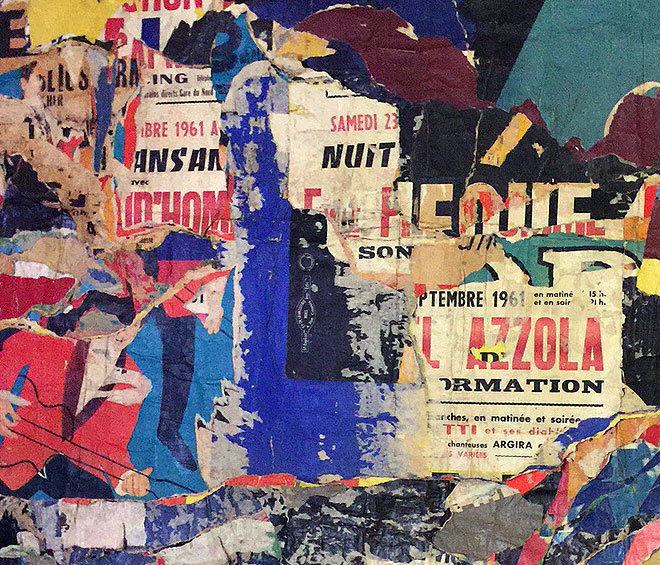
Jacques Mahé de la Villeglé. Jazzmen, 1961 (detail). Photograph: Jill Spalding.
Metropolitan Museum of Art, New York
13 September 2017 – 14 January 2018
by JILL SPALDING
The theme show is becoming something of a Metropolitan Museum of Art signature, pitting art against conceit with widely varying success – Unfinished, brilliant: Regarding Warhol, specious. A pro and con strategy, it serves the curatorial impulse to package disparate material for bait while inviting a close reading that can backfire. Delirious – a come-on if ever there was one – is very much to the point, a sure-fire catch-all, but so loaded with swoon that, as a serious investigation, it risks missing its mark. To the made-for-app wall tag, “delirious times demand delirious art”, a collective sigh rises: “Give me a break.”
The quarrel is not with the material, which is mostly top-notch and well balanced between storied and less known. This is an energetic exhibition, in all senses of the word, displaying an acrobatic medley of mediums and subjects, but it covers such a wide range of artists as to ask why so many who qualify were omitted. (Francis Bacon’s twisted Popes, anyone?) And it so narrows the time slot as to call into question the premise. What, specifically was up with 1950-80 that eludes referencing the decades prior and post? If the overarching thesis is art inflected by social disruption and political chaos, then what of the Japanese flung-ink moment, Goya’s Cronus, the dada and surrealist movements, Picasso’s Guernica – all contorted by conflict? Also, what are the limits of reason? Do only artists confined to an asylum transgress (none is represented here) but not, say, Ana Mendieta (she is), whose bodily interventions verged on lunacy? The distinction, as with each of the four categories shaping the show – Vertigo, Excess, Nonsense and Twisted – is one of curatorial choice.
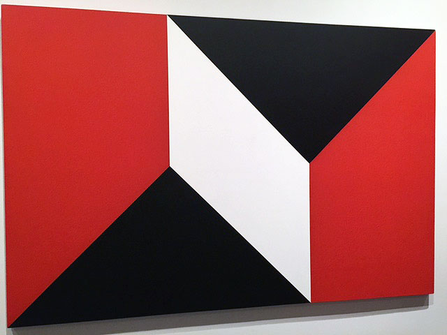
Dean Fleming. Snap Roll, 1965. Acrylic on canvas, 66 x 99 in. Installation view. Photograph: Jill Spalding.
The risk of a concept show is viewer blowback. “What’s delirious about a geometric abstraction,” I overheard more than once in the Vertigo section and, contemplating the Dean Fleming and Al Loving in question, I concurred. On a first viewing, a good third of the 100 or so works selected don’t derail. Some, such as Bruce Nauman’s neon wheel, are so familiar they have long ago seeped into the universal lexicon. Others are too cool, too static, or too cerebral to disrupt any viewing experience not itself hooked on mescaline. Many of the video pieces are, to varying degrees, hallucinatory, but that the distortions are attributed to ecstasy misrepresents the baby-step tumbles of a then very new medium. And what is gained, other than to break the monotony of a floor-wide show, by the seemingly arbitrary division into four categories that cross over; why is Dara Birnbaum’s hilariously sequenced Kiss the Girls: Make Them Cry (1979) in the Vertigo, not the Nonsense, section? Why is Hannah Wilke’s postcard streaked with erasers skewed into vulvas not placed in Twisted?
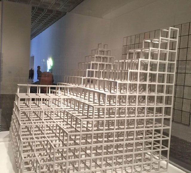
Sol LeWitt. 13/3, 1981. Painted balsa wood, 31 3/8 × 31 3/8 × 31 3/8 in (79.7 × 79.7 × 79.7 cm). Installation view. Photograph: Jill Spalding.
There is a problem, too, with curatorial pronouncement. Kelly Baum’s opening wall text announces: “All sacrifice order for legibility, and intelligibility in favor of humour, absurdity, obsession or disorientation.” Not a good start for those thinking that humour can be intelligible, and obsession, ordered. Most glaringly, Sol LeWitt’s 13/3 (1981), a 13x13 grid rising to three towers, which is said to have inspired the show, comes off less as a “rational means to generate irrational ends” than as an elegant, methodical three-dimensional solution to a complicated mathematical problem. As for Lygia Clark’s investigation into bent time with a looping one-bordered band, what is delirious about visualising a physics principal to explore a new spatial dimension? And what of the preponderant number of mirror pieces? Does Larry Bell’s nested polygon “shortcut cognition” or does it, more impressively, achieve through isometric projection a new form of perception? Dan Graham’s architectural steel works, stated by the artist to address light, presence and time, in fact do just that.
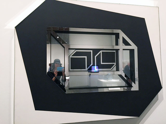
Larry Bell, Untitled 1962, 1962. Mirrored glass, acrylic on canvas. 53 × 66 × 3 in. Installation view. Photograph: Jill Spalding.
Nonetheless – and here the value of a metaphor stretched too far – a curated exhibition places you in the hands of the curator, forcing a mind-shift or, at the very least, a dialogue. In this era of revisionist history, might not art, too, be revisited with fresh eyes? Take a deep breath, read the wall texts and settle in. The exceptions, it turns out, prove the dis-rule, and therein lies the reward. Step back from those Euclidean geometries and they do seem unsettled by their subtle juxtapositions of colour and inverted shapes. Yes, Edna Andrade’s vibrating chequerboard can be filed as op art, but her tight manipulation of tiny black and white squares does induce vertigo.
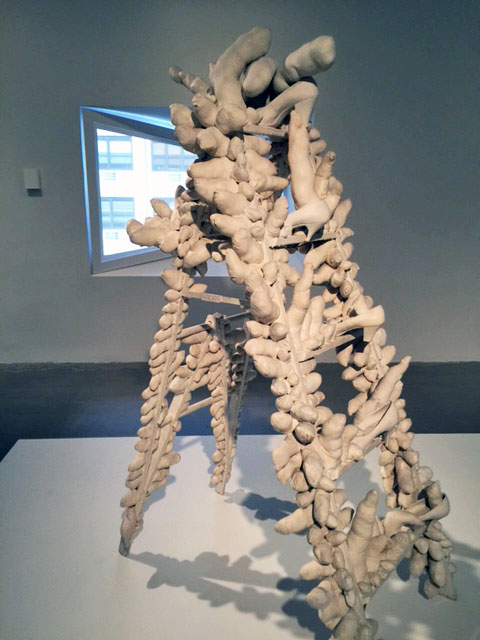
Yayoi Kusama. Ladder, 1963. Installation view. Photograph: Jill Spalding.
Manipulated systems engorge in the Excess section with Yayoi Kusama’s Ladder, charged with shoes and phallic objects from the Compulsion Furniture series that she herself called “obsessive”; Howardena Pindell’s densely painted sprawls aggregated from punched-out paper consuming grids of string; Brian O’Doherty’s colour charts grouping pictographs into repetitive incantations; and Tony Conrad’s moving finger wresting from the gridded face of an adding machine the numerical canto “times 3 divided by seven, times two, divided by …” ad dizzying infinitum.
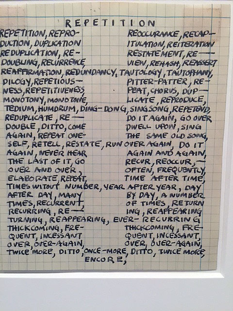
Mel Bochner. Portrait of Robert Smithson, 1966. Installation view. Photograph: Jill Spalding.
If a good portion of the Nonsense section begs credulity with perfectly intelligible coding, surrender to the exceptions; Nancy Spero’s masterful collaged reworking (Codex Artaud XXl) of a French surrealist’s “fractured hysteria”, for one, is delightful. There is good news, too, for those who remain resistant to arbitrary intervention: curatorial largesse offers some palate cleansers. Greet Mel Bochner afresh with the linguistic systems he translated into ingenious word portraits (here, the ubiquitous trio of LeWitt, Robert Smithson and Eva Hesse), before he floated to the bank on his best-seller Crayola alphabet soups. Marvel at Anna Maria Maiolino’s lurid, primal video stream of lips and tongues mouthing invective, greed, appetite and, through its shrill, wordless soundtrack, rattling despair. And acquaint yourself with Richard Serra’s weightless 1974 foray into video-speak (Boomerang) with a subject whose voice, echoed back to her, disrupts her ability to think.
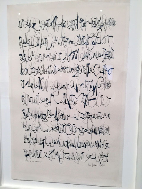
León Ferrari. Letter to a general, 1963. Ink on paper, 45 x 30 cm. Installation view. Photograph: Jill Spalding.
Meanings within meanings join graffiti to a dream-inducing cuneiform in Martin Wong’s Attorney Street (Handball Court with Autobiographical Poem by Piñero) (1982-84); Argentinian artist León Ferrari’s encrypted calligraphy piece has you reaching for a railing to lean on. And Jazzmen (1961), one of Jacques Mahé de la Villeglé’s terrific “torn” posters, viscerally communicates the aural and visual chatter that rocked heyday Paris. Closest to hallucinatory are Henri Michaux’s mescaline drawings, an exercise in speed undertaken under the influence of peyote.
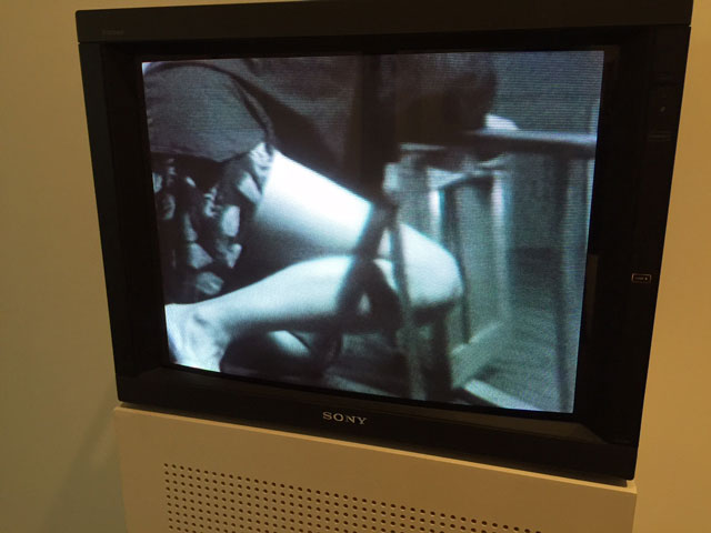
Dara Birnbaum. Chaired Anxieties: Slewed, 1975. Installation view. Photograph: Jill Spalding.
Twisted, the final section, and the strongest, is apt for Leon Golub’s disembodied Vietnamese Head; for Birnbaum’s torturous extrication video, Chaired Anxieties: Skewed (1975); and for Lee Lozano’s use of childlike scribbles to dismember body and machine parts into violations that unseat reason. The final twist is that the show builds to its end along Marcel Breuer’s signature window, but the famous glass trapezoid has been walled off for a bench, suggesting that the city scene it views on detracts from delirium.
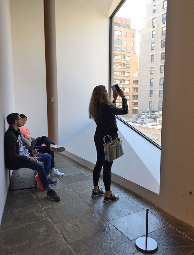
Signature Met Breuer window. Photograph: Jill Spalding.
It is thus supremely ironic that the masterwork (in the Metropolitan Museum’s own collection) selected to walk you out of the show is Philip Guston’s 1977 The Street, which depicts the rush-hour tangle of feet and hands on just such a city street. Albeit inadvertent, the irony begs the question whether skewed art, at its conception, isn’t rational, and – it stands to reason – vice versa.