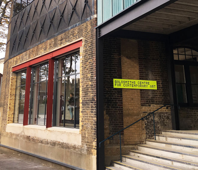
Goldsmiths, University of London
by VERONICA SIMPSON
There is a thoughtful scruffiness, an artful dishevelment about Assemble’s reinvention of an old bathhouse as contemporary art gallery for Goldsmiths, University of London. It demonstrates a decisiveness and clarity not just about where the old bits end and the new bits begin, but about how those interventions are framed and materialised. It is notable everywhere, but perhaps most striking in the void this Turner-prize winning architecture collective has placed at the centre of the building. By punching a hole through the ground floor, they have turned a section of the basement into a double-height exhibition room: now called the Project Space (and currently hosting a charming Ivor Cutler exhibition), its activities are visible from the ground and first floor corridors above, through apertures sliced out of the tiled walls and the removal of doors; in this way, they have created a kind of contemporary minstrels’ gallery.
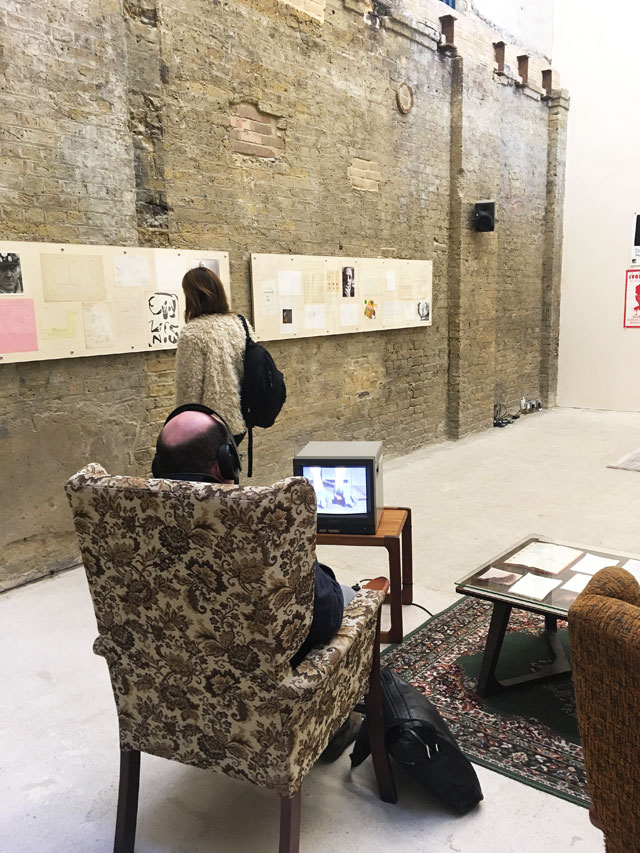
Ivor Cutler exhibition in the basement gallery. Photo: Veronica Simpson.
On every wall of the Project Space you see the joins, the layers of usage, and scars from the most recent intervention: the raw, scraped walls of this former basement; the new bricks that fill in the dark holes where the ground floor slab has been ripped out, leaving a distinct tidemark where the Victorian tiles, which cover almost every ground floor wall in all their scuffed and cracked splendor, begin. There is something unapologetic – indeed, celebratory – about this revelation of previously hidden basement spaces for cultural programming. “A lot of what they have done with this building was excavation and archaeology,” says the freshly appointed curator, Natasha Hoare (under director Sarah McCrory). “It was all about revealing previous occupation and use.”
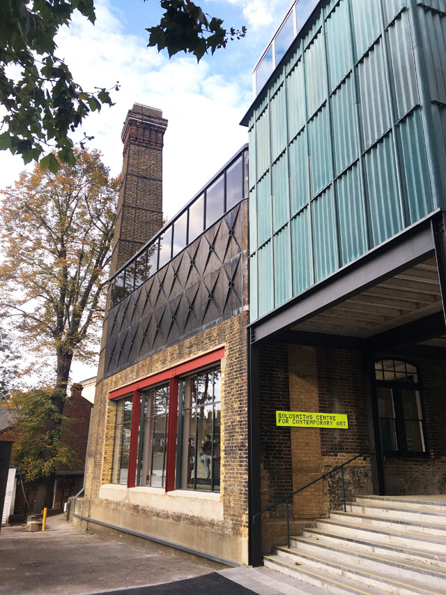
Goldsmiths Centre For Contemporary Art. Photo: Veronica Simpson.
The 2015 Turner Prize was some way off when Assemble won the competition to convert this listed building into Goldsmiths’s first public-facing gallery, in 2014, beating off art-world favourites including 6a Architects and Jamie Fobert Architects; it was also Assemble’s first major building commission. One of the aspects of their practice that won them the job was this desire to make good through a combination of simple but robust interventions along with more artistic ones. “They wanted every detail to be visually expressive of their practice,” says Hoare.
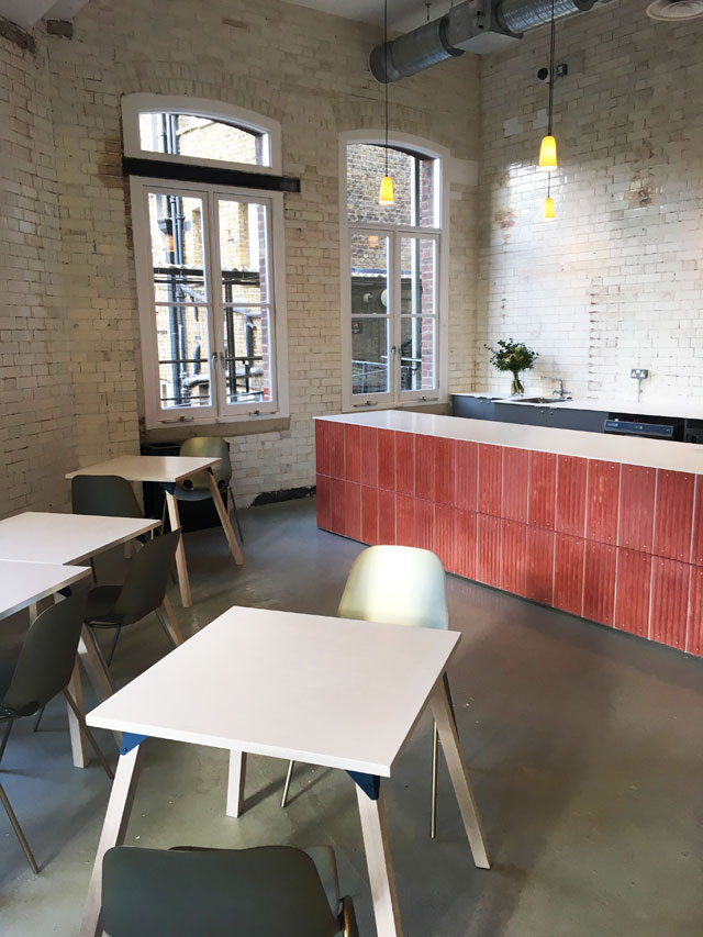
Goldsmiths Centre For Contemporary Art, Cafe. Photo: Veronica Simpson.
Famously invested in experiment and craftsmanship, the collective seized this opportunity to create a number of unusual hand-finished elements, from the naked, pink tones of the cast-concrete panels that line the reception desk and cafe counter to the unusual cladding on the building’s upper storey; it looks like an expensive verdigris metal, but is in fact corrugated cement board – a material more often found in agriculture - that Assemble tinted this hue by dipping it in their own homemade acid wash.
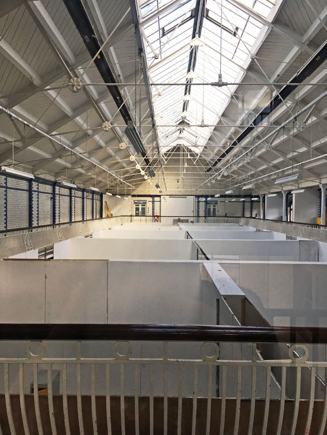
Skylight over pool studios, Goldsmiths Centre For Contemporary Art. Photo: Veronica Simpson.
It was an inspired idea to balance the few judicious structural interventions with this degree of craftsmanship and careful detailing. The idiosyncratic quality of each room - and all the transitional spaces between them - works to unite those original, used and scruffy parts of the building within an intriguing textural palette. And it helped to make the most of the relatively modest budget. This Grade II-listed 1898 Bathhouse was, at various times, a dance hall and venue for gigs, wrestling and community events before it closed in 1991. Acquired by Goldsmiths in 1999, the university’s only move initially was a light conversion of the glass-roofed swimming pools into top-lit studios for students, and some of the surrounding rooms into offices. But the back section – the boiler house and public laundry, containing two huge water tanks, “slipper baths” and much of the original engineering plant - had been untouched. The university raised £4.6m to transform this into 1,000 sq metre of public art space (700 sq metre of it galleries); comprising eight galleries, a cafe, curators’ studio and event space. A big chunk of the funding was donated by Goldsmiths’ famous former students: £1.4m raised at Christie’s from an auction of works by alumni including Bridget Riley, Damien Hirst, Sarah Lucas and Antony Gormley.
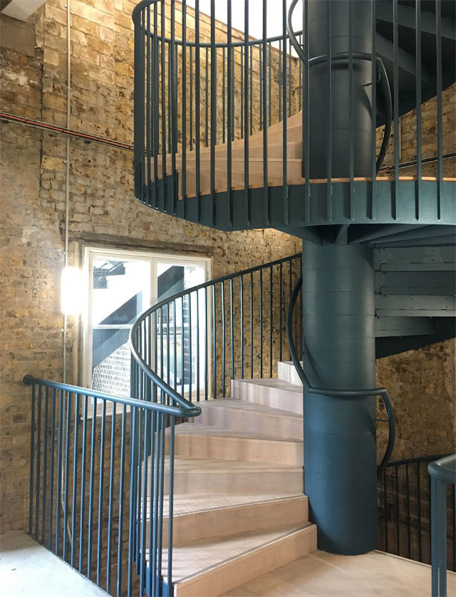
Spiral staircase, Goldsmiths Centre For Contemporary Art. Photo: Veronica Simpson.
While the structural interventions were kept to a minimum, they are executed with flair. These include raising the ground floor roof by one storey to form the new first floor. This also necessitated two new staircases – one near the entrance and an additional (delightfully spiral) staircase at the rear, which connects all three levels; in this way, the building can be moved through continuously. With the front staircase, Assemble has reutilised an original Victorian skylight, reglazed and repositioned; original windows now give on to the artists’ studios from its stairwell, reinforcing the sense of this building as a space of artistic production. Four distinct gallery spaces have been created on the first floor, two of them reusing the carcass of the Baths’ cast-iron water tanks.
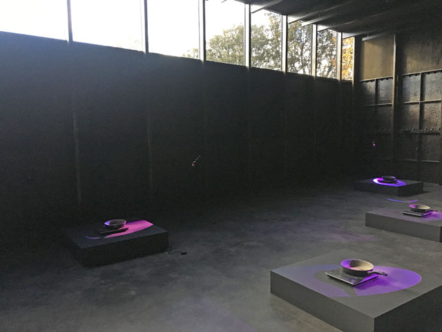
Mika Rottenberg, Frying Pans, 2018, Tank gallery, Goldsmiths Centre For Contemporary Art. Photo: Veronica Simpson.
These water tanks are extraordinary - like galleries carved out of a Richard Serra sculpture. The cast-iron interior of the main one has been cleaned, oiled, preserved and strengthened to resist wind-load. It can, of course, be painted any colour, but for now it is black and raw, the perfect setting for Mika Rottenberg’s Frying Pans (2018) which intermittently hiss and steam, their vapours captured by shafts of light from a long, clerestory window. The top level of this space has been lined with timber, darkened to a similar gritty texture as the metal panels by using Assemble’s home-brewed acetate tincture of wire wool dissolved in vinegar. Another cast-iron tank around the corner has had its lid sliced off to create a small rooftop sculpture terrace; it is also lined with timbers painted in this sticky, briny-looking residue. The other two galleries contrast nicely: top-lit, white-cube-style galleries.
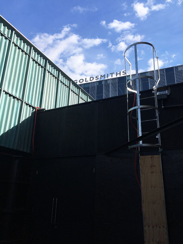
View from the roof terrace, Goldsmiths Centre For Contemporary Art. Photo: Veronica Simpson.
Adam Willis of Assemble says their scheme “offers a series of very diverse and distinctive rooms for display – contrasting qualities of light, varying proportions, different levels of finish, and a range of environmental qualities”. This quirky sequential quality is an aspect that artists are invited to respond to; and Rottenberg seizes every opportunity for this inaugural show: a surreal video (NoNoseKnows, 2015) on the first floor, of pearl-workers picking out fragments from shells, is accessed via a corridor made to look like a backroom in one of the very sweat shops she is depicting, filled with bags of pearls and rabbits festooned with beads. Another of her films (Cosmic Generator (Variant 4) 2017-18) is accessed via a roughly plastered, low tunnel, which has a dank, cave-like quality (the only treatment in the whole ensemble of spaces that rings slightly false, given its first floor location; unless this is also one of Rottenberg’s interventions).
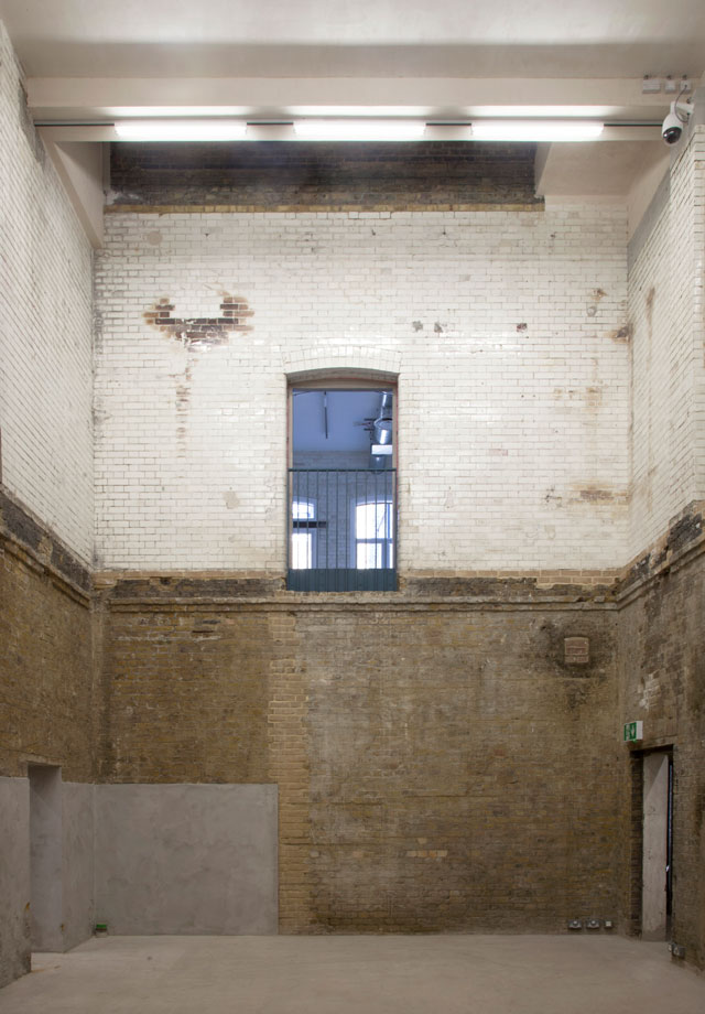
Goldsmiths Centre For Contemporary Art, project space. Image courtesy of Assemble.
But the real “social and theatrical heart” of the building, according to McCrory is the aforementioned Project Space. This will be used for talks and screenings, embracing the fact that it is visible from all sides at all times. Even the installation of shows will be on view, reinforcing the dialogue between practice and theory. “The visibility of process makes a lot of sense for students learning about curatorial practice,” says Hoare.
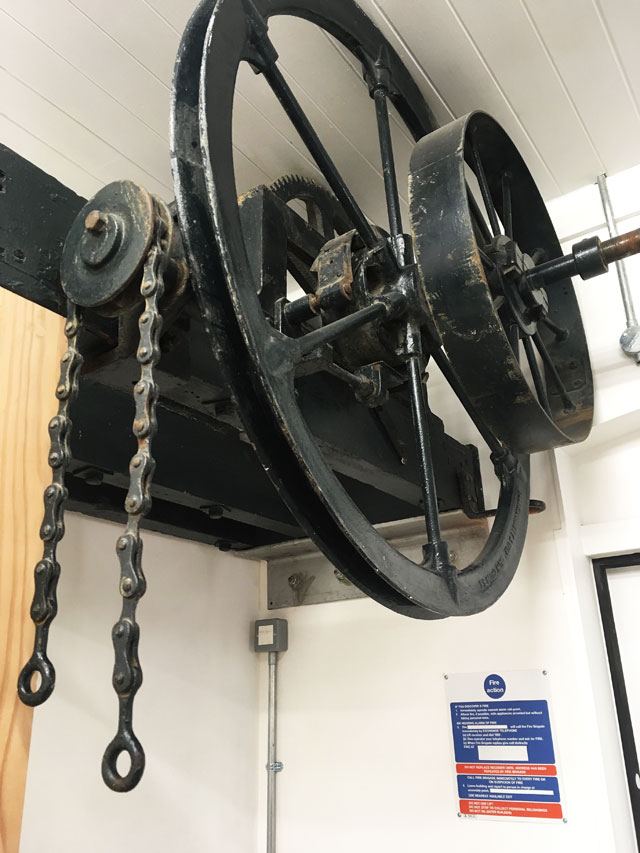
Original bathhouse engineering elements, Goldsmiths Centre For Contemporary Art. Photo: Veronica Simpson.
It is a building that rewards – encourages – closer inspection and inhabitation. There is so much to observe and admire, not least in the way vintage machinery and materials have been knitted into the new interior palette. Old pipework, interior banisters, and exterior cladding alike are painted a distinctive teal-ish blue (a paint apparently sourced from the German transport system), which perfectly matches a set of original metal laundry racks that remain in situ in the ground floor cafe (it also, apparently, matches the blue tiles that previously lined the pools). And there is the care with which new elements have been chosen, like the subtle, sanded timber deployed - lightly colour-washed - in floorboards and doorways. Then there are the sleek and slightly other-worldly cafe chairs that have been created by Assemble from passivated zinc; their pale, bluey/green/bronze patination resonating with the cafe’s blue pipes and laundry racks, the creamy, greeny-grey painted concrete floor and the pale wooden ramp.
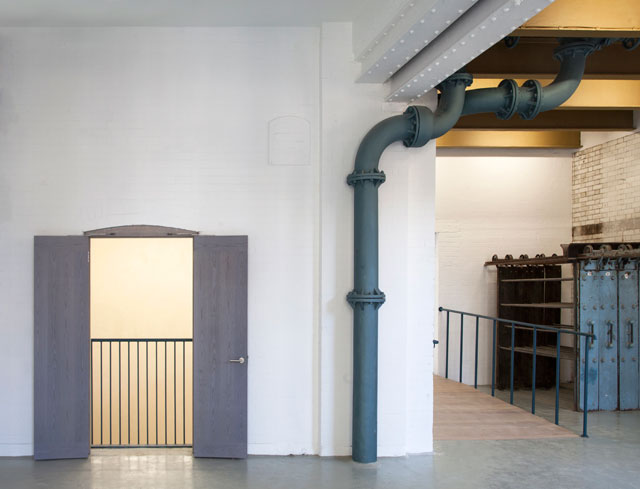
Goldsmiths Centre For Contemporary Art, interior view. Image courtesy of Assemble.
This feels like a new kind of architecture – a sort of naked architecture. It is architecture as archaeology: great sawn-off lumps of metal and blasted brick are revealed where joists were removed to make space for the back stairs. And this particular combination of craftedness and scruffiness communicates care: care of the building; care for its occupants.
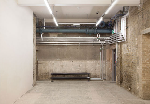
Goldsmiths Centre For Contemporary Art, basement gallery. Image courtesy of Assemble.
There is one other gallery that comes to mind as similar in spirit, at least, and that is Kettle’s Yard in Cambridge: also a sequence of carefully curated spaces, evolving over time, that invite perambulation and percolation, with a minstrels’ gallery at its heart. It is no surprise, given that most of Assemble met while studying at Cambridge. As with the original Kettle’s Yard, this building feels like an astute and honest articulation of space and time; a celebration of things found in a setting that makes them profound. But unlike the recent refurbishment of Kettle’s Yard, which now feels like a shrine to itself, this reinvention feels far more robust. It happily straddles past and future, ready to cope with multiple appropriations, according to the whim of all its occupants, now and for decades to come.