hong kong artists, women. Courtesy of the artist.
Online / M+, Hong Kong
Launched: March 2020
by HARRIET THORPE
While battles for equality continue across the globe, gender equality is an issue that Hong Kong’s M+ has been taking active steps to address over the past few years. New acquisitions have focused on works by major female artists, including Yayoi Kusama, Etel Adnan and Cao Fei, while more than half the art M+ has bought from emerging artists under the age of 40 in the Greater China region has been by women.1
While M+’s highly anticipated museum building, designed by Herzog & de Meuron, is yet to open following construction, it has also been looking out beyond its collection, to the internet, with the intent of helping to spread the word about female artists from Hong Kong across the world. In collaboration with the Asia Art Archive, Wikipedia edit-a-thons have contributed to more than 100 new articles since March 2018.
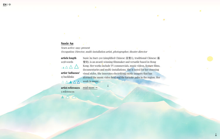
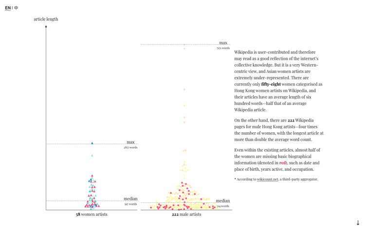
This year, a new digital commission, hong kong artists, women, designed by Shirley Wu, a San Francisco-based data-driven creative, draws attention to missing data on Wikipedia and proposes a call to action for members of the public to research, authenticate and update it. Hosted on the M+ Stories platform, the new browser-based interactive resource is a scrolling mountainscape of visualised data pulled in from the Hong Kong Artists, Women category on Wikipedia.

hong kong artists, women. Courtesy of the artist.
As well as an important mission for M+, the project was also very personal to Wu. Growing up, she loved art and maths, but it was not until later on, after several years working in business, that she realised she could combine the two. She segued from business to work at Splunk, a company designing software for data visualisation, where she experimented with the programme D3, and then worked for Illumio, a business tool designer. She is now freelance, with the aim of working across industries to tell, through data, stories that are important to her.
“I am a Chinese American woman, and in the last few years I have started to realise how important my background is to me. I wanted to learn more about my heritage [Wu acknowledges the difference between the Chinese and Hong Kong identities] and uplift women. I realised how much not having visible role models that looked like me when I was younger affected my experience and self-confidence growing up.”
The hong kong artists, women project widened Wu’s scope of what an artist can be, and it took her back to her childhood, to her mother’s hanging scrolls in the hallway that depicted ink paintings of mountains over the four seasons. These personal memories would inform the visualisation of the data as a softly undulating mountainscape: “I really loved the idea of the women being represented as mountains, as being strong and resilient and powerful,” she says.

hong kong artists, women. Courtesy of the artist.
Wu made the work with WebGL, a programme commonly used for designing two- and three-dimensional graphics for browser-based games. It allowed her “more sophisticated rendering possibilities”, such as the dappled watercolour effect that Wu had always wanted to create, because she had loved painting in watercolours as a child.
“I was new to [WebGL], so it took me a month and a half to be able to get the colours right and to get the fog rolling through. I was really happy with the result I landed on, which is a juxtaposing of the strength and resilience of the mountains with this lighter, slightly, but not too feminine, colour palette in the fog.”
A legend shows the mapping between the design and the Wikipedia data. A mountain’s height represents the page word count and its number of peaks the number of linked references. Its colour highlights the number of other Wikipedia pages that mention the artist, and the stars surrounding the mountain each represent a male contemporary on Wikipedia.
Most importantly, the beauty reveals the shortcomings of the dataset. As you start exploring the terrain, you will see many low-lying, light-coloured mountains showing the lack of basic information in almost half the entries and the below-average word counts. The visualisation is a call for people to contribute the missing biographical information and add more women to the dataset to strengthen the mountainscape.
Visualising the data through colour, storytelling and personality is a compelling way to communicate information that we may otherwise find hard to digest. Wu says: “We as human beings tend to be very visually driven. Our brains are good at picking up patterns and motions, so, for a lot of us, when we see a spreadsheet of thousands – or tens of thousands, or millions – of rows of data, or a database, it’s hard for us to remember all of those numbers and then translate that into anything holistic that we can figure out and analyse from.”
Since the data was last collected in 2019, eight new articles have been added into the Wikipedia category. M+ hosted an event, Art+Feminism: Wikipedia Edit-a-thon, in March, and Wu hopes that the visualisation might inspire some further additions and updates. The data will be updated every six months to show how the mountainscape is growing stronger and more resilient.
It is important to remember that even if this mountainscape is strengthened, this data reflects the representation of women through only one lens, Wikipedia, and there is a lot of ambiguity within the dataset. Wu flags the non-binary and self-defined spectrums associated with gender, nationality and the role of the artist, for example, and points out that Wikipedia, an English language resource, is inherently skewed to a western perspective, along with the questionable authenticity of user-contributed data.
Wu compares it to a previous project, Legends (2018), a data visualisation of female Nobel Laureates which, while highlighting the inequality between 51 females to 853 men, was a definitive and binary list. Hong kong artists, women presented a new challenge, because the data set was “imperfect”, so discussions with M+ about the data, an in-depth methodology and a clear legend had to accompany the work.
“It’s always important that I, and anybody working with data, recognises and acknowledges the imperfections in the dataset and communicates that clearly. That’s why it’s so important for me to work with experts,” she says.
“There is a lot of danger in representing imperfect data without communication about the imperfection. We’ve been seeing that a lot [recently], because people who aren’t used to seeing data tend to see charts or visualisation and think that it’s very official and it’s telling them the truth, that there could be no fault in data. So, just as it is easy to lie with statistics, it is easy to lie with data, and it is easy to lie with data visualisation and charts. It is our responsibility to make sure it’s represented as accurately as we can and, where we cannot represent accurately, we communicate those inaccuracies.”
Wu advocates data literacy – always to look for the methodology and be aware of absolute and relative numbers – as a way to tackle the misreading of data and its inaccuracies. “I think that is especially evident in this pandemic because Covid-19 has generated so much data that it’s become really important for the public to be informed, but also to be informed on all of the numbers. The easiest way to digest those numbers is with data visualisation.”
“I remember reading something from either an epidemiologist or public health official that was about how one of the most important things when trying to contain a pandemic is trying to convince a public about the dangers of something before the dangers are apparent – so that communication with the public is really important.”
People of the Pandemic is Wu’s latest launch. It is a “hyperlocalised, co-operative and simulative game” that combines data on local demographics and hospital bed capacity from the player’s postal code. Based on this, the player makes weekly decisions about how often to go out and for what activities. Resulting mortalities are then measured in the community.
“The goal,” says Wu, “was to try to create understanding on the individual level, to give a more concrete understanding of how a pandemic might spread and have that be from an individual’s perspective. For that particular [project], there was a lot of imperfect data as well, so we tried to get that across in our disclaimers and in our methodology.”
Reference
1. At the end of April this year, the M+ Collection and the M+ Sigg Collection included 7,062 works across the disciplinary areas of design and architecture, moving image and visual art, as well as the thematic area of Hong Kong visual culture. Female artists/makers in the M+ Collection and the M+ Sigg Collection make up around 25% of the whole, taking into account that there are significant holdings that are not gender specific.