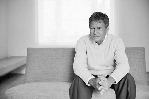
John Pawson, London. Photo: Orla Connolly.
Design Museum, London
22 September–30 January 2011
by RICHARD CARR
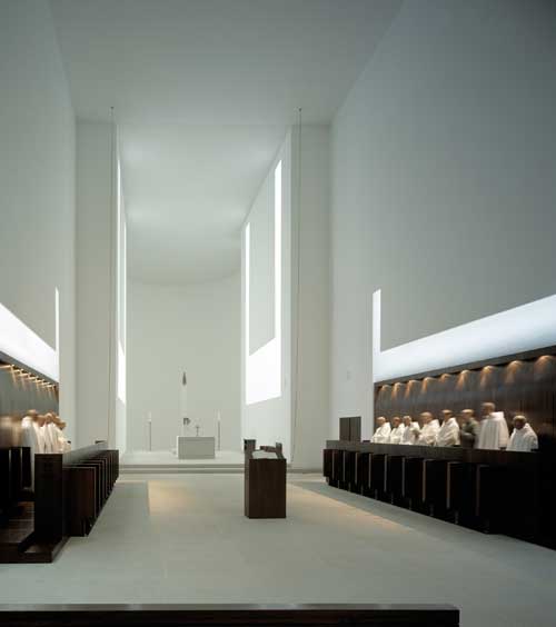
Mies van der Rohe, of course, was fond of expensive and exotic materials such as marble and onyx, and to Pawson the choice of materials is equally as important so that the visitor to the exhibition sits on benches reflecting his use of granite, marble, bronze and oak. But, though the environments created by Mies usually have a warmth and human quality created by his use of colour and choice of furniture and fittings (as in, for instance, the Tugendhat House in Brno), the interiors created by Pawson are spare and austere. In the case of his houses, one wonders what kind of people live in them; where is there any sign of life? (Rietveld’s Schroder-Schrader house in Utrecht is warm and welcoming by comparison.) In the case of the Monastery of Our Lady of Novy Dvur in the Czech Republic, built between 2000–4, the environment seems eminently suitable for monks who spend their lives in meditation and prayer.

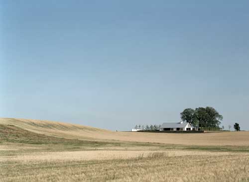
John Pawson. Baron House exterior, Sweden. Photo: Åke E-son Lindman.
The exhibition concentrates on a few buildings, including the Baron House built in Sweden in 2005; the Martys Pavilion built on the edge of a playing field belonging to St Edward’s School, Oxford of 2009; and a North Sea apartment in Belgium, also of 2009. There is also a site-specific, full-sized space created by Pawson at the heart of the exhibition that is used for showing large photographs of his architecture in its natural setting. His sites are always spectacular and include Okinawa, the Alentejo, Beverley Hills, rural California and the Veneto, as well as beautiful locations in Yorkshire and Gloucestershire, England. And there are films, sketches, study models and prototypes, interviews relating to some of his projects, and letters from Bruce Chatwin and Karl Lagerfeld. Among the commercial buildings considered is Calvin Klein’s flagship store in New York.

John Pawson. Monastery of Our Lady of Novy Dvur, Czech Republic. Photo: Hisao Suzuki.
The four buildings mentioned at the beginning of the paragraph above are characterised by Pawson’s rectangular, static and sometimes monumental compositions, his use of a few, carefully chosen materials, the elimination of any superfluous decoration – spaces are sparsely furnished and the walls are usually white or in pale colours – with the occasional reference to local materials, as in the white rendered walls and corrugated pitched roofs of the Baron House. Otherwise, the materials may be exotic – there is a lava stone kitchen island amid a wooden floor and sliding onyx panels in the North Sea apartment – or luxurious, as in the pavilion in Oxford. This has a plinth and overhanging roof in marble and walls of vertical oak panels.

John Pawson. Private House, Germany. Photo: Todd Eberle.
Nevertheless, despite the high quality of the materials and the immaculate craftsmanship involved in shaping them, a paradox often lies at the heart of Pawson’s architecture: why go to such lengths when, as in his own house in London, the result is a dining space that looks as if it could belong to a chain of Japanese noodle restaurants. Indeed, why go to such lengths when the result seems to offer so little comfort? He is, of course, making a stand against all the showy, glitzy interiors popularised in social lifestyle magazines, as well as a stand against the lesser of those contemporary buildings that owe their convoluted shapes to computer programmes. But it does not seem surprising that one of Pawson’s latest projects, the Casa delle Bottere in Veneto, contains a private chapel set apart from the main house for use for family baptisms and private services. An unheated box with a barrel-vaulted ceiling, above which a concealed skylight allows natural light to filter down behind the walls, the chapel is deceptively simple, with Toscana Pietra limestone flooring and an altar and benches made from local oak. It is also a repeat of the approach taken in the design of the Czech monastery.
Pawson himself says, “It’s nice for us to do these spaces. Churches have been a learning curve – Cistercians, for example, are the ultimate minimalists.” It is not surprising that more religious commissions are in the offing.
Besides his architecture, the exhibition also contains Pawson’s designs of tableware, lacquered bowls, salad servers, candlestick holders and a tote bag, all of which no doubt will also be on sale when Pawson completes his design of the Design Museum’s new home in the former Commonwealth Institute in London’s Kensington. As The Observer’s critic, Rowan Moore, has noted (19 September 2010), the director of the Design Museum, Deyan Sudjic, seems to be promoting a small group of designer/architects that includes Javier Mariscal, Jan Kaplicki, David Chipperfield, the late Ettore Sottsass, Paul Smith – and John Pawson. Maybe, in future, Sudjic should concentrate on others who are outside this magic circle.
John Pawson – Plain Space continues at the Design Museum, London until 30 January 2011.