by VERONICA SIMPSON
“How do you create an architecture that has meaning for people whose days are numbered? Does architecture matter?” These words, from architect Alex de Rijke, crackle over the Skype connection in his newly finished Maggie’s Centre, on the perimeter of Oldham’s NHS hospital campus.
These words come from the heart: de Rijke cannot be with the assembled press at the centre’s opening in June 2017, because his partner is in the terminal stage of this brutal disease. His personal experience of supporting someone through diagnosis and treatment has undoubtedly infused this project with additional layers of insight and inspiration.
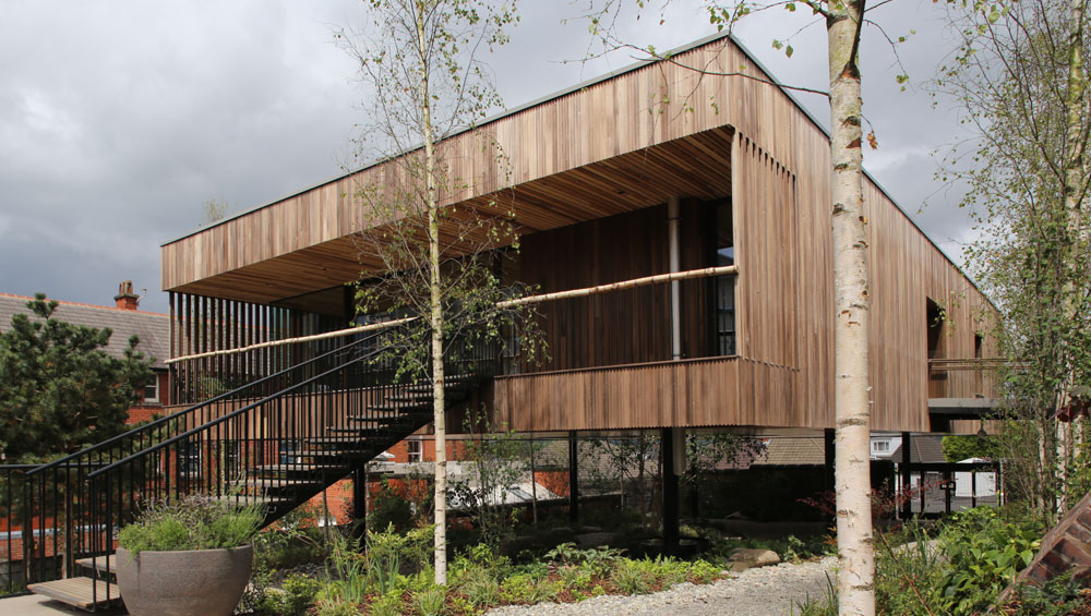
View from the entrance, Maggie’s Centre for cancer care, Oldham. Photograph: Jasmin Sohi.
To answer his question: the way the architecture of the Maggie’s Centres brings meaning to people with cancer is by demonstrating, through design, materials, lighting, form and placement, a level of care and consideration for the individual that is still alien to most UK healthcare buildings - not to mention the NHS system itself, currently crippled by decades of mismanagement and austerity.
For those who aren’t aware of Maggie’s, one of the UK’s most high-profile healthcare charities, the idea was dreamed up by landscape designer Maggie Keswick Jencks and her architect husband Charles Jencks, after she was diagnosed with cancer in the dark days of the 1990s, when the disease was usually regarded as terminal and treatment required spending days, weeks or months in sterile corridors and surgeries, dreary wards or waiting rooms. Sadly, Maggie didn’t survive, but the couple’s vision, to work with leading architects to create uplifting, non-institutional spaces that offer information, counselling and support for people with cancer and their carers, bore spectacular fruit. Thanks to a huge team of seemingly inexhaustible fundraisers, in the space of 21 years, 20 Maggie’s Centres have been built at major NHS hospitals around the UK as well as one in Hong Kong.
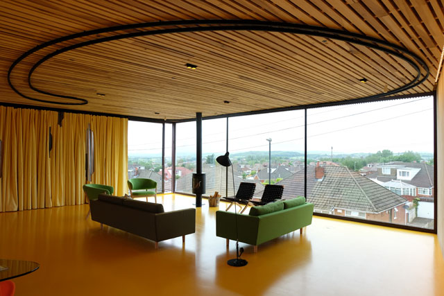
View out over the town and the Penines, Maggie’s Centre for cancer care, Oldham. Photograph: Jasmin Sohi.
The genius of this organisation is as much about how it works with architects as anything else. First, there is total clarity of brief: what is required is a warm, immediate welcome; a kitchen table where people can help themselves to tea and coffee; a choice of spaces that accommodate different levels of privacy, from consulting room to cosy corner; lots of daylight and views on to nature. But their real gift, it seems, is giving interesting and emerging architects carte blanche to deliver an inspired response to that brief, freeing them to deploy their own particular sensibilities to light, form and space, resulting in places of great charm and character; consequently, the Maggie’s Centres commissioned from architects including Frank Gehry, Zaha Hadid, Kisho Kurokawa, Snøhetta and Rem Koolhaas (in each case, their first UK building) are also among their best.
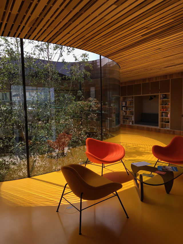
Interior view with poured resin floor of sunshine yellow, Maggie’s Centre for cancer care, Oldham. Photograph: Veronica Simpson.
So what magic has de Rijke Marsh Morgan (dRMM) brought to this commission, within the clunky, postmodern campus of Oldham hospital in Greater Manchester?
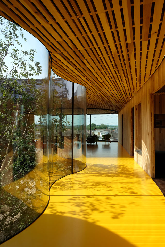
From his end of the Skype connection, de Rijke tells us that cancer is an experience of surprises – most of them nasty. So dRMM has designed this centre as a “box of surprises” – nice ones. Initially, it looks gently incongruous: a wooden matchbox on metal legs, with a garden sprawling beneath it. But there is a gentle wow factor when the large wooden front door opens on to a curving glazed void occupied by a solitary birch tree. Surrounded by rippling glass and a poured resin floor of sunshine yellow, this moment gives “pause” so that first-time visitors can stop and get the measure of the space – another Maggie’s requirement. Immediately to the left of the entrance is a circular kitchen table, with an open kitchen beyond, and a spacious, wooden terrace and chairs (already the building is communicating: come in, make yourself at home, spend some time). To the right is a contemporary lounge, glowing even on a dreary day thanks to the saffron floor and some zingy shades of upholstery; it has a wood-burning stove and full-height windows offering views on to the neighbouring Oldham streets, with the blue-tinged outline of the Pennines beyond.
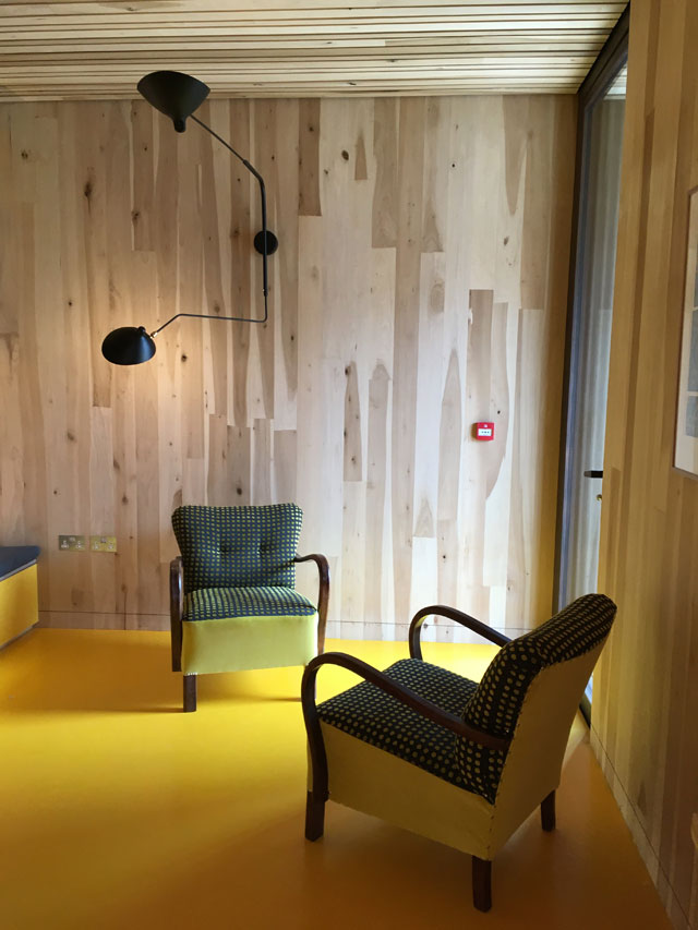
Counselling room, Maggie’s Centre for cancer care, Oldham. Photograph: Veronica Simpson.
This view – and the opportunity it offered to harness the calm that comes with vistas out on to nature and landscapes - was one of the reasons dRMM chose this spot (the other option was in a car park). When the design and client team first surveyed the site, a disused redbrick mortuary sat here, forbidding and moribund, but the view from the first floor was fantastic. So dRMM opted to demolish the mortuary, and build in its place a garden, with the centre on top. For reasons of access, Maggie’s likes its centres to be all on one floor. But better still, placing it at this height puts it on the same level as the oncology centre, next door.
Many Maggie’s Centres set themselves apart from their hospital hosts via plants and landscaping. Here, it is about including the hospital community – all of them are welcome in the garden beneath the building. However, a bridge over the void to the front door provides the necessary sense of threshold from institutional space to healing place.
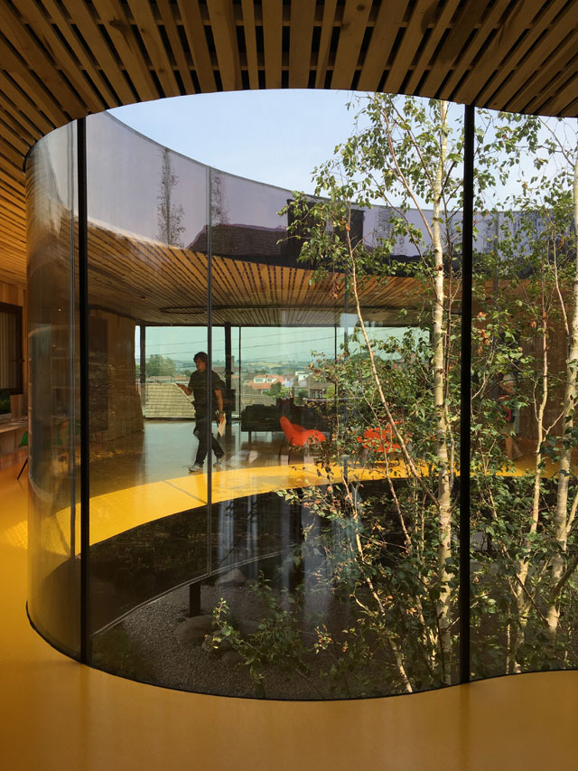
View through the void, Maggie’s Centre for cancer care, Oldham. Photograph: Veronica Simpson.
For de Rijke, the materials are part of the solution. In an accompanying essay, he talks about the causes of cancer – the evidence that points to “carcinogens in food, drink, air and materials in our built environment” (stress is also a factor, which hospital buildings do nothing to alleviate). The practice is passionate about the sculptural, material and sustainable qualities of timber, and deploys it wherever it can. He says: “In wood there is hope, humanity, scale, warmth and nature’s clever plan to absorb carbon.”
This building is almost entirely made from engineered American Tulipwood, thanks to dRMM’s collaboration with the American Hardwood Export Council and Arup to create an optimal version of a cross-laminated hardwood that is robust enough for exteriors but also attractive for indoor use. This is the first public building in the world to use it. Exterior timber panels are heat-treated to make them weatherproof, but here the panels have been contoured, giving a corrugated appearance, which enriches the ageing process: after only a few months in place, the panels are nicely brindled, pale grey to brown, like the fur on a tortoiseshell cat.
Simple timber panels line the interior walls, and are placed in stripes across the ceiling. Although this could have shrieked sauna, the quality of detailing is such that it feels like entering a sophisticated private home, designed to suit an especially sociable client.
Instead of an architecture of form, de Rijke and his team went for “an architecture of experience”. Cancer patients spend “too much time contemplating corridors, vending machines and mortality”, says de Rijke. There are no corridors in this building. Consultation rooms and toilets are arranged in one long block along the east side. The rest is open plan. However, to enable the accommodation of larger groups for discussions, or even yoga sessions, the north-end lounge can be turned into a free-form enclosure, courtesy of a full-height reversible curtain, created by Dutch artist Petra Blaisse. We are “redefining space, light, colour, acoustics and privacy levels”, says de Rijke. “The shadowy foliage of the trees is as deliberate as the comfortable height, fabric and colour of your chair.” Even the door handles have been considered – all bespoke, and made of hand-turned oak, because chemotherapy patients often have a heightened sensitivity to cold and find it painful to touch metal. Wooden door and window frames add that sense of domesticity.
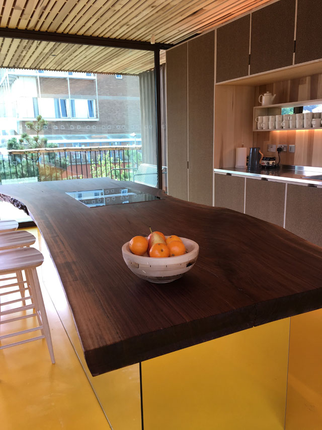
American walnut breakfast bar, Maggie’s Centre for cancer care, Oldham. Photograph: Veronica Simpson.
A further sense of domesticity is communicated via the eclectic chairs and sofas, most of which have been chosen by Laura Lee, Maggie’s chief executive, and director Marcia Blakenham, after years of learning what works and what doesn’t. The pale tulipwood kitchen table was made in 2014 by de Rijke himself. The breakfast bar is a secondhand slice of American walnut, which the dRMM team spotted online.
Nothing is left to chance. The south-facing terrace, looking on to the garden, is given a huge overhang, so people can sit out while avoiding direct sunlight (radiation treatment makes one photosensitive).
As we tour the exterior landscape, additional charming elements keep being revealed. There is a single rainwater pipe that flows from north to south. The outflow is a stainless steel pipe that extends down below the building but ends halfway, poised over a large water bowl - so when it rains, it turns into a musical/percussive water feature. The underneath of the building is clad in birch plywood, painted with yacht varnish to give it a reflective shimmer; it feels as if you are walking beneath a giant musical instrument, adding another charming surprise.
My favourite detail, however, is the tree at the centre of the building: a very particular kind of birch, called Betula szechuanica (Szechuan birch). It was chosen, says project architect Jasmin Sohi, because: “It is always the first tree to recover after a forest fire.”