


National Gallery, London
18 June – 7 September 2014
by NICOLA HOMER
Now, the National Gallery is hosting an exhibition dedicated to the history of making colour in western paintings, from the Middle Ages to the late 19th-century and beyond – a highlight is a fragment from Roger Hiorns’s crystalline Seizure (2008), where he transformed an abandoned London flat into a shimmering blue cave. Science and art collide as this show looks at how artists overcame the technical challenges involved in creating colour, and the breakthroughs they achieved in their quest to capture ethereal and earthly beauty.
Caroline Campbell, curator of Italian Paintings before 1500 and co-curator of Making Colour with Ashok Roy, director of collections at the National Gallery, says: “Colour is something that is all around us. We are very familiar with its brightness and use. We don’t think of it as something that is difficult to obtain. It was very different for most of the painters whose work is represented in the National Gallery’s collection. In the exhibition, we wanted to tell a part of that story and also to showcase the work that the scientific department does in understanding the colours and pigments artists have used. That was the goal of the exhibition, and also to put the gallery’s paintings into a wider colour context.”

Sassoferrato. The Virgin in Prayer, 1640-50. Oil on canvas, 73 x 57.7 cm. The National Gallery, London.
In the Sainsbury Wing, this world-leading research expertise is featured in a show that presents a fresh view of National Gallery paintings alongside special loans, such as lapis lazuli figurines from the British Museum. The inclusion of Isaac Newton’s colour wheel and Johann Wolfgang von Goethe’s reading of the emotional impact of colour sets the scene for this exhibition, which is arranged in colour-themed rooms. The Quest for Blue tells the story of lapis lazuli, a semi-precious blue mineral mined in the mountains of Afghanistan and transported along the ancient trade route of the Silk Road, before arriving in Italy during the Renaissance era. The stone was ground into the pigment “ultramarine”, which literally means “beyond the sea”, and refers to the fact that its source was imported from the east to Europe, across the Mediterranean Sea. Yet as Campbell explains, it was not only the extraction of lapis lazuli from the Afghan mountains, but the very process of mixing this mineral into ultramarine that was fraught with peril. “It’s terribly hard to extract it from the stone to get the colour … It’s not as straightforward as when we go to a shop, buy colours and there they are. You had to grind your colours, you had to make them, this process could go wrong – it was not risk-free. We wanted to show that.”

Thomas Gainsborough. The Painter’s Daughters chasing a Butterfly, c1756. Oil on canvas. The National Gallery, London. Henry Vaughan Bequest, 1900. © The National Gallery, London.
During the Renaissance era, artists would learn how to grind colours and that was phased out. By the 16th century, painters were able to buy materials from “colourmen”, as they were called in English. Yet as Campbell observes, the use of ultramarine endured across the centuries. “The use of lapis lazuli, as ultramarine, this lovely blue, which I have always associated with Renaissance painting, stopping in the 15th century, to discover that painters are still using it 200 years later, that I find very interesting.” This can be seen in the celestial blue of the Madonna in Sassoferrato’s The Virgin in Prayer (1640-50) and the rare panel of lapis lazuli that creates an ethereal sky in Orazio Gentileschi’s David contemplating the Head of Goliath (c1612). By the late 19th century, industrial chemistry enabled post-Impressionist painters to use cobalt blue, or synthetic ultramarine, and heralded the arrival of the deep blue-green pigment viridian. Georges Seurat, known for his Pointillism, where dots of multicoloured paint enable you to blend colours optically, is represented by Study for“Bathers at Asnières” (1883-4) and Paul Cézanne is the painter of a bright landscape mixing viridian with emerald in Hillside in Provence (c1890-92).
. Kneeling Angel holding a Candlestick, about 1500-50. Terracotta, painted with lavender-blue, green, yellow, manganese-purple and white tin-glazes. Lent by the Syndics of The Fitzwilliam Museum, Cambridge
© The Fitzwilliam Museum, Cambridge.")
Della Robbia family (active 15th – 16th centuries). Kneeling Angel holding a Candlestick, about 1500-50. Terracotta, painted with lavender-blue, green, yellow, manganese-purple and white tin-glazes. Lent by the Syndics of The Fitzwilliam Museum, Cambridge
© The Fitzwilliam Museum, Cambridge.
While the show centres on the history of making colour in western paintings, it also shows the importance of material connections that form a lively dialogue with the sister arts of textiles, ceramics and glass. Campbell says: “Often we separate the art forms so much, we think of painting as happening in a vacuum, and, of course, that never has been true. In a material sense, it has not been true either, because painters have responded to innovations in other art forms, such as glazing materials and ceramics, or dye-stuffs for textiles, and they have used it in their colours.” This idea is key to Fashionably Yellow, a room that presents the Della Robbia family’s decorated terracotta Kneeling Angel holding a Candlestick (c1500-50) and Thomas Gainsborough’s great work The Painter’s Daughters chasing a Butterfly (probably c1756) – a meditation on the fragility of beauty.
Campbell says: “In the 16th century in Italy, all this richly glazed terracotta is being developed, mainly by the Della Robbia family in Florence, who are making these wonderfully coloured sculptures out of this very basic material of earth, or a majolica – which is a decorated ceramic that tells stories. They found particular yellow glazes that they used for this, yellow and orange, which are based on lead, tin and a rarer metal called antimony. Painters began to realise that they could use these pigments that were used for the glazes in their painting, and that they were very strong and very durable. If you look at 17th-century painting, so often the bright yellow colours that you suddenly see, the bright orangey-yellow colours, are as a result of this technological change.”

Hilaire Germain Edgar Degas. Combing the Hair ('La Coiffure'), c1896. Oil on canvas, 114.3 x 146.7 cm. The National Gallery, London.
This lively dialogue of innovation is central to Seeing Red, a room that explores the impact of red, traditionally sourced from the bright red pigment vermilion, originally derived from the mineral cinnabar. In the 15th century, pigments called “lakes” appeared in paintings, often made from dye-stuffs used in textiles such as velvets, which might have come from cochineal beetles; or vegetable sources such as madder or indigo. The impact of red is apparent in a gorgeous display of Edgar Degas’s Combing the Hair (La Coiffure) (c1896) and Masaccio’s Saint Jerome and Saint John the Baptist (c1428-29) alongside fragments of crimson velvet brocade on loan from the Victoria and Albert Museum. Here, as elsewhere, by juxtaposing different objects from different times, and complementing the exhibition with a film developed in conjunction with the University of Newcastle’s Institute of Neuroscience, the curators reveal the human stories that lie behind the making of colour.

Paul Cézanne. Hillside in Provence, c1890-2. Oil on canvas, 63.5 x 79.4 cm. The National Gallery, London.
As Campbell says: “One of the highlights has been the ability to put paintings of different periods together, and see that they can talk to each other. Often, we feel that you have to hang objects like by like and I have been very struck by, displaying Masaccio, the wonderful Florentine Renaissance painter’s wing from an altarpiece next to the Degas. There are so many connections between those paintings in terms of their colour, but also there is a link that I realised Degas would have been proud of, because he admired Masaccio and painters of his generation, almost more than anything else. So it’s very nice when you can make that type of connection across the centuries, but it actually works.”
Click on the pictures below to enlarge
![Moses Harris. The Natural System of Colours Wherein is displayed the regular and beautiful Order and Arrangement, Arising from the Three Premitives [sic], Red, Blue and Yellow, The manner in which each colour is formed, and its Composition, 1769/1776. Royal Academy of Arts, London.](/images/articles/m/making-colour-2014/X8384.jpg)

Copyright © 1893–2026 Studio International Foundation.
The title Studio International is the property of the Studio International Foundation and, together with the content, are bound by copyright. All rights reserved.

 The Shape of Things to Come: New Sculpture
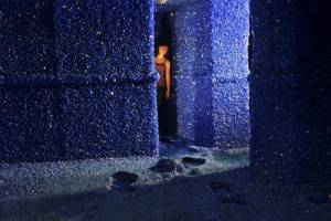 Roger Hiorns: Seizure
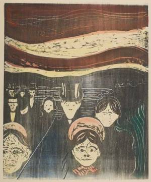 Munch: The Problem With Women
 Toby Ziegler
 British Art Show 7: In the Days of the Comet