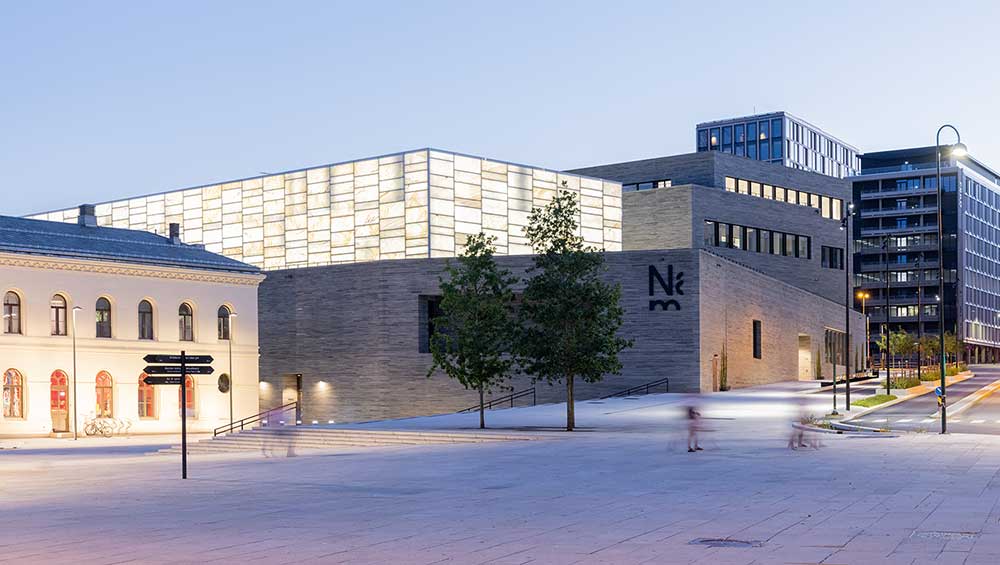
National Museum of Oslo. Photo: Iwan Baan.
by VERONICA SIMPSON
Two landmark cultural buildings have opened on Oslo’s waterfront in the space of eight months, but they are of such different characters that they seem to have been conceived by entirely opposing forces and clients with completely contrasting objectives. The Munch Museum is like a foghorn broadcasting the importance of Norway’s most famous painter to the world. It is a beacon of Oslo’s ambition to attract cultural tourism to its regenerating harbourfront. The other, the National Museum of Art, Architecture and Design (usually referred to simply as the National Museum) is a repository of treasures, lovingly husbanded from the collections of several museums and now displayed for the benefit and enrichment mainly of Norwegians. Though this may not reflect their true origin story or evolution, it is very much how they appear. No prizes for guessing which one I prefer.
The National Museum is eight years overdue and its £500m price tag is many millions over budget. It houses 6,500 objects drawn from the merged collections. It is truly a grand project, not just for the scale and breadth of its diverse artefacts, but also because this single building presentation has afforded its curatorial teams the opportunity to tell a very different story – the story of art, craft and design across categories and ages; to reveal more of why art and design matter, what they have meant and how they have shaped our ideas of beauty and status over more than 2,000 years.
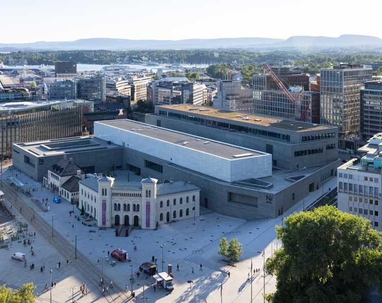
National Museum of Art, Architecture and Design, Oslo by architects Kleihues + Schuwerk. Photo: Iwan Baan.
From the outside, the building, by German architects Kleihues + Schuwerk, does – as per the remarks flying between Scandinavian cultural commentators – look rather like an enormous storage depot. The three-storey building is stacked low and long, its bulk minimised by an exterior envelope of grey, slate tiling. On a gloomy winter’s night, it might vanish altogether, were it not for the luminous glow of its bright green digital screen signage and its top storey, a pavilion clad in “marble glass” (a 4mm thin slice of translucent marble laminated between two sheets of glass).

National Museum, Oslo. Exterior view with Nobel Peace Center (left). Photo: Veronica Simpson.
There is something about this subtlety that I like. It manages to be both discreet and monumental - much more in keeping with the Norwegian character than the overbearing, performative verticality of Juan Herreros’s Munch Museum. Also, unlike that structure, it is sensitive to its context; this low-profile and humble presentation is clearly designed so as not to eclipse the Nobel Peace Centre immediately in front of it, one of several historic civic and government buildings that sit on the periphery of this traditional public waterfront plaza.
The Munch Museum has been criticised by many for appearing to have spent a great deal of money on its exterior – including a strange metal-grille envelope, which may provide solar shading but obscures the views across the water, completely robbing its occupants of that glorious vista - while leaving the inside feeling impoverished and industrial. Luckily, the opposite feels true at the National Museum. The outside may have a certain low-key pragmatism but, inside, the spaces, craftsmanship and materials feel considered, generous and robust.
The National Museum arose out of the amalgamation in 2003 of four museums, which was followed by the idea of combining all of them in one building. In 2008, this site was chosen - a former car park that served the major rail terminus. In 2010, Kleihues + Schuwerk won the architectural competition, and construction began in 2014.
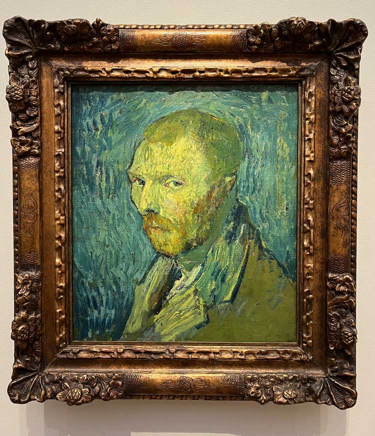
Vincent Van Gogh, Self-Portrait, 1889. Installation view, National Museum, Oslo. Photo: Veronica Simpson.
The 54,600 sq metres of exhibition space is arranged over 86 rooms on three floors, with the ground floor (which, in US-style, is called the first floor) devoted to permanent displays of crafts and design, from ancient times to modern. The first floor (here called the second) is dedicated to fine art, from the Renaissance to the 21st century. It is a huge challenge to merge several collections amassed over centuries, each built with a certain logic. The curatorial team’s decision to create a chronological overall layout, with themes and sub-themes across the spaces, to focus on areas of strength and also reveal context, seems to have paid off.
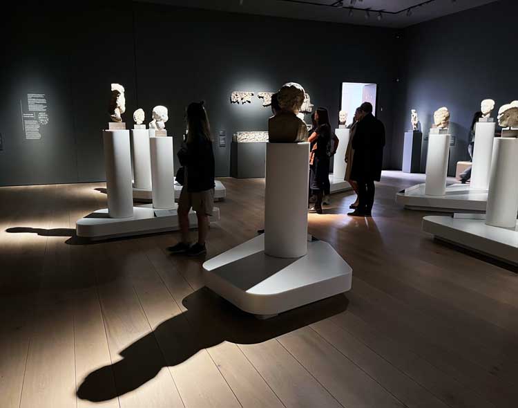
Gallery 1. Busts revealing displays of power. Photo: Veronica Simpson.
The choice of themes and sub-themes is most illuminating. I like the fact that the first room – appropriately flagged up as room No 1; all the rooms are clearly numbered, to help with wayfinding – is the story of power. A dark space, filled with spotlit busts and statues, there are heads of state, kings, queens, gods and goddesses here. But to show its post-colonial credentials, there is a caption that confesses that the removal and destruction of icons and figureheads is a very common way for one culture to oppress another – as Norway has done to the indigenous Sami population (and, some would argue, still does) over the centuries, both as an independent nation and when aligned with Denmark. (Norway was ruled by Denmark during the Dano-Norwegian Union, which ran from the 16th to the 19th century. It became independent briefly in 1814, but was then tied in a union with Sweden until 1905.) A caption placed alongside Sami artefacts featuring the Sami’s own icons and figures of importance tells us: “For centuries, the Sami are subjected to religious persecution, evangelisation and Norwegianisation.”
Another room focuses on religion (and not just Christianity), with a broad array of items including robes, paintings, furniture, tapestries, silver drinking horns and golden candelabras, against a vivid red wall, with an accompanying soundtrack of cerebral, choral church music. In another room, there is a focus on the importance of boats and trading to the evolution of the region’s politics and economy – with goods being traded between Holland (to where most of Norway’s timber is still exported) and Denmark, and regions beyond, with the concurrent expansion of awareness, and interest in, other ideas of beauty. Here, there is also a text acknowledging that, in the nautical quest for global power and influence, Norway also played its part in the slave trade.
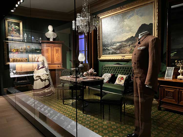
Ground floor displays of interior design and affluent tastes. Photo: Veronica Simpson.
Another early room examines the impact of the Gutenberg Press and how that burgeoning (albeit tightly controlled) industry of book publishing and printing leads to the wider dissemination of knowledge and appreciation of the decorative arts. China vases start appearing, as do velvet robes, elaborate furniture and finery. The Versailles effect is noted, with the influence of King Louis XIV on clothing, furniture and architecture, as well as the wealth and glamour of the Catholic church bringing an Italian flavour to what the aspirational few commissioned and crafted in the name of wealth and status. I like the way the topics are chosen to reflect global currents of taste and politics but also delve into areas where the collection is strong. For example, there is a room on the history of ceramic art through the ages, and another looking at the influence of trading in, and consumption of, tea and coffee, the emergence and popularity of coffee houses being inextricably linked to the concurrent explosion of interest in conversation, ideas and culture in the wider sense.
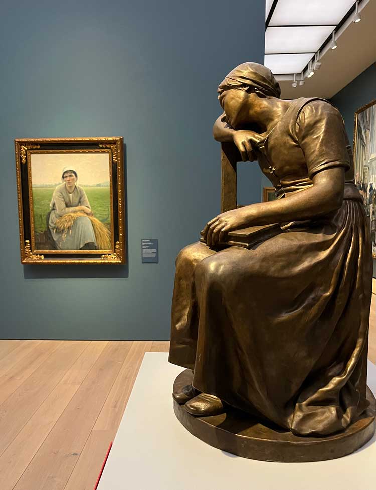
Peasant life celebrated. Painting by Asta Norregaard, Peasant Woman from Normandy, 1889. Sculpture by Mathias Skeibrok, Weary, 1882. Photo: Veronica Simpson.
A series of interior installations follows, presenting elegant drawing rooms and salons demonstrating the growth of the merchant classes, who wielded their own influence through their displays of taste and symbols of power. This includes a room acknowledging the democratisation of these symbols, when, many years after Norway’s first glassworks was established in 1741, it was allowed to make glass without a royal permit.
As we progress towards the 20th century, we see the growing importance of the home as a place for expressions of comfort and style, in a display titled Home Sweet Home. This is followed, logically, by a room examining the impacts of the industrial revolution and the emergence of affordable, machine-made creature comforts, followed a few years later by the postwar developments of “Iconisation and Consumption”.
It is a dizzying whirl through more than two millennia of craft, art and design, but coherently, delightfully and succinctly done. There is a nice flow of ideas and textures, pacing and context – zooming in and out again, as the collections allow. I particularly enjoyed the room celebrating Scandinavian modernism – one of this region’s greatest and most lasting contributions to visual culture being 20th-century architecture and lifestyles. It draws widely from Denmark, Finland and Sweden, as well as showcasing iconic Norwegian designs. A final flourish on this floor is created by the various fashion collections, including fancy dresses worn by Scandi royalty, and a procession of contemporary fashion designers’ creations, rather boldly and inclusively presented on black mannequins.
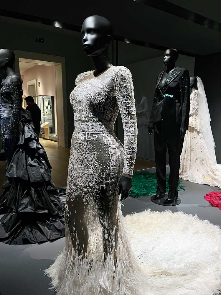
Ground floor fashion displays on black mannequins. Photo: Veronica Simpson.
Ascend via any of the wide staircases or spacious lifts and you arrive at the first floor for the procession through, mostly, the last 600 years of fine art. There are works by Titian, Orazio and Artemisia Gentileschi, and Van Dyck, but the collection is mainly focused on Norwegian artists, with some stunning 19th-century landscapes by, among others, Johan Christian Dahl, plus depictions of Norse mythological tales, fuelling the Norwegians’ sense of national identity. The celebration of peasants and peasant life and landscapes dovetails with the French impressionists’ similar explorations, with many Norwegian painters – including Edvard Munch – spending time in Paris to absorb its impacts and ideas at firsthand. It is good to see a decent display of work by Munch’s contemporary, Harriet Backer, who set up a painting school in Oslo and pioneered the idea that women, too, can make a living from art. There are some glorious 19th-century sculptures, including those by Auguste Rodin and Edgar Degas, along with Norway’s most famous sculptor of the time, Gustav Vigeland. This era – mid-19th to early 20th century – seems to have the greatest concentration of work, mainly French and Norwegian. Claude Monet and Vincent van Gogh appear, the latter in a wonderful self-portrait where he looks positively green (though not from overindulgence; it was painted during one of his stays at a Provence sanatorium).
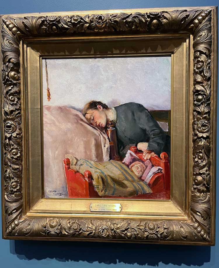
Christian Krohg, Mother and child, 1883. Installation view, National Museum, Oslo. Photo: Veronica Simpson.
There are Munchs, too, of course. There are some really choice examples, including a poignant painting of a mother and daughter in what looks like a sick-room setting (Munch’s sister famously died of TB when he was 14), called Spring (1889). But I like that there is also a good selection from Munch’s mentor and teacher, Christian Krohg, whose interest in representing ordinary people and everyday scenes, plus his mastery of light, must have had a major influence. His Mother and Child (1883) is a particular treasure, the mother slumped in exhausted slumber against a nearby bed while her infant sleeps. Among the slightly later and best landscape painters, Harald Sohlberg and Nikolai Astrup (successfully showcased with solo exhibitions at London’s Dulwich Picture Gallery in the past decade) are also here.
Though the timber flooring and tastefully dark paint hues on the walls feel quite traditional, most of these rooms enjoy what feels like daylight from light panels across the ceiling, which keeps the rooms light and airy and prevents the kind of claustrophobia that usually arises from the classic enfilade procession of galleries, which is followed here. Every now and again, such as in the sculpture section, there are cutaway views through to a roof terrace or the street. This slicing into these huge exterior walls to create vistas is done most impressively, however, with a central “lounge” space where you can sprawl, mid-visit/mid-building across an assortment of comfy sofas, tables and chairs, and enjoy tea, coffee, snacks or a glass of wine while looking on to the back of the historic harbourfront buildings. Splayed across the walls is a vibrant Sol LeWitt graphic.
A window is also allowed into the room dedicated to contemporary ceramics, to the rear of the building. Various expositions of modern and conceptual art are displayed nearby, as well as one area dedicated to Norway’s leading 20th-century architect Sverre Fehn (architecture, otherwise, seems very thinly showcased, given that the Museum of Architecture is one of the collections in the wider pool). But my favourite room on this first floor is a large gallery for temporary exhibitions, currently dedicated to the collection of the Fredriksen family.
-installation-shot-for-temporary-exhibition-called-The-Pillars.jpg)
Sheila Hicks pom poms (Escalade Beyond Chromatic Lands 2016/17), installation view for temporary exhibition titled The Pillars. Photo: Veronica Simpson.
Here, in an exhibition titled The Pillars, we have glorious representations from some of the leading female artists of the last 100 years. There are excellent works from Louise Bourgeois, Eva Hesse and Helen Frankenthaler, a classic Georgia O’Keeffe (Calla Lilies on Red, 1928), and an Agnes Martin of skin tone and white stripes that tones beautifully with the pale pink background wall colour. There is a dynamic composition in yellow and grey from Joan Mitchell (Untitled, 1951) and a fabulous splurge of Sheila Hicks’s pom poms all across the rear wall, and another fabulous splurge – of paint this time – from Cecily Brown, on the opposite wall (To Skies That Were Brighter, 2018). In the centre of the room is a stunning Simone Leigh glazed stoneware figure in a raffia skirt, Cupboard XII (2020).
Interwoven among these fine art rooms are spaces for teaching and interaction, including a children’s workshop: here, during my visit, two youngsters were hard at work, scribbling away on their tilting desks, a blackboard of chalk drawings behind them looking every bit as complex and interesting as some of the abstract works nearby.
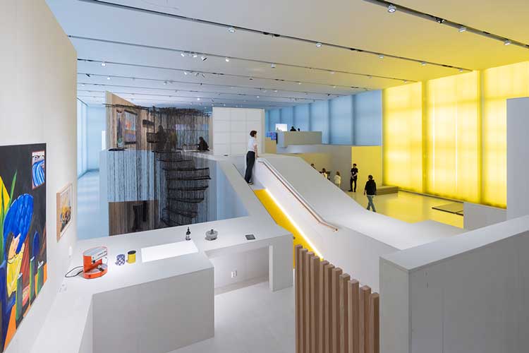
National Museum, Oslo. I Call it Art. Photo: Iwan Baan.
The top floor, which features this light wall on to the harbour, is for temporary exhibitions. Currently, it is filled with a show called I Call it Art, displaying 147 artists or collectives working across Norway. They were selected through studio visits and an open call. The idea was that none of the artists would already have work within the collection. Two-thirds of the work came from the open call.
This top floor show is a real highlight, with work that is eclectic, stimulating, diverse. I imagine it will do more for contemporary Norwegian art – and Norwegian artists – than any of the usual showcases by which nations establish their arty credentials, such as the typical biennials, and a presence at the big art fairs, both of which are usually of interest only to other museums, galleries, collectors and possibly artists.
Given that I had one evening in which to experience it – on the Saturday of the public opening, to which all Norwegians were invited free of charge – I am amazed at how much of the massive collection I managed to see, and how enjoyable it was, despite the time constraints. The scenography going from dark to light as you process through and up the building makes it feel less like a bunker. I spent three and a half hours in there and could easily have spent longer – or gone back for more the following day. I particularly like how this building really gets out of the way of the experience – you lose yourself in the work, the stories, lose your sense of where you are without worrying that you are genuinely lost, because the flow of work and rooms seems to propel you through them in a logical fashion.
At the opening, the museum’s director, Karin Hindsbo, said: “With this new building, Norway now has a modern museum with classic qualities, a new home for Norway’s largest collection of art, architecture and design. It enables us to show more of the collection than ever before, with spaces for exhibitions of entirely new formats or on an international scale.”
The building may not sparkle or gyre like some of the more fantastical structures conjured in the name of cultural regeneration, but I think the quality of that interior experience, as well as its exhibits and accessible curatorial approach, will win it a warm place in visitors’ affections. Remember, the Norwegian winter nights are long and dark. This would be a great place to spend a rainy Sunday.