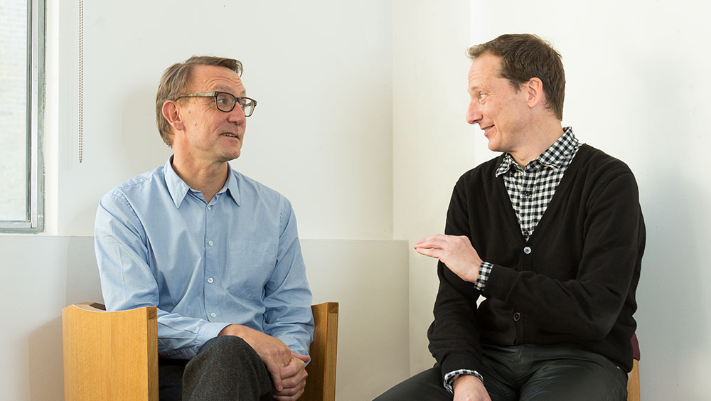
Peter St John (left) and Adam Caruso of Caruso St John Architects.
by VERONICA SIMPSON
Peter St John (b1959) and Adam Caruso (b1962) established their practice in 1990. Within a decade, from the opening of Gagosian’s first London gallery, at Heddon Street in 1999, and the New Art Gallery Walsall in 2000, Caruso St John Architects had become one of a handful of UK architectural practices that consistently won the plum jobs from leading cultural organisations in the UK as well as further afield – they now have offices in London and Zurich. While loudly celebrated for their newbuild structures – including Nottingham Contemporary and four Gagosian galleries in London, plus Gagosian outposts in Rome, Paris and Hong Kong - their skilful interventions in existing buildings have also brought them accolades.
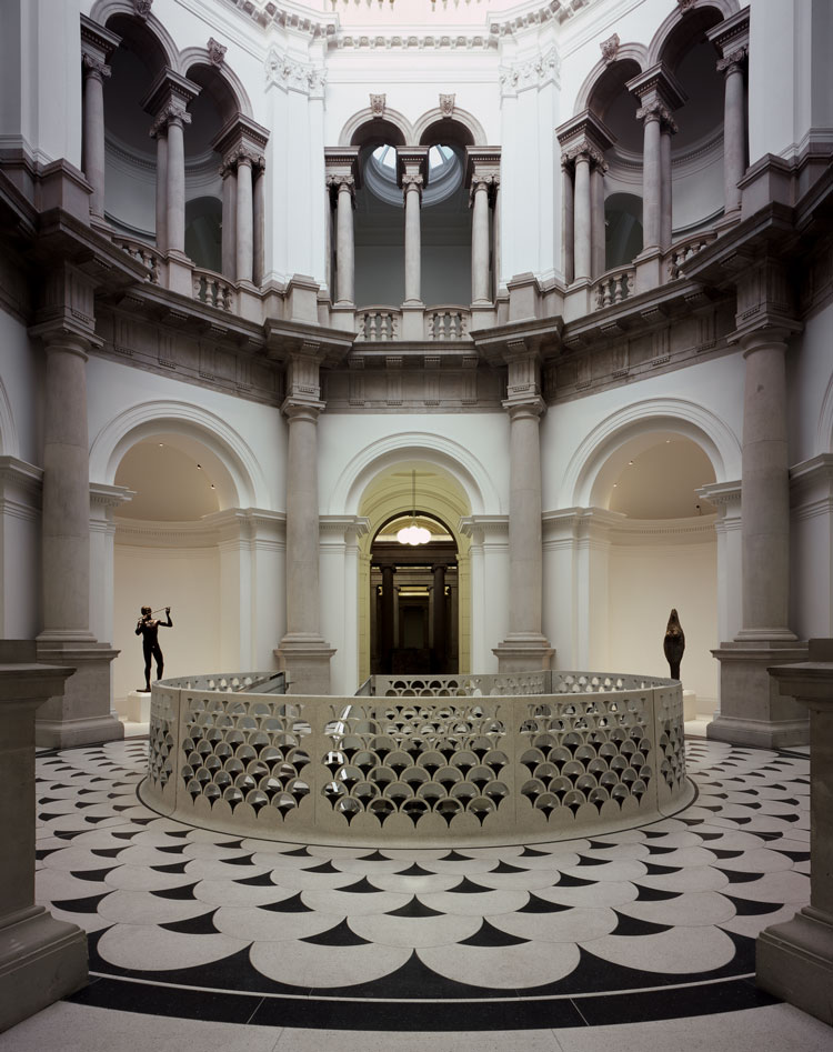
Tate Britain, interior, 2013. Image courtesy Caruso St John Architects.
The refurbishment and interior rationalisation of Tate Britain in 2013, as well as the renovation of Liverpool’s Philharmonic Hall (2015) have been transformational for these institutions and their audiences. But it was their skilful blend of conservation and contemporary additions for Damien Hirst’s Newport Street Gallery - which grouped three restored Victorian industrial buildings with two new structures under a distinctive sawtooth roof – that secured the practice the prestigious Stirling Prize in 2016.
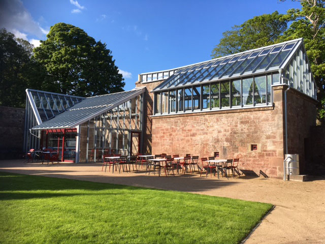
Hospitalfield cafe on the left and fernery on the right. Photo: Veronica Simpson.
Currently, it is a small project on the east coast of Scotland that is garnering attention – a scheme remarkable not just for the thoughtful, subtle interventions the practice is making around the original Arts and Crafts House of Hospitalfield in Arbroath, but also the careful husbandry of resources evident in the three-part refurbishment and expansion. From the modest budget and the reuse of existing buildings and materials to the low-key structures they are introducing, it is light years away in sensibility, scale and aesthetics from the statement building 15 miles south along the coast, Kengo Kuma’s V&A Dundee.
This project speaks to our straitened, carbon-footprint-conscious times. It also reunites the practice with one of its early clients: in 2003, Lucy Byatt, now the director at Hospitalfield, chose Caruso St John for the refurbishment and expansion of Spike Island in Bristol. This involved converting a dockside tea warehouse into a simple, robust, flexible, high-ceilinged gallery with offices and a community cafe, which has since served the many artists in the adjacent studios and has helped to establish the gallery’s reputation and vision for independent, artist-centric, curatorial excellence.
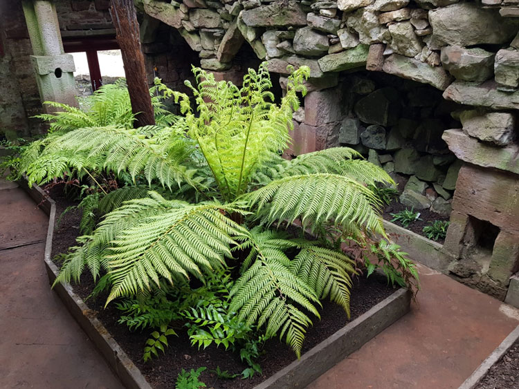
Hospitalfield fernery and grotto. Photo: Kate Robinson. Image courtesy Caruso St John Architects.
Caruso St John’s Hospitalfield masterplan, which evolved through close collaboration with Byatt and her team, places almost greater emphasis on the house’s garden than on the architecture. Still flanked by medieval walls, the garden has become a beloved resource for the local community and volunteer maintenance teams. A major relandscaping scheme by the Olympic Park landscape architect Nigel Dunnett leaves space for locals and artists to enjoy some improvisation and for the garden to evolve along with the site, while the cafe and fernery provide all-weather, enchanting lookouts for residents and garden visitors. The completion of this first phase is the key step that will establish Hospitalfield as a major destination in this region.
Studio International talks to Peter St John about the evolution of this project and how it chimes with our times and their enduring ethos.
Veronica Simpson: How and when did you find out about, and become involved in, the Hospitalfield project?
Peter St John: It’s a very long journey because we’ve been involved since 2013, when we first went up there. There was a competitive interview in which we were selected. And there was a connection to Lucy Byatt, the director, because she was previously director at Spike Island in Bristol, where we did a project with her as client. So, we have been working on it for a very long time. Our first steps were to make a masterplan with the clients, about how to develop the stages of the project they had in mind. It’s taken this long for us to finish the first phase, which is the garden and cafe and the fernery. We’re working on the next two phases, so it’s finally gathering momentum.
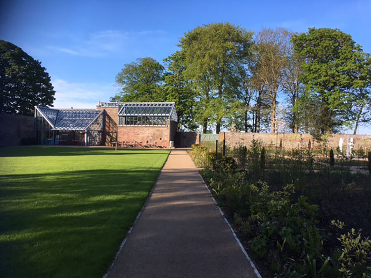
Hospitalfield, cafe and fernery blend in with the walled garden. Photo: Veronica Simpson.
The next phase will be a new accommodation building that will provide 10 bedrooms for overnight stays, in the west side garden, and a new studio building, which will provide spaces suitable for new media, as well as the renovation of existing studios at the rear of the site. These were built in 1901, after the death of Patrick Allan-Fraser (the artist who, together with his wife, Elizabeth Fraser, conceived of this art-filled home, gallery and art educational resource, built on the ruins of an ancient hospital and monastery). We are improving facilities for artists, but also providing Hospitalfield with good accommodation so they can use the site more flexibly, for conferences and events. It’s about creating a revenue stream for the house to make it more sustainable.
We still haven’t done the renovation of the house itself, which does require some maintenance and work to the roofs. But it’s in pretty good condition. It wasn’t ruinous. But I would say the organisation hadn’t moved on for a long time and it needed someone with Lucy’s dynamism to revive it and have a vision for how it could grow and become relevant again for the Scottish art scene.
VS: Which aspects particularly interested you about the context of this house?
PSJ: Architecturally, it’s a very interesting story: the building has a long history. There’s medieval construction there from the 13th century, with some lower walls, when it was a hospital and chapel for pilgrims visiting Arbroath Abbey. Then there is construction from the 17th century. Then, from the 1850s, it was taken in hand by Patrick Allan-Fraser, who massively expanded it. That’s why it has this amazing organic, additive quality that all Arts and Crafts buildings aspire to, but this building has: you can see how it has developed. And that’s really special. When I talk about the new projects, what we’re doing is making another stage in this development. We’re building in the gardens, but it is about continuing that organic expansion of the building, which, because it’s so additive rather than perfect, you can do. It can take it. In a way, you are making it more interesting, not damaging it. You’re bringing it to life.
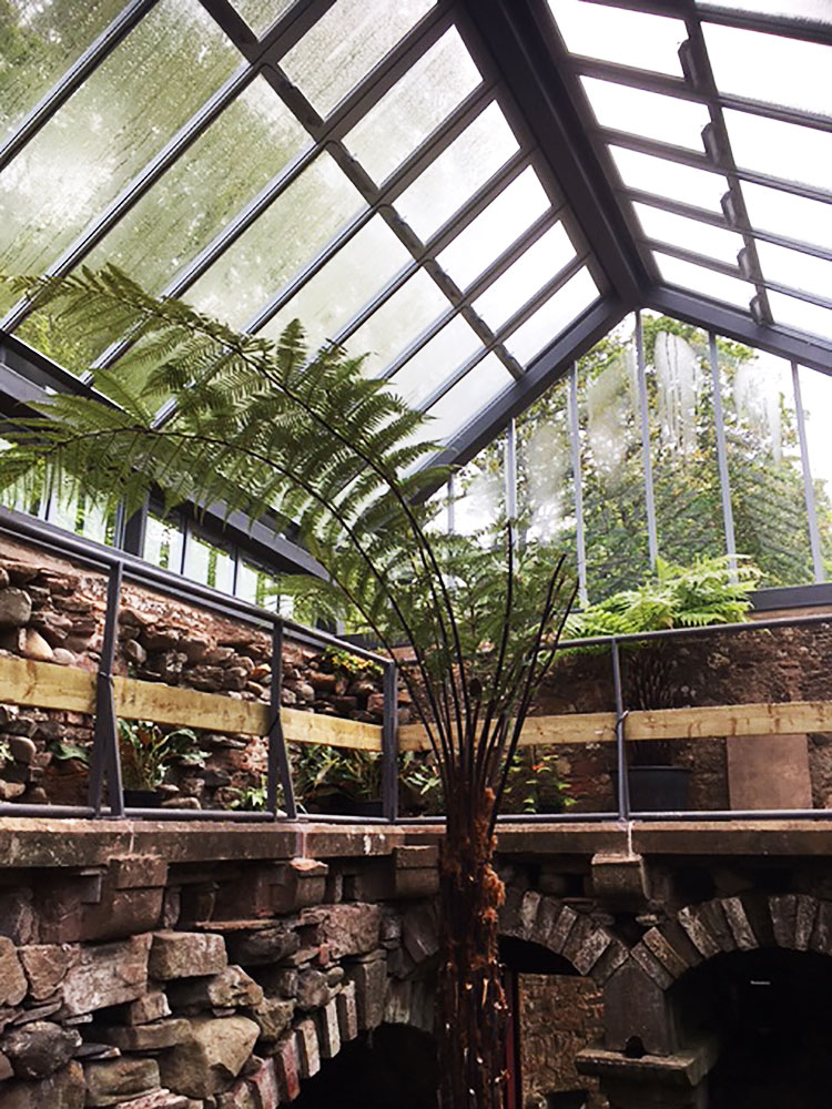
Hospitalfield, fernery from ground floor, with the first plants yet to mature. Photo: Veronica Simpson.
VS: The site has a very strong character: there is that remarkable red sandstone and brick that gives the house such presence – which is typical of that part of Scotland, but which can also be somewhat imposing, especially when the skies are grey, as they often are.
PSJ: That’s why the gardens are so fantastic in the spring. It’s so wet and moist, and when you have that combination with the walled garden, and you get these microclimates that are really special. It’s also to do with the stone: the stone and the ferns go together.
VS: As extensions go, they are very light touch – just a cafe and fernery added to the main house. When was the decision taken to insert these two elements?
PSJ: The fernery was not our decision. We are reinstating the Victorian fernery that was once there, and the whole project is in the north-west corner, facing south, overlooking the garden, in an area where there also used to be greenhouses. When we went there, the fernery was a ruin. But it was a cleaned-up ruin: the glass roof had been completely removed and all that remained were the stone walls - because ferneries traditionally have stone walls and glass roofs. It was an open building and a few ferns were still growing in the cracks between the stones. It’s a two-storey building and has a rather beautiful series of grotto cavities. The idea was to put back the glass roof, but there was no evidence of what was there before - no pictures, no drawings, nothing. It was possible to imagine the shape of the roof, which we have, and in a way put it back quite faithfully, but without trying to recreate the original construction. It would have been made with timber, which you wouldn’t want to build a greenhouse with today. The design is like a sort of sketch of the shape of the fernery, outlining the proportions of the building, but building it in a totally different way on top of the stonework. The steelwork we’re putting back in doesn’t feel Victorian, it feels contemporary. And then that language extends into the cafe, which is also a “greenhouse”, in that it’s made of glass.
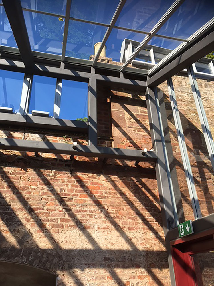
Hospitalfield, cafe roof structure rests lightly on brickwork. Photo: Veronica Simpson.
VS: With the whole Hospitalfield project, it seems that everything is oriented around the garden – including these buildings.
PSJ: It goes together with the restoration of the garden – not a restoration, more a rebuilding of the garden. They have been making this garden together with the local community, and it looks amazing. The whole project is about this first new space, as it were, for welcoming the public: you go through the entrance gate into the walled garden and there will be the new garden, and beyond that the cafe and the fernery, providing for the first time a public destination and focus for visitors. At the moment, the house itself is very delicate and rather precious, so the public can visit, but only by appointment. It’s not a place that’s designed to receive visitors. The garden will make it into that. We have designed a proper car park area, so we can accommodate everyone’s cars. This is the first step to making it a real destination.
VS: It seems that what you have had to focus on with the long-term masterplan – more than architecture or landscape, as such – is the ecology of the site, especially the cultural and social ecology, and how that enables or drives the programme.
PSJ: It is an internationally known arts organisation, but it’s also an amazing resource within its region and in the town, and it runs all sorts of interesting workshops and events for local people, and it involves the community in its work.
The project is primarily about bringing more programme into the gardens and courtyards around the building. We start with the walled gardens and the cafe and fernery, then you go behind the house, where the existing artist studios and the new studios are grouped around a green courtyard. Then the new accommodation building itself is a little like a cloister, making a garden within another field. We’re working with the existing stone walls that previously separated the fields and courts … and building on these walls.
VS: How are your extensions/additions responding to this unusual layering of medieval, monastic and Arts and Crafts architecture?
PSJ: It starts with the idea of it being a hospital, but also a place of working and shelter and refuge. To me, the idea of the walled gardens around the house is very important and bringing those to life is an important idea. It does have an amazing quality … this landscape around it, with mature trees, the gardens around the house and then, beyond that, open fields and the sea. There is this intimacy and yet a sense of privacy that really makes it something special. It is a special environment in which to work and meet people.
VS: Did any other projects inspire you in responding to the brief?
PSJ: It was about responding to the place, but it’s also the organisation and the spirit of what they want to do there. It is unique, I would say. I remember when we went to the interview, we talked about Black Mountain College (a college in North Carolina founded by John Andrew Rice and others). I’ve read about it, and it’s an inspiring story of a school in the wilds, which was so well known for bringing together interesting people, who went there to take part in amazing events. The beauty of the place was part of the reception and hosting of those events, and those two things go together. It had an amazing lineage because of the people attracted by the idea of going there and being there together. The fact that it’s in rather a remote location is a problem, but at the same time a real attraction.
It is also a bit like Spike Island Studios, which was very unusual in having exhibition space as well as studio space. There is a longer-term idea to have a collections building also, adjacent to the house, which would be the first point of reception on visiting the site, and would have an open archive of the collection of Hospitalfield. There would be works of art from former students and documentation left behind by Patrick Allan-Fraser. They want to have an exhibition space, too.
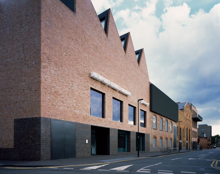
Newport Street Gallery, London, 2015. Image courtesy Caruso St John Architects.
VS: Regarding inspirations, I know you and Adam are fans of the Italian architect Carlo Scarpa, who did extraordinary work in revitalising or reinventing ancient buildings.
PSJ: I love Carlo Scarpa, but the level of construction and quality of a Scarpa building is not something we would try to do on this site because it’s not appropriate or possible. We’ve had to work within certain realities, which are about making the largest possible space using the funding we had. And I think it’s something that will grow over time. Because the ferns will take time to grow into the building. The café, which is also a greenhouse, will have some greenery in it and the garden itself will grow. We have made something that will be very special over time in that situation. And it’s very exciting to do a project up in Scotland, a place I really love. It’s taken a lot of work, at that distance, to keep the kind of control over things that we like to have.
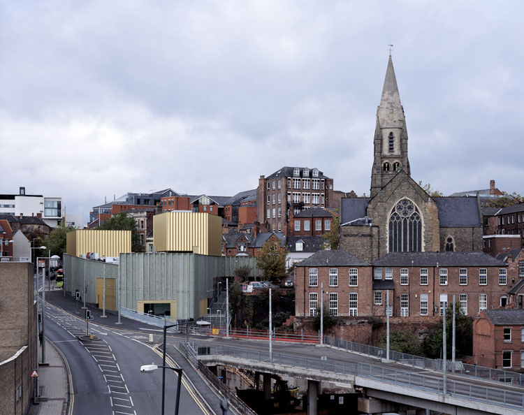
Nottingham Contemporary, 2010. Image courtesy Caruso St John Architects.
VS: There are always elements in your projects that are very much about sculpture and craftsmanship, aspects that demand particular skills in construction – such as the spiral staircases in Newport Street and Tate Britain, or the lace-imprinted concrete on Nottingham Contemporary. Certainly, there are always details that the architectural press goes nuts about. Are there aspects of your work here that might attract that kind of attention?
PSJ: (laughs) Well, I hope people will go nuts about it. This first stage is a beautiful, small project, which we have spent a huge amount of time on, with a modest budget. The idea of making these glass buildings in the context of these walled gardens is very special because they do shine and have a crystalline quality, but in the longer term, because we have more buildings in mind, which we’re working on, it is about trying to work sustainably in an interesting way. The new buildings are all going to be built out of timber. We are going as far as possible to not use any materials that have a high embodied energy. It’s very much about building with zero carbon construction and it’s also about reusing things on the site. We’re hoping to reuse the stone and brick that’s lying around. We like to use timber from the site. That’s what we’ve been developing as a language for the whole project.
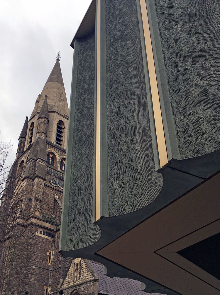
Nottingham Contemporary, lace imprinted concrete, 2010. Photo: Veronica Simpson.
VS: Husbandry of resources seems to me to be the epitome of good building, as well as being a good thing environmentally. It is tempting to feel such projects say something important about how we proceed in the revitalisation of existing cultural assets at this time. Would you agree, or do you think this solution was very much site and context specific?
PSJ: Well, I do think that we are architects who have a very strong association with building new museums and galleries, particularly for regional galleries and ones in London, but, to be honest, that does feel like a different time now. Things have changed and for perfectly good reasons many of these organisations aren’t willing to embark on new capital projects and funding is more focused on helping organisations operate rather than building new buildings. Now, it’s about being sustainable and stable. This project is in a way an opening up of Hospitalfield, but it’s also about repairing and restoring the life that used to be at the site when it was a living art school. It’s going to be a different version and a different combination for artists and the public, but it is about restoration of an energy. It’s not a massive expansion. We do feel it’s a careful husbandry of resources.
There is a lot of engagement with interesting ways of working in the local community. Having said that, Hospitalfield is an amazing place to go and stay. And it has a residency programme, which means people come from all over to stay there. That’s part of its role: to bring interesting things in from outside.
VS: Which other current or forthcoming projects are you excited by?
PSJ: We are working on a very interesting project in Belgium, which is the reusing of a rather magnificent orange-glass modernist building from the 70s, a company HQ; we’re working with the client on how to reinvent it. It has been empty for about five years. We are discussing how to bring the building back to life with a totally different programme of co-working, a health club, a hotel, mixed uses. To me that challenge of how to reuse the existing building stock is a really interesting one. We’re also on a shortlist for a competition at the National Gallery to do some work in the Sainsbury Wing.
It’s a beautiful building and I really love it, but the difficulty the National Gallery has is that the main entrance isn’t accessible because you have to go up steps to go into the portico. The Sainsbury Wing, over the last 20 years, has become the de facto main entrance for most people. It wasn’t designed for that. It was always designed as a separate wing. We need to look at how to develop the inside in order to cope with the reality of this large number of visitors.
VS: Do you feel we have seen the end of statement buildings?
PSJ: I think we have seen the end of substantial investment in new art buildings. And the more interesting area of work now is working on old buildings and renovating existing ones, even modernist buildings, reusing things - which we have always done. We have always been equally interested in working on existing and old buildings, as well as creating new ones.