


Tate Modern, London
21 February–27 May 2013
by CELIA WHITE
On visiting Tate’s current Lichtenstein retrospective, then, it is natural to anticipate more of the same – to expect to be moved, blown away, even, but not to be surprised. Many critics, curators and scholars of Lichtenstein’s work have long given up unearthing meaning in his paintings and have instead emphasised their apparent vacuity, their big, bold obviousness. Yet what this exhibition offers is a survey (the first of the artist’s work staged since 1993, four years before his death) that renounces this easily packaged, entertaining Lichtenstein in favour of Lichtenstein the experimental, self-critical, exploratory artist, avidly producing paintings to make sense of his perception of the world. Lichtenstein as we know him is, from the start of the exhibition, obliterated, then slowly reconstructed again as we progress through his broad-ranging oeuvre.
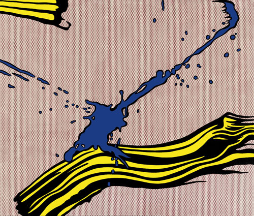
The show begins this deconstruction with a brave opening gambit: a focus on Lichtenstein’s series of depictions of brushstrokes, such as Little Big Painting of 1965, consisting of paintings of sections of paintings selected and enlarged so that individual, apparently freely applied brushstrokes take on a monumental quality. Yet this monumentality is derived from the relative invisibility of Lichtenstein’s own painterly hand – the controlled superficiality of the paint that makes much of his work seem naturally occurring rather than the result of human choice and intervention. The depicted brushstrokes appear as solid objects in startling relief, jutting out from the canvas as violently as Lichtenstein’s refuse to. The subtle humour which underlies these brushstroke paintings in fact sets a serious tone for the exhibition by pointing to an essential concern of Lichtenstein’s: that paintings are not only artworks, but they also depict or assert their status as artworks. They are physical objects that layer up the notion of representation until artwork and object, or the world, become indistinguishable.
Interestingly, a second, associated gambit concerning Lichtenstein’s brushstrokes falls later in the exhibition, but would perhaps have been more pertinently placed at the beginning. Lichtenstein’s early (and self-confessedly poor) attempts at painting in an Abstract Expressionist style are compared, in the penultimate room of the exhibition, with his 1990s revisiting of that style. The early works are directionless and largely hideous; the later paintings, showing Lichtenstein’s signature benday dots and bold coloured shapes painted over with a free hand and loaded brush, are devoid of such uncertainty. In Brushstroke with Still Life IV (1996) Lichtenstein highlights, with the confidence of a successful if formerly deviant artist, the cultural irrelevance of Abstract Expressionist painting by directly comparing it with (and even allowing it partially to erase) his tried and tested aesthetic.
Though on the surface these two rooms appear to emphasise Lichtenstein’s stylistic and technical preoccupations at the beginning and end of his career, their position as conceptual brackets allows the subtlety of their argument to permeate the rooms between them. Lichtenstein’s work from the 1960s to the 1990s, displayed relatively conventionally by genre in the remainder of Tate’s exhibition, can no longer be perceived merely as the sensational if heady mix of high- and low brow that many of us have come to enjoy when we consider that, as implied in the first “Brushstrokes” room, and as Lichtenstein himself stated in 1964, “the painting itself can be thought of as an object”.
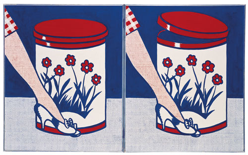
This search for the object-artwork crossover is perhaps the source of the visual power of Lichtenstein’s work, and yet he achieved it by reducing depicted objects to their solid essentials. Inspired by the sparse yet to-the-point aesthetic of advertising, the paintings Large Jewels and The Ring, both of 1963, are so overblown, so stylised that they become amorphous, even abstract, while still holding their physical presence. Similarly, Golf Ball (1962) hangs in the air with such strong three-dimensionality that it looks almost sinister. On the wall opposite, a portable radio is painted, not nearly so convincingly, onto a canvas, but fills it so that the canvas itself becomes a half-painted, half-sculpted radio, replete with a real leather carrying strap pinned to its edges.
Lichtenstein’s work orchestrates a constant confrontation between the real and the represented, between art and object. Arguably, he used his reductive and systematic method to render objects solidly in this way as a means of reflecting on what art can be in a world shaken by the explosion of new visual media in the 1960s, and, as a result, a world looking constantly to reproduce itself. But this reproduction-by-reduction, or representation-by-reduction, does not confine itself to objects; despite the cold hard surfaces of many of Lichtenstein’s paintings, they acknowledge that emotions are at stake in the frenetic whirl of TV, cartoons and bill boards. M-Maybe (1965), for instance, distils the fear and consternation of a woman’s concern into a troubled brow, a sideways look, a sweep of hair and a desperate thought: “M-maybe he became ill and couldn’t leave the studio?”
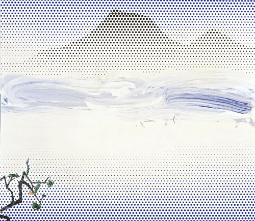
The three-dimensional does not escape such scrutiny, either: Lichtenstein’s sculptures, of which he made far fewer than his paintings, carry a feeling of unease in the way that they bring the superficial reality that the artist has constructed out into our environment. These surfaces at which we stare, offering us a hand brandishing a cleaning sponge, a perfectly foreshortened tyre hovering in white space, a calm seascape constructed from layers of coloured Plexiglas – they keep their distance, always treading the boundary between the actual and the represented, always highlighting that boundary but never transgressing it. But in Lichtenstein’s sculpture Head with Blue Shadow (1965), the bust of a woman is treated in the same way as a painted head would be: shadow is painted onto the neck, the side of the face and the hair as if the sculpture were not a three-dimensional object but a painting of an object. Galatea (1990) shows the female form stripped to her essentials – breasts, stomach and a wisp of hair, all drawn together by means of one curving black line. Yet the sculpture is almost completely flat: really, it is a painted figure with the edges cut away, but one that insists on standing among us. These stylised, stereotyped figures, with their perfectly waved locks, chiselled features and ideal forms, are launched forth into our surroundings in a way that makes them all too palpable and yet all the more absurd in their inability fully to inhabit either real or represented space.
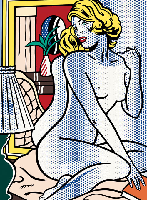
Still the most powerful expression of this preoccupation with solidity is in Lichtenstein’s mirror paintings: sinister, non-reflective surfaces that render the sheen of the mirror that we would see were we not looking at our own reflection. As paintings of mirrors, rather than actual mirrors, they are recognisable as such only through their shape and their title; rather than offering us a window back into our own selves, we stand, vampirical, before them. They are as dead and unforgiving as the eyes of Lichtenstein’s late nudes two rooms away, and they ridicule us for believing that a mirror, much less a painting, can reflect or recreate life with any semblance of “truth” – that a mirror or painting can be anything more than simply an object.
Despite this indictment not only of the demands we place on art but also of our treatment of visual material and communication in modern (and contemporary) life, Lichtenstein’s primary tool remains the bold language of Pop, and it can be taken in, appreciated, even, with the viewer’s chosen degree of levity. The root of Lichtenstein’s renown – clearly still considerable despite the recent lacuna in his exhibition history – is undoubtedly the way in which he moved through genres, styles, themes, and even planes and dimensions as a means of exploring the limits of his practice. The irony is that he often came out with the same visual results (if not the same conceptual ones), like the fudged conclusions of a laboratory experiment: smooth surface, bold colour, the discernible presence of cultural paraphernalia cut, layered and parodied, and ultimately a visual appeal as controlled and targeted as that of a magazine advert.
The danger with exhibitions of such works is that Tate’s curatorial hand is almost as invisible as Lichtenstein’s own painterly one, with artworks emerging from walls and plinths as if they were meant to be there, much as the fundamentally familiar, machine-finished surfaces of Lichtenstein’s paintings render them more akin to products than to pieces of art. Yet there is a sense in which Lichtenstein’s work does, dare I say it, “speak for itself”: the muted language of a world at once isolated and strangely familiar, at once recognisable and deeply unreal. Our eyes slide over their surfaces like oil on water, and yet somehow we’re still absorbed.
Click on the pictures below to enlarge

Copyright © 1893–2026 Studio International Foundation.
The title Studio International is the property of the Studio International Foundation and, together with the content, are bound by copyright. All rights reserved.


 Face to Face - The Daros Collections
 CRASH (Homage to JG Ballard)
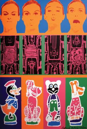 Eduardo Paolozzi: The Jet Age Compendium
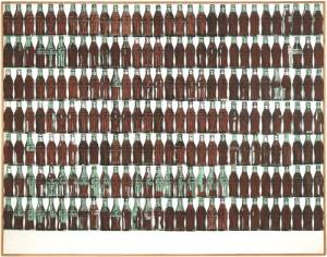
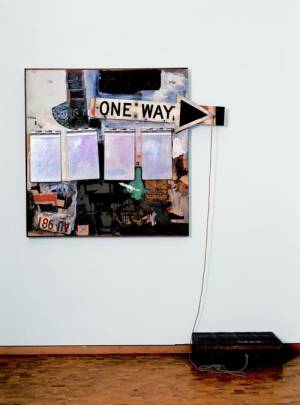 Robert Rauschenberg: Combines
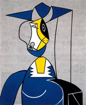 Documenting the Obvious: Picasso and American Art