


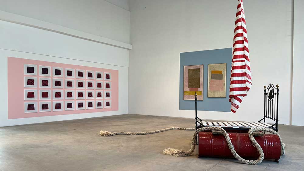
Installation view, Yto Barrada: Deadhead, Fondazione Merz, Turin, 2025.
Fondazione Merz, Turin
20 February – 18 May 2025
by TOM DENMAN
What is the materiality of colour? Often when I look at colour – especially artificial colour, the red lettering on the spine of a book on my desk, for instance – I experience a kind of dissociation: it is an image of colour, its materiality in the retina, or in my brain. I find it hard to think of the colour in material terms. Photographs of colours, or of coloured objects, further highlight this liminality, displacing the experience of colour from the original pigment, so that colour exists somewhere between the object photographed, the photograph itself and my perception of the (object in the) photograph. Consider, for instance, the artist Yto Barrada’s Quilt Builder Block Set (fig 1-32) (2024), a grid of 32 photographs of red and black wooden blocks in varying, also gridded formations. It is a work that cleverly encourages us to contemplate the material difference between the blocks and the photographic print, even if optically their colours register as the same.
Barrada seeks to challenge our mindless consumption of colour by asking us to attend to what the curators of her survey of recent work at Fondazione Merz, Turin, call the “materiality of colour”, or to question what that might be. At the heart of her practice is The Mothership, a farmhouse in Tangier where she cultivates indigenous plants and experiments with traditional dyeing practices, often by consulting and collaborating with local communities, to make geometric tapestries – in which the materiality of colour is anchored in the pigments used, the processes that went into making them, and their related environmental and colonial histories of endangerment. Dependent on the fickleness of weather, the cycles of growth and changes in the soil, the work is recalcitrantly inefficient by today’s industrial standards, resisting capitalist acceleration. I do not know why this exhibition was postponed from its scheduled timeslot last year, but I like to think of the delay as stemming from the ethical inefficiency of her practice conflicting with the international rat race of the artworld.
-FMM-Photo-by-Renato-Ghiazza.jpg "Yto Barrada. (Left) Untitled (After Stella, Tetuan I), 2019. Cotton, natural dyes 73,7 x 76,2 cm. (Right) Untitled (After After Stella, Tetuan III), 2019. Cotton, natural dyes, 101 x 104,1 cm. Courtesy Fondazione Merz. Photo: Renato Ghiazza.")
Yto Barrada. (Left) Untitled (After Stella, Tetuan I), 2019. Cotton, natural dyes 73,7 x 76,2 cm. (Right) Untitled (After After Stella, Tetuan III), 2019. Cotton, natural dyes, 101 x 104,1 cm. Courtesy Fondazione Merz. Photo: Renato Ghiazza.
Speaking of colour, there is no getting away from the industrial wall paint. In varying, mostly pastel colours – sometimes in rectangles framing individual or groups of works – the exhibition-specific backdrop is so intrinsic to our aesthetic experience that it could almost be an artwork in itself. This feels at odds with Barrada’s decelerative ethos. There is no clearer visual reminder of an exhibition’s link to the speeded-up world we live in than wall paint that will be painted over when it ends. In fairness, its conspicuous presence could be intended to make us recognise a material conflict between slow and fast, organic and artificial in the visual harmony between some of the works (or at least the tapestries) and the wall. But its aesthetic impact is in danger of overwhelming these intricacies, and throughout this show I am confused as to whether Barrada is being made to team with or critique the show’s decorative framing, or both. One thing the wall paint distracts from is the show’s deeper, historical backdrop: the commonalities between Barrada’s offline methods and the anti-capitalist ethos of Mario Merz (after whom the foundation is named), not to mention their shared interest in modularity (one of Merz’s neon sculptures numerating the Fibonacci sequence adorns the building’s exterior).
A more resolved double-edged approach is felt in Barrada’s experiments with natural dyes, which account for some of her most interesting work. In the opening room are three stretched tapestries reinterpreting Frank Stella’s geometric paintings from the 1960s, for which the American abstractionist drew inspiration from Moroccan textiles and paintings of the Casablanca Art School, and two tapestries based on compositions by Mark Rothko (both 2024). Although there is no account of Rothko having been directly influenced by Morocco, he is part of the same politico-aesthetic edifice as Stella, that of a triumphant modernism that has failed to adequately acknowledge its debt to African art. Incorporating the aesthetic of modernist painting into her tapestries, Barrada reinvents modernism’s reinvention (an agential act that affords the work its critical power, something harder to detect in the relation between her work and the wall paint), the fragility of her tapestries pointedly at odds with the grandeur of their western art historical references. Her politically loaded replacement of Stella’s industrial paint with precariously hand-dyed fabric challenges his claim: “Only what can be seen there is there.” Barrada suggests there is more than meets the eye.
-FMM-Photo-by-Renato-Ghiazza.jpg "Yto Barrada. Continental Drift, 2021. Super 8 film transferred to digital, colour, sound 24’ 9”, loop. Courtesy Fondazione Merz. Photo: Renato Ghiazza.")
Yto Barrada. Continental Drift, 2021. Super 8 film transferred to digital, colour, sound 24’ 9”, loop. Courtesy Fondazione Merz. Photo: Renato Ghiazza.
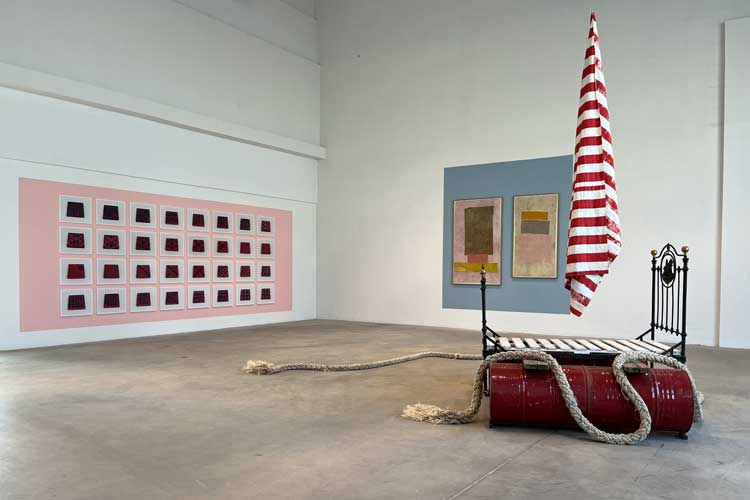
That our appreciation Barrada’s work requires a fair amount of contextual knowledge could be an affront to Stella’s words; yet it is helpful that some works offer jigsaw pieces to guide our viewing of others. In this, the videos are especially forthcoming. Continental Drift (2021) consists of three monitors with black-and-white super-8 footage of city streets and barren landscapes in different places (Giulia Turconi’s accompanying essay says that they are Antarctica, the US and Morocco), possibly taken in the early 20th century, a shifting colour filter on each screen making the three of them, at times, resemble a tricolour flag. The atmospheric work sets the historical and geopolitical tone for the tapestries around it, especially since it is next to Lit-Ras-d’Eau I (Raft I) (2023), a sculpture made of an iron bed on metal barrels, supporting a flagpole with a red-and-white striped flag (crucially unrepresentative of any particular nation), effectively a makeshift raft bringing together symbols of migrancy and permanence.
, 2023. Installation view, Yto Barrada: Deadhead, Fondazione Merz, Turin, 2025. Photo: A Guermani.")
Yto Barrada. Lit-ras-d’eau I (Raft I), 2023. Installation view, Yto Barrada: Deadhead, Fondazione Merz, Turin, 2025. Photo: A Guermani.
In a room of its own, Tree Identification for Beginners (2017) presents stop motion footage of pastel-coloured geometrically shaped teaching aids – associated with the non-verbal, Montessori method of education – which mutate, multiply, twitch and trot to the sound of various voices detailing “Operation Crossroads Africa”, a summer exchange programme for outstanding students from Africa and the US that was established in 1958. Among the speakers is a woman (Barrada’s mother, who travelled from Morocco to the US on one of these trips in 1966) who relates the participants’ disillusionment at the poor hospitality they received. The film could be suggesting that these chromatic teaching aids retain their rudimentary value into adulthood, even helping us playfully – and perhaps therapeutically – think and feel through complex political histories, potentialising the political ramifications of the psychically foundational significance of colour.
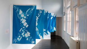
-FMM-Photo-by-Renato-Ghiazza.jpg "Yto Barrada. Untitled (Color Analysis), 2024. Cotton, silk, natural dyes, 114,3 x 114,3 cm. Series of 8 works realized for MAO Museo d’Arte Orientale,Torino, 2024. Courtesy Fondazione Merz. Photo: Renato Ghiazza.")
Yto Barrada. Untitled (Color Analysis), 2024. Cotton, silk, natural dyes, 114,3 x 114,3 cm. Series of 8 works realized for MAO Museo d’Arte Orientale,Torino, 2024. Courtesy Fondazione Merz. Photo: Renato Ghiazza.
The foundational significance of colour is encapsulated in Barrada’s most recent series of tapestries. Titled Color Analysis (2024-25) and mostly shown in its own room – and I will refrain from saying why, in this room, they are resplendently sustaining – it reformulates the colours of existing artworks and museum artefacts into hand-dyed, tapestried 10 x 10 grids. Her compositions follow the American artist Emily Noyes Vanderpoel’s technique of mapping the colours of similar objects, some charged with the politics of postcoloniality – an Egyptian mummy, for example – a technique Vanderpoel described and illustrated in her 1902 book Color Problems: A Practical Manual for the Lay Student of Color. The artworks Barrada reprises include artefacts taken from the Arab world and housed in Turin’s Museo d’Arte Orientale, and a painting by Marisa Merz (2002/3), the latter of which is included in this show and hung in the neighbouring room, close enough to compare the painting with the tapestry. Knowing the relation, I begin to see Merz’s nebular, foetal, anything-but-geometric swirl of gold, white and magenta in Barrada’s grid; the latter has five deep crimson squares along the top, for instance, which is probably beneath what I register as a lighter magenta in Merz’s painting, and mentally I start mixing the crimson with the pale blue blocks below it and swish the colours about. Again, I am in that liminal zone between the dye and the mind where colour does its work.

Click on the pictures below to enlarge

Copyright © 1893–2026 Studio International Foundation.
The title Studio International is the property of the Studio International Foundation and, together with the content, are bound by copyright. All rights reserved.
-300.jpg)
-300.jpg)
-18-300.jpg)
-Tate-(Larina-Fernandes)-(12-1000)-300.jpg)
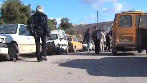 Push the Limits: Culture Strips to Reveal War
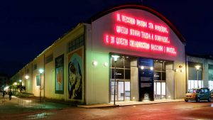 Beatrice Merz – interview: ‘The purpose of the project is to contribute to the traditions of Sicily and southern Italy’
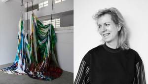 Katharina Grosse – interview: ‘My eyes are my most important tools’
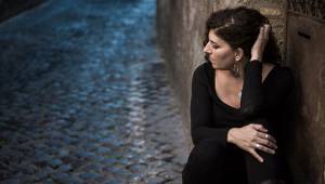 Emily Jacir – interview: ‘I wanted the locals to show me what was important for them, what they thought I should see, what they wanted to talk about’
 Yto Barrada: ‘The whole thing is a dance between a mad poet, children and ghosts’