Design Museum, London
28 June – 24 September 2017
by NICOLA HOMER
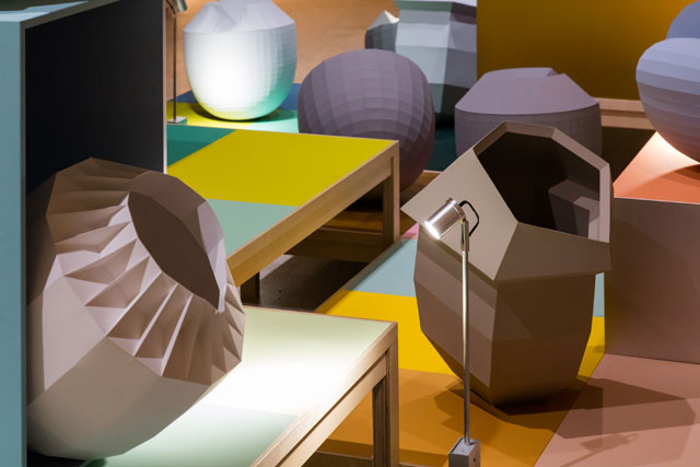
A colourful screen glows in front of you. Looking at your smartphone, you may be distracted. Yet this is a story about a lightbox. You can reach inside the box, move the objects around and consider how the shifting colours affect your perception of their quirky shapes. At the Design Museum in London, you can discover the playful installation in a brilliant show, Breathing Colour by the Dutch industrial designer Hella Jongerius. The piece is one of a collection of her new commissions in an exhibition that reveals how colour behaves. Through your experience of touch, which is becoming important in an increasingly digital world, you are invited to explore how colour is affected by shape, texture and light in the calm and contemplative space.

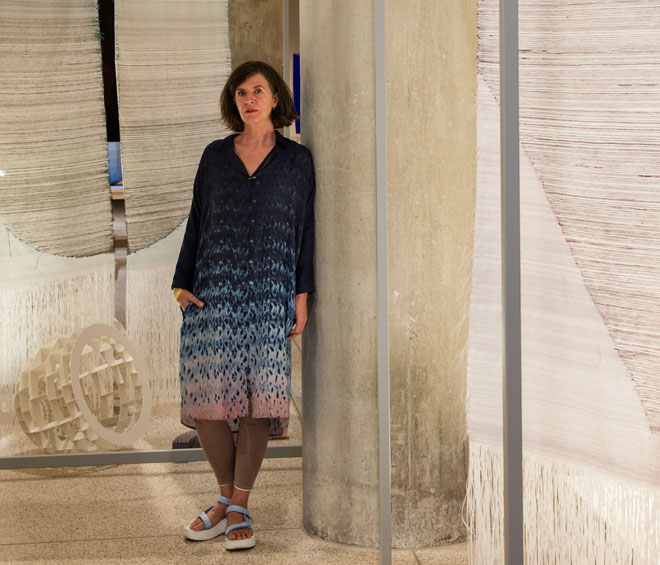
Breathing Colour by Hella Jongerius, Design Museum, London 2017. Installation view. Photograph: Luke Hayes.
The work of Jongerius (b1963) exhibits a lively sense of interplay between craft and technology. On graduating from the Design Academy Eindhoven in the Netherlands, she started her own studio, Jongeriuslab, in Rotterdam, and later moved to Berlin, enabling collaborations with leading names in industry, such as Ikea, KLM, Royal Tichelaar Makkum and Vitra. Jongerius has exhibited internationally at museums, including the Cooper Hewitt, Smithsonian Design Museum and the Museum of Modern Art in New York. Together with the renowned Dutch architect Rem Koolhaas and graphic designer Irma Boom, she worked on the renovation of the North Delegates’ Lounge at the United Nations Headquarters in New York. In this exhibition, she draws on 15 years of research to create a series of new objects that allow you to take a deeper look at colour.

Breathing Colour by Hella Jongerius, Design Museum, London 2017. Installation view. Photograph: Luke Hayes.
Jongerius put together this exhibition with the Design Museum’s senior curator, Alex Newson. She brings a sense of fun to the curatorial strategy, as she explains the goals of the show, in seeking to reveal the possibilities of expression in the language of colour. Importantly, she adds a touch of handicraft to the industrial process, and explores the idea of colour as a material substance, to be moulded and shaped by artists. In doing so, she challenges the modern industrialisation of colour, seen in the printing industry.
Jongerius says: “With this exhibition, we hope to build up an archive, create a tool for interpreting, tickle the eyes of the viewer, let the viewer see the breath of a colour, show a broader perspective behind the industrial pallet, show how powerful a colour can be in taking over a shape, or even transform a shape and show all options that lie in the grammar of colour, as an ongoing toolbox.”
,-2010,-Hella-Jongerius.jpg)
Hella Jongerius. Coloured Vases (series 3), 2010. Photograph: Gerrit Schreurs.
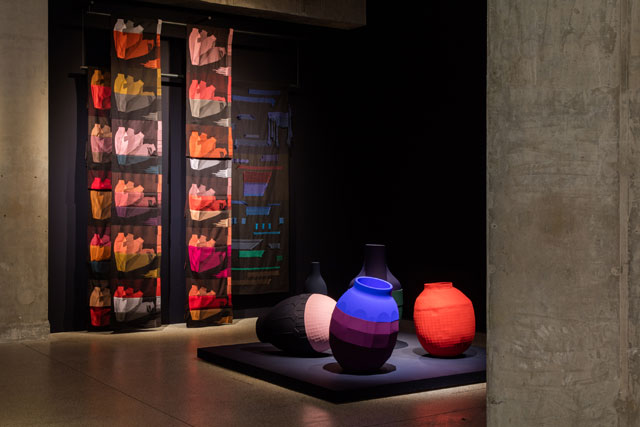
This installation-based exhibition is curated around the natural clock of day, in a trio of segments – morning, noon and evening – which frame the perception of colour in different light settings. At the centre of the gallery, on seeing the saturated hues of sculptures with complex folded surfaces, you can imagine the brilliant noon daylight. Jongerius describes these objects as “colour catchers”. “They are designed as the ultimate shape to research colour, shadows and reflections. They are my canvases. The folding acts as a shift between two different colours; it turns the form of an object into a generator of new colour tones,” she says. An innovative and painterly approach can also be seen in the extraordinary series of 300 coloured vases from 2010, which appear to be reminiscent of old master paintings, in their beautifully layered shades, produced with a historic glazing technique using metal oxides.
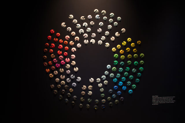
The ground that this exhibition opens up may be familiar to art historians. The series of vases suggests ancient Greek philosophy, where colour was an instrument for describing natural processes. The installation of crystal stones highlights the optics of colour dispersion, demonstrated in 1672 by the English physicist Isaac Newton. It is also worth exploring the alternative, philosophical viewpoint of the German poet Goethe, author of the 1810 book Theory of Colours, who focused on the perception of colours, and the practical colour aides developed by the French chemist Michel-Eugène Chevreul for the Gobelins tapestry factory in Paris, which facilitated the development of impressionism. In the show, you can see the influence of the Bauhaus school, including the Swiss painter Johannes Itten’s teaching on colour contrasts, exploring factors such as hue, lightness and temperature. The complexity of the perception of colour is such that connecting different strands of thought is important.

Breathing Colour by Hella Jongerius, Design Museum, London 2017. Installation view. Photograph: Luke Hayes.
“There is a phenomenon in colorimetry called metamerism. This was the starting point in my colour research. It occurs when colours are viewed in different conditions, and describes the effect when two colours appear to match even though they might not actually do so,” says Jongerius. The designer thinks that everyone has once bought a piece of furniture or clothing in a certain colour and experienced a shock when unpacking it back home. Many companies see the effect as problematic. However, she encourages people to embrace metamerism. Jongerius observes the instability of colour, as you can see in the organic pigments creating reflections in the vases. “As a designer, I want to make a plea for plastics, varnishes and paints to use layered pigments that provide intense colours that are allowed to breathe with changing light,” she adds.
In this exhibition, Jongerius brings a human touch to industrial production. In the final gallery, an experimental textile display suggests the rich texture she has discovered in black by using handcrafted pigments. The painted walls ask a tantalising question, as to whether the flat carbon black of the printing industry could be replaced with an alternative, which would transform the industrial palette. The designer explores the potential of shadows to bring life to objects in the stage-like set of furniture pieces modelled on famous works by celebrated names, such as the American duo Charles and Ray Eames, the French architect Jean Prouvé and the contemporary French designers Ronan and Erwan Bouroullec. These affirm Jongerius’s place among the most celebrated designers of her generation, while encouraging you to appreciate the perennial swirl of colour.