Lisson Gallery, London
16 November 2018 – 12 January 2019
by HATTY NESTOR
For centuries, artists and philosophers have theorised about the relationship between private and public space, materially and conceptually. In Henri Lefebvre’s Critique of Everyday Life (1947), he discusses the relationship between personal and private life as an “interconnectedness”, where our internal and external lives mutually inform one another. Particularly in urban settings, the ramifications of how we live among, and indeed with, everyday objects have been the subject of artistic address. In her exhibition at the Lisson Gallery in London, the Berlin-based artist Ceal Floyer (b1968) – renowned for her poetics of the everyday – through a myriad of forms and mediums embarks on a terrain of the familiar, subtle and uncanny. I interviewed Floyer to get a sense of her practice and to discuss the body of new work she is exhibiting at the Lisson Gallery.
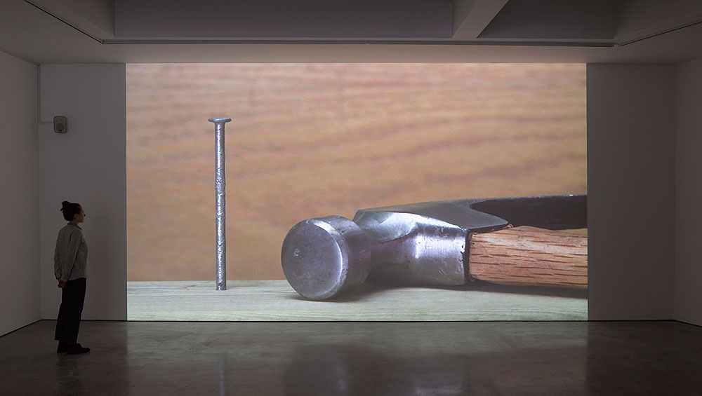
Ceal Floyer. Hammer and Nail, 2018. Video projection with audio,
dimensions variable. © Ceal Floyer. Courtesy Lisson Gallery.
Floyer’s show, her first appearance at Lisson London since 2011, examines existential questions of the self through mundane objects. Her work creates interventions into the everyday – bearing witness to the simplicity of objects that surround us in our domestic and professional lives. This is immediately apparent in Hammer and Nail (2018), an oversized video that greets visitors to the exhibition, where stock footage depicts a hammer beating a plank of wood. I was perplexed by the physical and visual space that a hammer – an object that holds many connotations – was given: such weight and space. Where was the footage from? Floyer says: “The final video is the result of the rationalisation of the composition in post-production.”
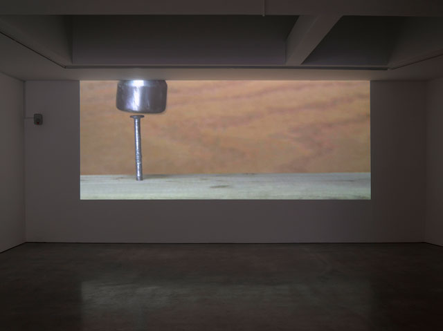
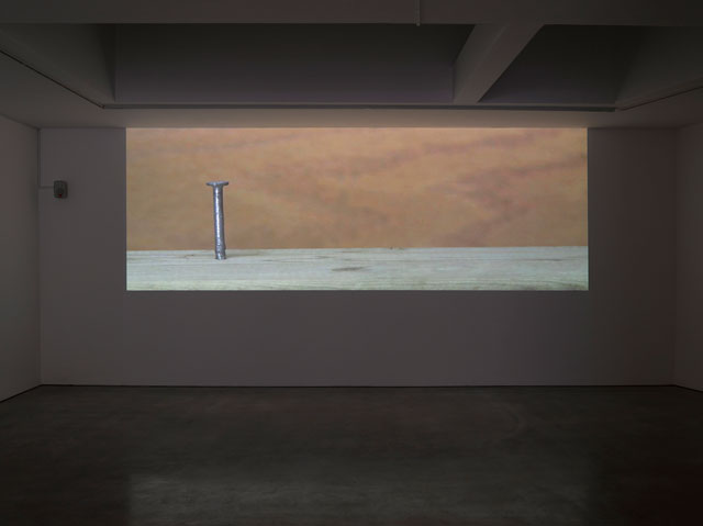
Ceal Floyer. Hammer and Nail, 2018. Video projection with audio,
dimensions variable. © Ceal Floyer. Courtesy Lisson Gallery.
She expands: “As a consequence, the hammer is denied the result of its hammering action, because it’s really the altered framing which appears to raise the plank containing the nail to meet the hammer’s head.” On further inspection, I realise that, without its functionality, its primary use is suspended, left to render it an aesthetic art object. In an uncanny gesture, Floyer resituates our relationship to the everyday, while reformulating, in this instance, the hammer’s properties and functionality.
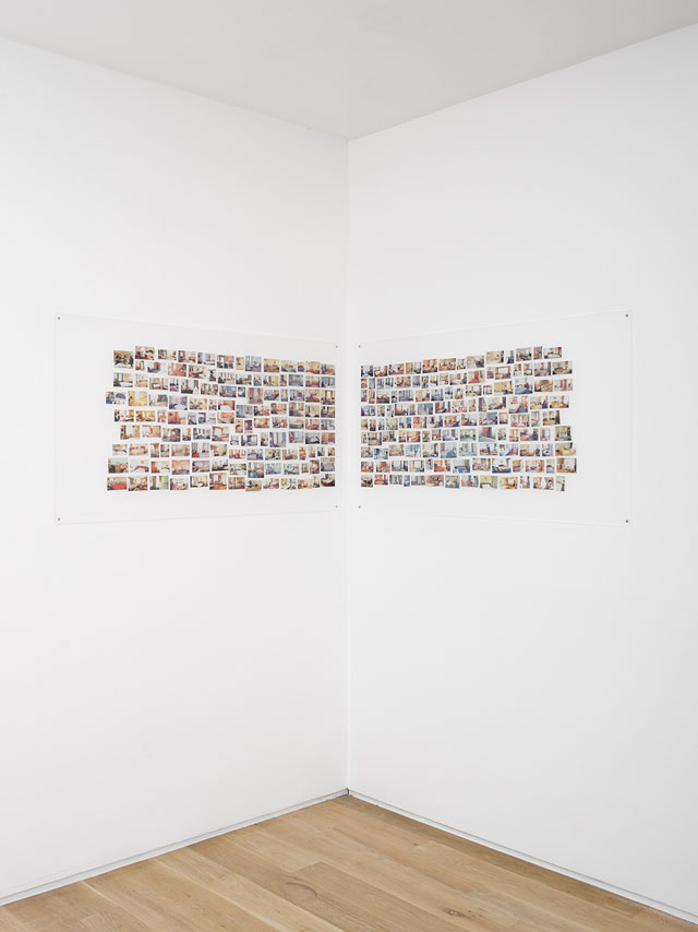
Ceal Floyer. Hotel Rooms, 2018. Scanned and printed promotional images of hotel rooms mounted on matte Plexiglas panels, diptych: 120 x 65 cm (47 1/8 x 25 1/2 in) each panel. © Ceal Floyer. Courtesy Lisson Gallery.
Moving upstairs, I am confronted with Hotel Rooms (2018) – myriad photographs of bedrooms, taken from advertisements in consumer magazines and travel brochures. Here, photography is presented as an imagined meditation on reality. Yet, despite this piece deriving from advertisements of hyper-realist lifestyles, Floyer’s presentation frames the rooms in a renewed context. She attributes the two perspectives found in these magazines as an artistic gesture, presenting the functionality of hotel rooms societally.
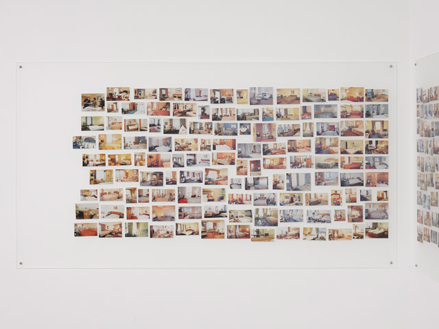
Ceal Floyer. Hotel Rooms, 2018. Scanned and printed promotional images of hotel rooms mounted on matte Plexiglas panels, diptych: 120 x 65 cm (47 1/8 x 25 1/2 in) each panel. © Ceal Floyer. Courtesy Lisson Gallery.
In Floyer’s recontextualisation of the bedroom, the viewer is oriented in direct reference to the subversion of the everyday – a recurring theme throughout her work. The diptych of photographs resides in the corner of the gallery framed by two opposing walls. “When a visitor stands there,” Floyer explains, “s/he is also recasting her/himself in the position of the photographer.” Perhaps this incompleteness is a type of agency in its own right, a method of demonstrating that we all are mutually intertwined with our private and public life, whether visually apparent or not.
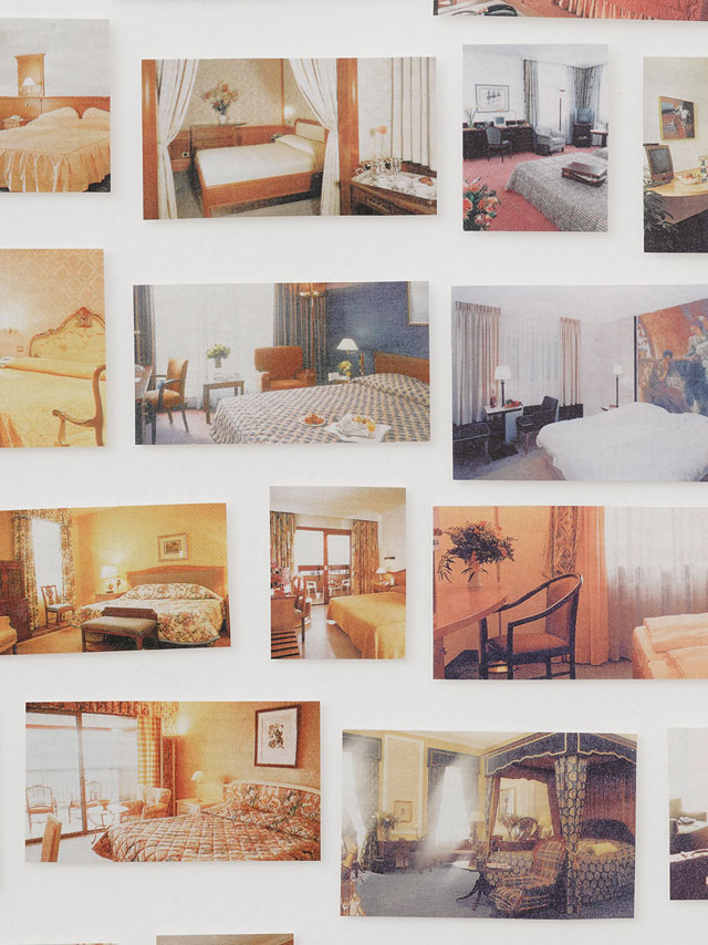
Ceal Floyer. Hotel Rooms, 2018. Scanned and printed promotional images of hotel rooms mounted on matte Plexiglas panels, diptych: 120 x 65 cm (47 1/8 x 25 1/2 in) each panel. © Ceal Floyer. Courtesy Lisson Gallery.
Floyer’s practice confronts complex questions of value, semantics and perception. In documenting everyday life, photography plays a crucial role in creating histories of personal and public settings. The hotel photographs are organised systematically, says Floyer, with “pictures representing the rooms shot from the left, on the left of the diptych, and pictures representing the rooms shot from the right, on the right of the diptych. Standing between the two panels of the diptych, there is also a nod to the act of looking and flipping through the pages of such a brochure.” She continues: “In a few cases, I found images looking straight-on at the bed, and it’s interesting because these don’t look like hotel rooms, the way that we are accustomed to ‘reading’ images of rooms shot from the right or left side (not unlike commercials for watches, which conventionally are depicted at ten past ten or ten to two).” Their placement on the two opposing walls feels casual, done without much precision or consideration, much like Polaroids on a bedroom wall.
But what was the process of collecting and archiving for Hotel Rooms? Floyer says: “The process involved cutting the pictures from the magazine pages (in the best cases, I had two copies of the magazines so I could make use of both sides of each sheet, if they had good images on both sides). All the cut-outs were then scanned into the computer, printed, cut out again, and, finally, fixed on to the surfaces of Plexi panels.” The collage of rooms, then, is like a narrative – there is a feeling that each photograph is in dialogue with another.
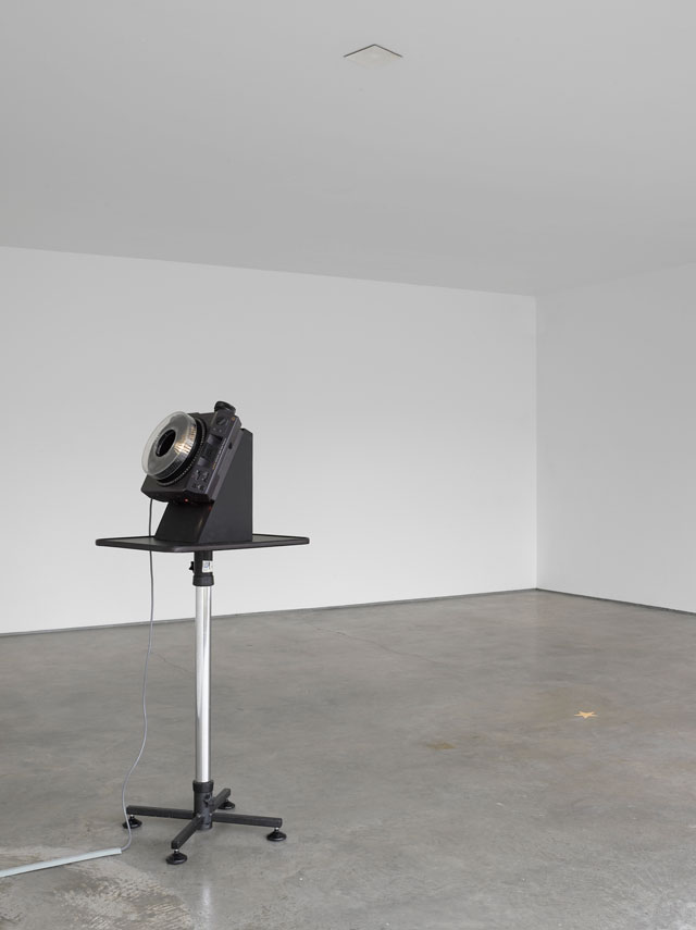
Ceal Floyer. Fallen Star, 2018. 35 mm slide projector, slide mask, mirror, telescopic AV stand, dimensions variable. © Ceal Floyer. Courtesy Lisson Gallery.
In Fallen Star (2018), a slide projector placed in the middle of the gallery projects one singular star on to the gallery’s ceiling, from where a mirror sends it falling back on to the floor. The work’s meaning and subtle purpose, like most of Floyer’s practice, isn’t readily obvious to the viewer. The relationship between the unique properties of an object – in this case the projector – and the poignancy of what it translates – light, appears to be central.
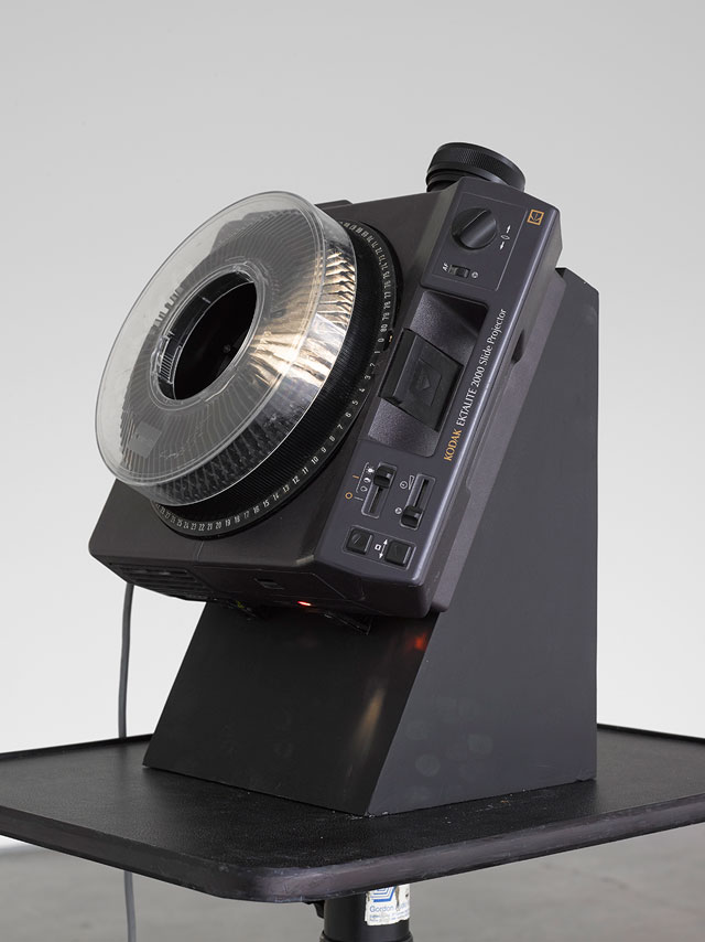
Ceal Floyer. Fallen Star, 2018. 35 mm slide projector, slide mask, mirror, telescopic AV stand, dimensions variable. © Ceal Floyer. Courtesy Lisson Gallery.
As Floyer describes it, when constructing the work she “was thinking about the song title Catch a Falling Star (sung by Perry Como), but didn’t realise how sentimental the lyrics are until after the fact. The work is not meant to be sentimental.” Encountering Fallen Star, the projected star is reminiscent of being a child lying in bed at night and looking at the stars I had on my ceiling – a quaint reminder of how the unknown, such as space, can be made familiar in the everyday.

Ceal Floyer. Fallen Star, 2018. 35 mm slide projector, slide mask, mirror, telescopic AV stand, dimensions variable. © Ceal Floyer. Courtesy Lisson Gallery.
Familiarity is a theme throughout the exhibition; the hammer, the stars and hotel rooms all prompt us to focus closely on the details of each piece, to look for differences and diversions from the norm. In Maximum Headroom (2014/2018), this feeling is most acute. Two aluminium printed traffic signs showing the maximum headroom both inside and outside the gallery are installed on a window, collapsing the boundaries of inside and outside. The piece, says Floyer, has a satirical quality: “The common traffic sign is an immediately recognisable, standardised example of vernacular life. Its familiarity allows us to transcend the sign and observe and interpret the almost absurd minutiae of detail that is therefore permitted to shine through.” Surely, here as viewers we witness strategy and measurement in art as something quantifiable with experience, as a tool to reimagine the everyday.
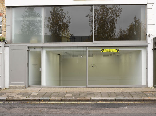
Ceal Floyer. Maximum Headroom, 2014/2018. Site specific custom printed aluminium sign, dimensions variable. © Ceal Floyer. Courtesy Lisson Gallery.
Maximum Headroom requires viewers to orientate themselves physically. Floyer meditated on this reorientation herself through specific measurements and calculations. “The figures are given to the nearest millimetre and eighth of an inch (both metric and imperial systems, which is the convention for UK signage),” says Floyer. What similarities are apparent in this piece? Asked about subtle details, Floyer said: “There are two signs installed back to back – one inside the gallery and one outside on its facade.
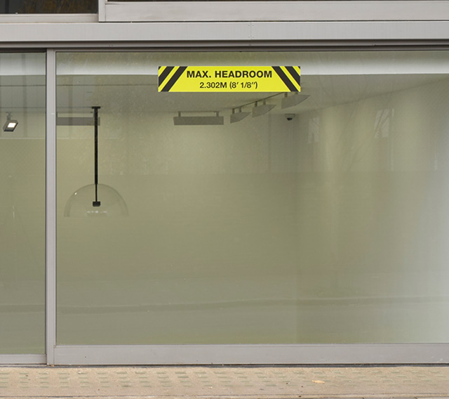
Ceal Floyer. Maximum Headroom, 2014/2018. Site specific custom printed aluminium sign, dimensions variable. © Ceal Floyer. Courtesy Lisson Gallery.
The sign causes us to remark that even though the two signs are in the exact same position, the implication is different because each sign hangs above a different floor height (the depth of the floor inside is far greater).” Indeed, the preoccupation with space is also theorised in Untitled (Static) 2018, a clear, parabolic dome containing a speaker, which hangs from the ceiling, much like a light. It is easy to miss; on entering the gallery space, one briefly wonders what the work actually is. Yet when immersed in the recorded distortion that emanates from the speaker, the visitor quickly acclimatises to the feeling of entrapment and physical absorption.
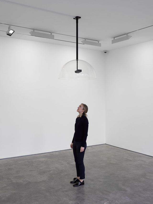
Ceal Floyer. Untitled (Static), 2018. Parabolic speaker and ready-made sound effect, dimensions variable. © Ceal Floyer. Courtesy Lisson Gallery.
It is surely the visibility Floyer creates through her meditation on the internal and external spaces we inhabit that bears witnesses to the ever-changing individual and collective experiences of art. If attention to such mundanity allows a preoccupation with what is often overlooked, then Floyer is a master of our everyday. Yet the consideration of how this might materialise, by virtue of the artist, or indeed the gallery space, is a contention Floyer tentatively unfolds at the Lisson Gallery. Although form and composition veer widely, her precedent runs clear; the everyday presents an infinite terrain from which to inquire about our reactions, emotions and, most of all, agency. The next time I find myself in a hotel room, or using a hammer, I will certainly look beyond its practical functionality.