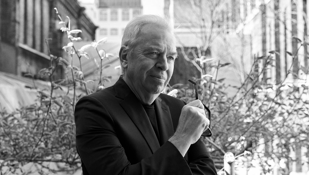
by VERONICA SIMPSON
David Chipperfield is the masterplanner and architect of many of the world’s most prestigious cultural and commercial projects, from the extension and refreshment of Berlin’s Neues Museum (2009) and the Saint Louis Art Museum in Missouri (completed in 2013) to his most recent, transformational refurbishment of the Royal Academy’s Burlington House and the adjacent Burlington Gardens site into one connected cultural campus.
Eschewing the seductions of flamboyant, statement architecture, his sculptural, often understated interventions seem to work all the more effectively to improve and enhance the function as well as the experience of the original buildings. While his newbuild structures may lack the bling of his fellow starchitects, through form, materials and character they channel something of the qualities and aspirations of their locations, drawing affection and popularity from locals and visitors alike (the Turner Contemporary in Margate and the Hepworth Wakefield, in particular).
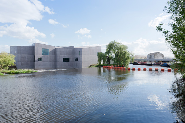
The Hepworth Wakefield, West Yorkshire, 2003-2011. Image courtesy David Chipperfield Architects London.
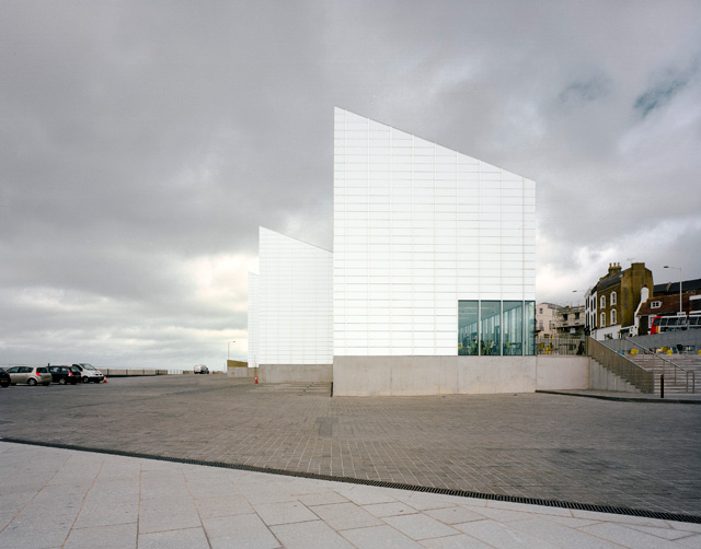
Turner Contemporary, Margate. Image courtesy David Chipperfield Architects London.
With offices in Berlin, London, Milan and Shanghai, Chipperfield is not averse to creating large luxury office and apartment blocks, but really comes into his own with culturally and historically sensitive buildings, such as the Inagawa cemetery chapel and visitor centre in Hyogo, Japan (2017). He is mid-refurbishment of Mies van der Rohe’s Neue Nationalgalerie in Berlin, which is due to reopen in 2020.
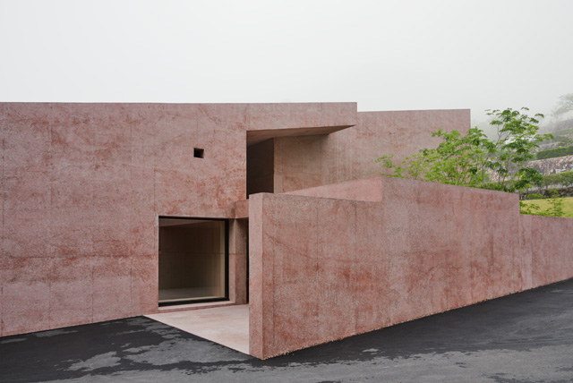
Inagawa Cemetery chapel and visitor centre, Japan, 2013-2017. Image courtesy David Chipperfield Architects London.
At London’s Royal Academy (RA) scheme, he describes his most decisive gesture – a new linking bridge and tunnel between the two structures – as “bringing oxygen to the whole”. Yet this very simple gesture had been resisted for decades, avoided by both the previous proposals (from Michael and Patty Hopkins and Colin St John Wilson), largely thanks to the desire not to impinge on the RA school below the original academy, which had been minding its own business quite happily for 250 years; a window on to its everyday vitality is now revealed by this connecting walkway, while the refurbishment adds a new dedicated student gallery, a courtyard space and a state-of-the-art lecture theatre for internal and external education and events.
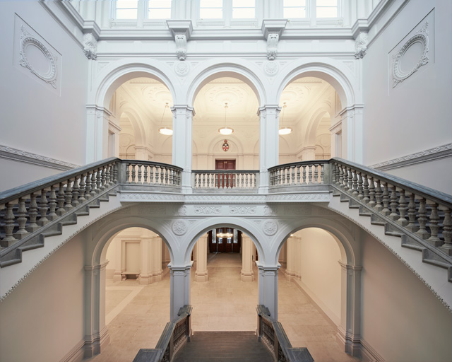
The Wohl Entrance Hall, Royal Academy of Arts, London, 2018. Photograph: James Harris
The RA’s chief executive, Charles Samaurez Smith, says: “There are loads of architects working on contemporary art gallery spaces, but there are few, I think, who manage to do it with perfect pitch in that way.”
Chipperfield is a contributor to this year’s Venice Architecture Biennale, which ends on 25 November, while, nearby, David Chipperfield Architects Works, an exhibition of his projects, can be seen at Vicenza’s Basilica Palladiana until 2 September.
Veronica Simpson: I was really struck by your description of the Royal Academy scheme, at the opening press conference, as simply a “linking together of two buildings and giving of purpose to this building” (No 6 Burlington Gardens). It is rare that you hear an architect introducing a project with less emphasis on their own contribution and more concern for the health of the institution as a whole.
David Chipperfield: Yes. Well, it’s a diagnostic approach, but that’s the same with every institution. Every institution says: “We need to extend our museum.” And you say: “Well, what do you need? Are you sure?” And you realise that there’s a vanity behind projects where people hadn’t thought hard about what they actually need. The interesting thing about museums and institutions is that they are complex. Therefore the front of the house and the back of the house are full of concerns that you have to consider equally. We (extended) a museum in Saint Louis and it was like an iceberg: there was just as much stuff underground, which no one ever sees. But without that, it wouldn’t function well. It’s not viable to extend an institution and not strengthen it at the same time. So, to have more galleries but not deal with some storage and art-handling and office issues, you just have a better looking, disgruntled institution.
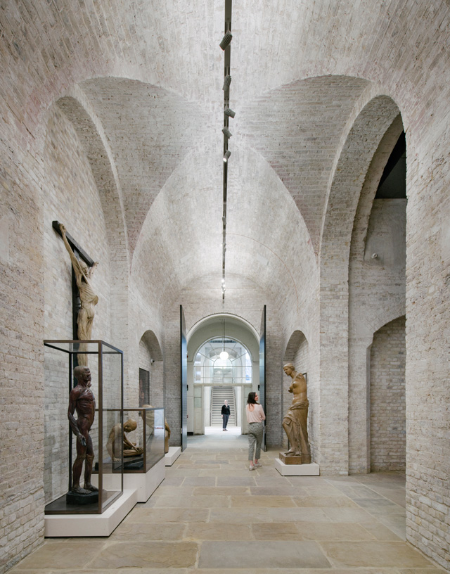
The Vaults, Royal Academy of Arts, London, 2018. Photograph: Simon Menges.
VS: But seeing how you can do more for a client and their culture with less actual building is not the usual approach.
DC: No, because architects tend to want the bit at the front.
VS: They want the glory?
DC: Yes. I’m old enough now not to worry about that. Why cut the body if you don’t need to? I think sometimes there’s a pressure on the architect to do something visual and visionary, and I think what was good here is that the RA, given its constitutional makeup (there are many architects as well as artists among its membership), there wasn’t that sort of desire about: “Where is the big image?” There are a lot of projects where you can tell that the client is just wanting the sucker punch, the CGI image of happy people wandering around this new thing. This (the RA) would have been a very difficult project to sell to some people. They might say: “Well, what are you actually doing?” And you might say: “There’s an auditorium here, we’re going to make bathrooms here, move those bathrooms there, put the elevator there.” It doesn’t look very exciting. It was good that the RA are sophisticated – the Academicians, though they’re a grumpy group sometimes, at least they are intelligent enough not to say: “Well, where’s the wow?” There is no wow in this project.
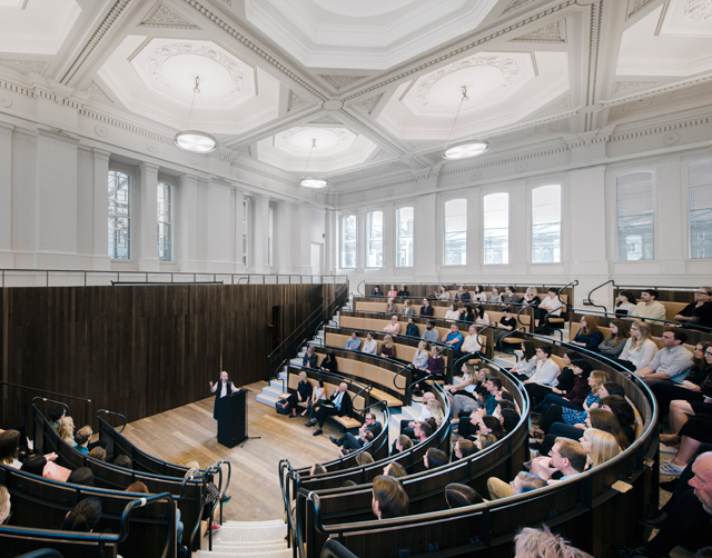
The Benjamin West Lecture Theatre, Royal Academy of Arts, London. Photograph: Simon Menges.
VS: The previous schemes had avoided cutting through between the buildings, as it meant exposing the Royal Academy art school and interfering with this prestigious but almost secret entity. How did you resolve that issue?
DC: First of all, it was working a bit more with the history and nature of the building. Then it was working a bit more with the organisation. We are interested in digging. You dig in the building, and you dig in the institution. You have to work just as much with the people and say: “OK, look, if we could come through here, it would make the whole thing much easier.” There was huge resistance to it, and quite rightly. Why shouldn’t they resist? Why should their peace be destroyed? But then you’ve got to explain what everybody gets out of it. It becomes a jigsaw puzzle: “What about if we give you a bit more space on the other side of the courtyard and what about if the courtyard becomes more of the territory of the school and you can move out there, and don’t forget that, if you can do that, you can use the auditorium as well and you can go up the stairs?” It was a dynamic project in that sense, re-describing the place. Then architecture is used as the element to do it. It doesn’t exist unnecessarily. Architecture shouldn’t exist on its own. There’s no reason for it to exist as an independent thing, except for the glory of the architect.
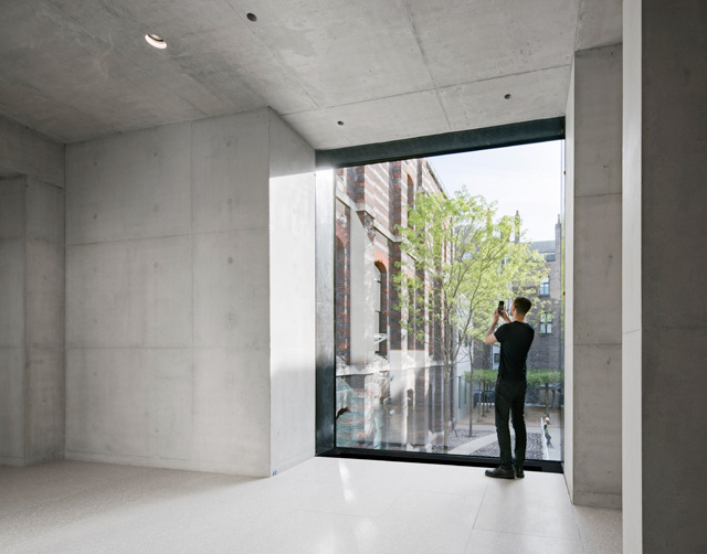
Weston Bridge, Royal Academy of Arts, London, 2018. Photograph: Simon Menges.
VS: But people want delight as well: it’s great the way you have opened up and clarified Burlington Gardens, brought in so much light to the stairwell and top galleries.
DC: People didn’t like that [Burlington Gardens] building though. It had just been eroded. Everything that had been done previously just slowly humiliated the building. And then the RA weren’t quite sure to what degree did they like it or dislike it, and therefore to what degree should they knock it around. And I kept saying: “It’s fine. You just have to clean it up. Let’s get rid of the wooden floor, paint it again. You don’t need to waste money redesigning it. Let’s try and reuse it.” That was important.
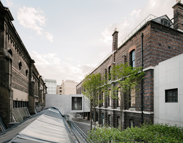
Weston Bridge and The Lovelace Courtyard, Royal Academy of Arts, London, 2018. Photograph: Simon Menges.
VS: Presumably they trusted you as well. You have a great track record for taking what has been old and beaten about and bombed – the Neues Museum in Berlin, for example – and showing the beauty in the fabric of the building. It is often mentioned that you have an affinity with artists. How do you go about creating spaces for art when that art is always changing? What are your parameters?
DC: Don’t get in the way. You don’t put architecture in galleries. You just make them nice rooms. No artist complains about nice rooms. We always try to use daylight, but only in so far as you can block it out. We always try to make nicely proportioned rooms, and leave the architecture somewhere else in a way. Wakefield [The Hepworth] was probably the most self-conscious moment, where I sort of knew the building - in order to stand up to the context - had to have a strong identity or silhouette, a certain sculptural quality to it. Instead of imposing it from the outside, I thought it might be interesting to generate it from the inside. In other words, to develop a room structure and reflect the room structure as the form - what Frank Gehry does. Gehry’s projects are quite sensible inside. They tend to be rather typical square rooms. But he then puts this body over the top of it. I was interested in saying: “Why can’t the body be generated by the internal spatial structure?” In which case, I was interested in making the rooms classical, but peculiar, shifting the angles, and using that as a way of bringing daylight in. But it’s still a 19th-century plan.
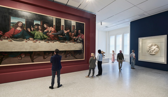
Royal Academy of Arts, London, Collection Gallery, 2018. Photograph: Rory Mulvey.
VS: But in that case, you also knew the artist who would predominantly be displayed in that building. Barbara Hepworth’s work has a wonderful scale and physicality, which your building really celebrates.
DC: I always think it’s about the size of room. With every new project, what is the room size? There are moments. There are certain museums where the room is a very big one, where you don’t subdivide. Renzo Piano does that quite well, whereas we tend to make rooms that then add together.
VS: There is also a sense of processing through these different spaces, which enhances the gallery experience rather than feeling as if you are filing through an endless series of similar spaces.
DC: You have to reward people. It’s like a book: you have to want to turn the page. You want to be happy in what you’re reading, but you also want to know what’s next.
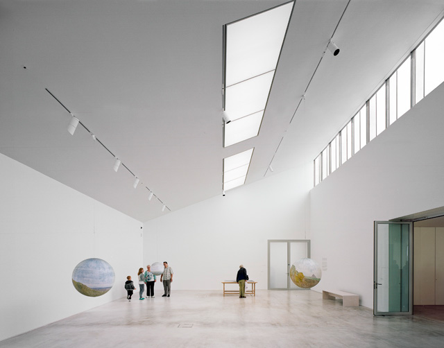
Turner Contemporary, Margate. Image courtesy David Chipperfield Architects London.
VS: You pay a lot of attention to thresholds, too, or the journey through each space.
DC: Museums don’t really want circulation. The ideal museum is where every circulation is through a room, and every room has work in. Ideally, you would land in the middle of a museum and you would be in a room full of work. You should never really walk through empty space.
VS: Is there any museum that does that?
DC: Historically, museums were much more like that. There wasn’t much flirting beforehand. So, now we’ve had to invent all of that stuff in the foyer. In Saint Louis, we tried to bring the gallery right to the front door, so the entrance lobby is like the gallery. The problem is that you do need this stuff beforehand, but from then on you should always be walking through gallery space. You can put art into circulation space but it’s decorative. And one of the problems with modern architects is they like circulation space. That’s the point where they can make architecture. You shouldn’t be making too much architecture in the rooms. When you talk about thresholds, I think that there’s a certain thing about museums which is about stasis - the relationship between the dynamic and the static. You should always be in a space where you’re happy to stay. The museum is about slowing you down and keeping you in place. With thresholds, we are trying to say: “When you’re in this room, you’re in this room, but there will be another room coming along soon.”
VS: What are your favourite spaces for art?
DC: Well, we’re restoring the Mies van der Rohe Neue Nationalgalerie in Berlin [due to be completed in 2019 and reopen in 2020]. I think it’s very interesting that it’s two types of space he made, both of which are fairly hopeless. You have a giant, 9-metre-tall glass box that you can hardly show work in. And then, downstairs, there’s a six-metre column grid with quite low spaces, with carpet. But in a funny way, it sort of works. I wouldn’t design either of those two spaces, but the idea is of the temple as the symbol of culture - a transparent temple, which then everyone gets to love and works out how to use. And downstairs, there’s a perfectly decent space to show work in. It shows you that, with well-judged architectural qualities, you can make a museum out of anything.
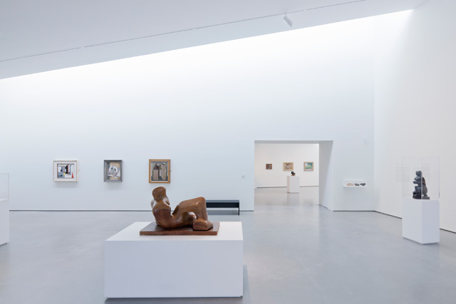
The Hepworth Wakefield, West Yorkshire, 2003-2011. Image courtesy David Chipperfield Architects London.
VS: I imagine you are not a great fan of the bland, industrial-scale, white cube sort of gallery.
DC: Well, I think the problem is you’re fairly doomed to the white cube because, in a sense, walls have to be neutral. Whether they’re white or red doesn’t make any difference, they’re neutral. You can’t materialise walls very much. You can think about the floor and the ceiling and lighting and sequence, and how that building relates to its cultural context.
VS: When you are trying to be considerate of all the different parties who own or have to occupy these buildings, how do you go about synthesising their requirements into one decisive gesture?
DC: You just tell everybody they’re going to get exactly what they want. And then you do what you think is right. You’ve just got to listen to everybody and not get beaten up by them. And then you’ve got to show responsibility for how you can put shape into those things. But we always listen. At the New York Metropolitan Museum of Art, we are working with 13 different user groups, and those user groups include people from events and things like that to art-handling to curators, to even the legal department. You have got to listen to everybody, you’ve got to bring them along, you’ve got to explain what you’re doing. You can’t just listen to the director who says: “This is what I want to do.” You actually have to immerse yourself in all of that stuff and then you’ve got to come out having been familiar with it and make judgments. You say: “Well, I think we can do this, but I don’t think we can do that.” We are very patient about that stuff. You get to know the values of the institution, and you become embedded. The problem is that you have got to become sufficiently embedded, but not to the point where you become useless, because there comes a point where you can’t be objective any more so you end up sympathising with the most forceful group.
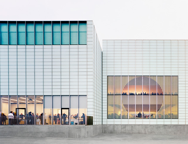
Turner Contemporary, Margate. Image courtesy David Chipperfield Architects London.
VS: There are always wonderful details in your buildings, which reveal themselves with repeated visits. How important do you think that is?
DC: I don’t see details as a separate thing. Details don’t replace ideas, but on the other hand they can sensitise. This is the thing I love about Japan – and I have worked a lot in Japan - that, quietly, you realise that everything has been well thought about and that heightens your experience of everything. Your glass of water tastes better because the glass has been beautifully chosen. It’s still the same water, but something about its presentation makes you appreciate it more.
• Freespace, the 16th Venice Architecture Biennale, takes place at the Giardini and the Arsenale, and other venues in Venice, until 25 November 2018. Watch David Chipperfield’s opening lecture, Beyond Purpose, here. David Chipperfield Architects Works is at the Basilica Palladiana until 2 September 2018.