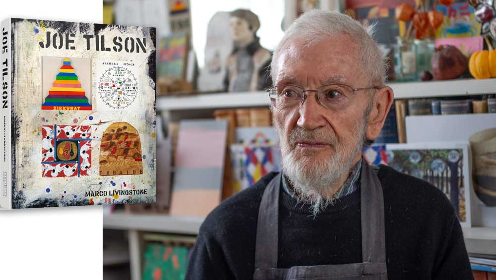
Joe Tilson, by Marco Livingstone, published by Lund Humphries, London. Right: Joe Tilson. Photo: Nick Howard.
reviewed by JANET McKENZIE
The British artist Joe Tilson (b1928) is the subject of a beautiful monograph by Marco Livingstone that the author describes as a collaborative project with the artist, his family and friends and his publisher. Designed by the artist’s son, Jake Tilson, painter, printmaker and graphic artist, the volume, published by Lund Humphries, includes more than 600 colour and black-and-white illustrations, and is a major contribution to the history of British art and culture. This is the latest in a series of publications by Livingstone, including on Peter Blake, Adrien Berg, Patrick Caulfield, Peter Kinley and Richard Woods. The author and publisher are making an important documentation of postwar British art and culture.
Tilson, now in his 90s, is remarkable for still being inventive and active and for maintaining the highest standards of practice throughout a 70-year career. His studio practice is based on a rigorous training in stonework, plastering, carpentry, joinery and metalwork at the Brixton School of Building in London, and he started work as a carpenter before being called up to serve in the air force during the war, based for a time in Italy. After the war, he studied in London at St Martin’s School of Art (1949-52), where he met Frank Auerbach and Leon Kossoff, and then at the Royal College of Art (1952-55). In 1955, he was awarded the Rome Prize, enabling him to spend two years in Italy, where he met Joslyn Morton, who was studying with Marino Marini, and whom he later married. On returning to London, he met David Hockney, Allen Jones and Caulfield.
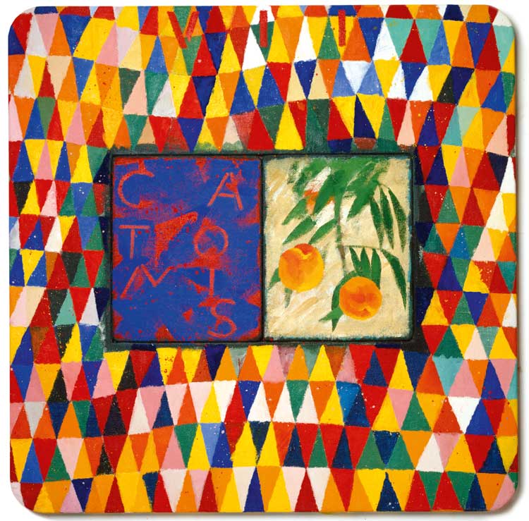
Joe Tilson, Conjunction Peschi, Catonis, 2003. Oil on canvas on wood, 138 x 138 cm. Cristea Roberts Gallery, London – Advanced Graphics, London. Photo: Tilson Family Archive. Page 162 in book. © Joe Tilson. All Rights Reserved, DACS 2023.
From the 1960s, Tilson was taken up by the Marlborough Gallery, established by the Jewish émigrés Harry Fischer and Frank Lloyd. He continued to exhibit at their galleries in New York and Rome until 1977 when he joined the Waddington Galleries. He rejoined the Marlborough Gallery in 2011. To mark the launch of Livingstone’s book, two exhibitions took place at the Marlborough’s London gallery earlier this year Joe Tilson: Modest Materials and A-Z Box of Friends & Family, the latter based on his 1963 exhibition of the same title, and they included work by Auerbach, Peter Blake, Hockney, Tilson’s wife, Joslyn, and daughter Anna. Another exhibition this year, Joe Tilson: Breaking the Rules, was shown at Cristea Roberts Gallery, London.
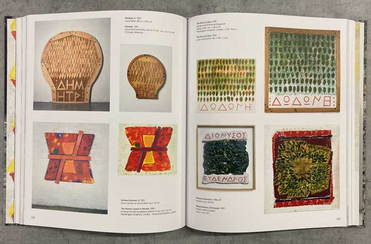
Joe Tilson, by Marco Livingstone, published by Lund Humphries, London.
Livingstone divides his study, which is, surprisingly, the first monograph on Tilson, into chapters that coincide with the decades in which Tilson worked. Chapter 2 explores the pop years, during which Tilson established a name as one of Britain’s most important young artists. By the end of the 60s, the Tilsons were disillusioned with city life and moved to Wiltshire, where they spent the following decade, covered in chapter 3. Entitled A Labyrinth of Languages, it explores Tilson’s intensive investigation into timeless forms – ziggurats, obelisks, spirals, interlocking shapes and ancient symbols in contrast to intense colour and pop culture. Chapter 4, The 1980s, Unity and Wholeness, reveals Greek mythology and terminology coming to the fore. Chapter 5, Le Crete Senesi and Conjunctions, covers the 1990s into the 21st century. Chapter 6, The Venice Years, discusses the lifelong importance of Italy to his life and work.
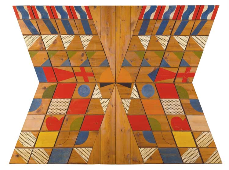
Joe Tilson, For Jos, January 1st, 1963. Oil on wood relief, 182.8 x 243 cm. Waddington Custot, London. Page 8 in book. © Joe Tilson. All Rights Reserved, DACS 2023.
The role of antiquity throughout the history of western Europe is central to Tilson’s coherent oeuvre. The visual excitement of his early work, which continues to resonate in recent work, is in part created by juxtaposition, by contrast and visual play with geometry, pattern-making and the loveliest use of colour. He employs a range of materials and methods that make his work distinctive and real. A sincere and curious individual, he has never lapsed in terms of rephrasing his concerns, of exploring ideas and making by hand, language (spoken, written). In pictorial terms, his bold, simplified forms, the frontality of the images and centralised compositions indicate the absorption of numerous aspects of European matter painting and American abstraction. His works are immediately recognisable.
Although he became well known as a pop artist, Tilson moved on from the use of contemporary imagery after just 10 years. Unlike Andy Warhol, Richard Hamilton and Blake, he did not love contemporary imagery and use it out of a fascination for commercial art and graphic design. Yet the work made during the 60s can be seen to inform the energetic practice that continues today.
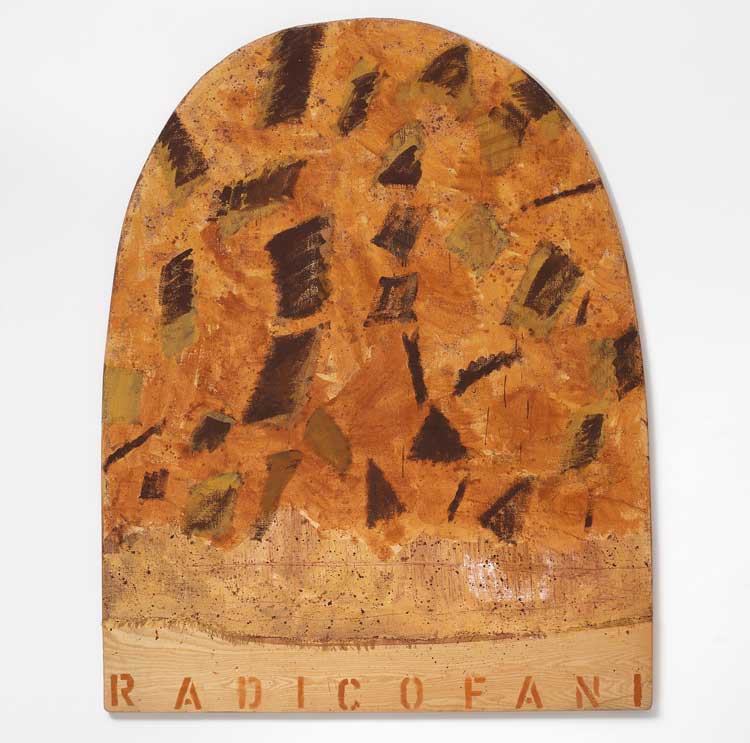
Joe Tilson, Le Crete Senesi, Radicofani, 1993, mixed media on canvas on wood relief, 205 x 175 cm. Marlborough Gallery, London. Photo: Mark Dalton. Page 145 in book. © Joe Tilson. All Rights Reserved, DACS 2023.
Livingstone points out: “Many of the guiding principles, systems, materials and structural methods of that formative period remained in evidence in his later art, constantly transformed and reinvented. Tilson never rejected the pop works through which he made his international reputation in his 30s. Instead, he continued to draw on them as a well of experience and as a foundation for the creative inventions that continued to define him as an artist for whom originality always entailed a recognition of the necessity of links with the (recent and distant) past.”
Perhaps the most distinctive aspect of Tilson’s work is his insistence on the handmade and an original use of carpentry. At a time when technology was galvanised to produce multiples, and huge abstract works were being produced, Tilson achieved monumental results through the most traditional of crafted materials, wood. But he gave it energy and flamboyance, infusing it with the power of geometric abstraction. The relationship with his picture plane made in wood and an architectonic space perhaps reveals a debt to the Bauhaus masters’ belief in trueness to material, but also the kinetic spatial drama created by an artist such as Oskar Schlemmer or the metaphysical world of Carl Andre, although Andre’s beautifully crafted pieces were made by assistants.
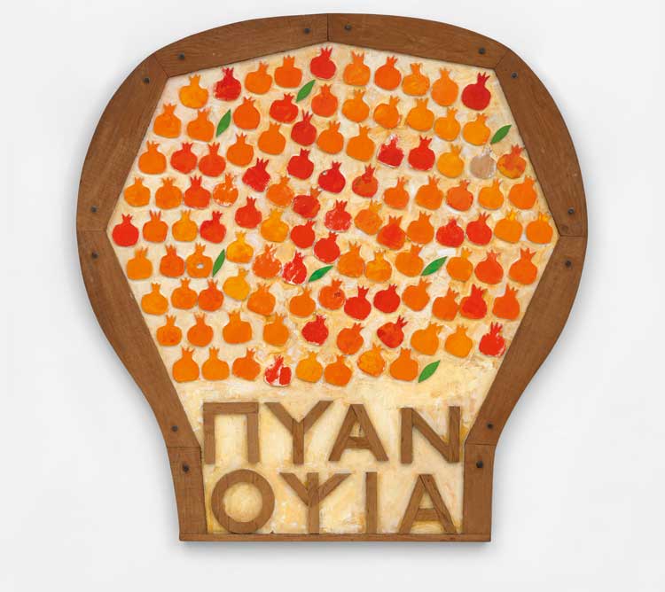
Joe Tilson, Pyanopsia Version B, 1982. Oil on wood relief, 188 x 181 x 4 cm. Marlborough Gallery, London. Page 113 in book. © Joe Tilson. All Rights Reserved, DACS 2023.
Tilson’s range of influences is well described by Livingstone’s description of A-Z Box of Friends & Family. “Nowhere in Tilson is his concern with the collaborative nature of art more in evidence than in [this work], a portable museum of small paintings and constructions by his wife, small children, and an impressive array of the new stars of the British art world. Allotting different letters of the alphabet to each person, either by their first name or their surname, and then slotting them into place in a grid-like construction in three rows, he orchestrated a perfect demonstration of one of the founding principles of the Royal College brand of pop art: that contrasting and even apparently conflicting modes of representation can coexist within a single work so long as there is a conceptual unity linking them. David Hockney, Allen Jones and the American RB Kitaj, all part of the extraordinary 1959 intake at the Royal College that Tilson befriended, make significant appearances within the alphabetical roll call of Tilson’s peers at this vital moment in the evolution of pop art.”
Disillusionment with the modern life that had been encapsulated by art, the film industry and media was widespread, and it coincided with the height of the Vietnam war and the civil rights movement. The assassinations of the charismatic figures of US president JF Kennedy, in 1963, and, in 1968, his brother, Robert F Kennedy, and the Reverend Martin Luther King Jnr, who had bravely highlighted the injustices of consumer society, combined to create a terrible outlook for humanity’s future.
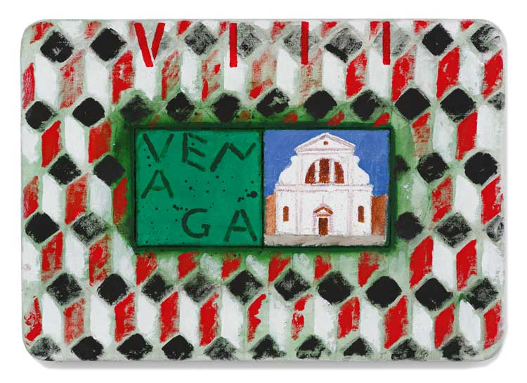
Joe Tilson, The Stones of Venice San Trovaso, Venaga, 2014. Acrylic on canvas on wood relief, 60 x 85 cm. Marlborough Gallery, London. Page 181 in book. © Joe Tilson. All Rights Reserved, DACS 2023.
Livingstone again: “The art in which Tilson most enthusiastically employed advanced methods and materials in the late 1960s – including, in particular, the Pages series, in which he made reference to the front pages of underground and counterculture newspapers and that featured such heroes of the radical left as Che Guevara, Malcolm X, Martin Luther King Jnr and Ho Chi Minh – turned out, paradoxically, to be his swansong of the decade. It was in these hybrids of painting and sculpture, among his most powerful and also most politically motivated works to date, that he bade farewell to the pop years.”
His fascination with technology and, indeed, city life ended in 1972 when the Tilson family moved from London to Wiltshire and when they also acquired a house near Cortona in Tuscany. Their life there was based on the wish to live in harmony with nature. Alchera: Notes for Country Works was first published in 1973 to accompany the exhibition at the Museum Boijmans van Beuningen in Rotterdam. In it, Tilson explores the centrality of mnemonic systems. Even at the height of his pop art, Tilson was interested in antiquity and in exploring structures such as ziggurats, ladders and mazes, using them as metaphors for human experience. Circles refer to Native American understanding of the world: Livingstone says: “Emblematic images, words and concepts, each triggering associations, have been central to his belief in many types of language (both visual and verbal) as carriers of content.” A belief in “collective memory” led to Tilson moving from a pop art view of culture to cycles in nature, to the writings of Carl Jung and the role of archetypes in human consciousness, of the prevalence of patterns in multiple societies at different points in time, a desire to find order within the world and within the cosmos. In the retreat from city to rural life, he sought a life closer to nature and the addressing of ecological issues, countercultural movements that question technology and the future of the planet. Livingstone says: “The head-spinning complexity of his web of references took in, among other things, the 13th-century Catalan mystic Ramón Llull, 20th-century writers such as James Joyce, Ezra Pound and WB Yeats, Native American culture, the dreamtime of Australian Aborigines … and a spectrum of world religions … his interest in numbers, like Joyce’s, was in numerology – the belief that they have a magical significance – rather than in mathematics.”
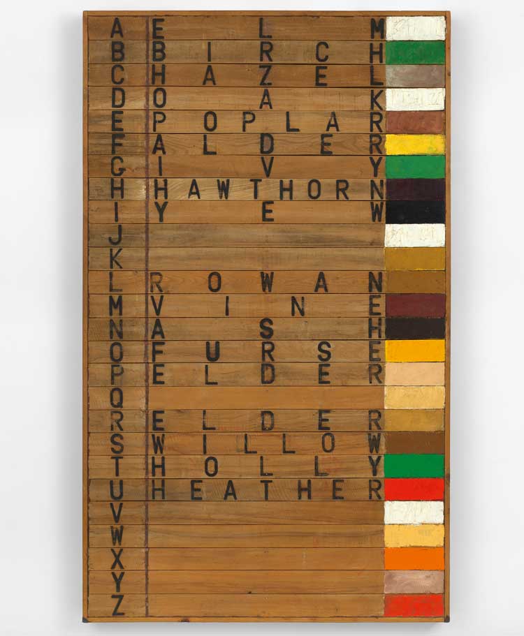
Joe Tilson, Tree Alphabet, 1973. Oil on wood, 235 x 141 x 10 cm. Page 69 in book. © Joe Tilson. All Rights Reserved, DACS 2023.
Livingstone is quick to point out that what might have remained in the world of the esoteric and intellectual is always filtered through his strong sense of design and form. Thus, the viewer experiences a memorable sensation of encountering something minimal in Tilson’s work that lingers in the memory with mystery and an enigmatic sense of purpose. “Ultimately,” says Livingstone, “we are invited into a realm of timelessness and infinity, one that removes us from the trivialities of everyday existence in order to focus on broader patterns that insist on our place within the much greater sweep of human history and of nature itself.”
Livingstone, according to Tilson, is a bridge between his work and the world. This is spot on. He weaves biographical detail that comes from knowing Tilson and his family since the 80s, with an authority of British art history of which he has been one of the most important documenters and interpreters. This is splendid and important new title.
• Joe Tilson, by Marco Livingstone, is published by Lund Humphries, London, May 2023, price £45.