Pace Gallery, New York
15 September – 21 October 2017
by PAUL CORIO
The artistic pilgrimage, in which the young artist is profoundly transformed after travelling a great distance to experience a particular work or to study at the feet of a great master, is one of the more enduring and appealing narratives in the collective mythology of art. Painter John Hoyland’s 1964 trip from London to New York City on a three-month travel grant is a textbook example of said narrative, and the canvases he produced on returning to London, at the tender age of 30, are the metamorphic ending to the story. Seven of the large-scale stained acrylic paintings that comprise that coda are now on display at Pace Gallery in the late artist’s first New York exhibition in 25 years.
To say that Britain was a backwater for abstraction in the early 60s would be an overstatement – but it would certainly not be an exaggeration to say that New York City was at that same time the centre of the abstract painting universe. It was also a transitional moment; abstraction was shifting from the emotive sluices of paint associated with abstract expressionism to the cool, colour-driven fields of so-called post-painterly abstraction. That particular change all took place under the watchful, astute and, many would say, tyrannical eye of the powerful critic Clement Greenberg.

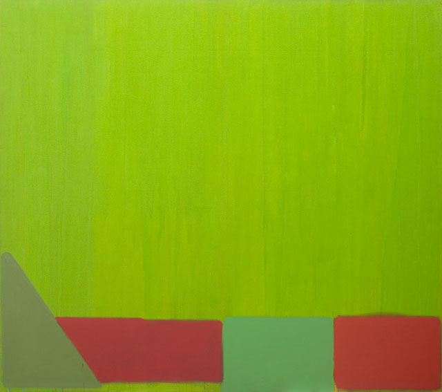
John Hoyland. 29.6.65, 1965. Acrylic on canvas, 85 x 96 in (215.9 cm x 243.8 cm). © The John Hoyland Estate. All
rights reserved, DACS 2017. Photograph: Colin Mills, courtesy of Pace Gallery.
The young Hoyland (1934-2011) didn’t arrive in New York as a wide-eyed naïf; he knew whom he wanted to meet and what he wanted to ask them. And in those short three months he met Greenberg and many of the key figures of the New York School as well as the emerging colour-field painters. The two principal aspects of these interactions as manifested in the works Hoyland made on returning home are the staining technique, invented by Helen Frankenthaler and perfected by Kenneth Noland and Morris Louis, and Greenberg’s notion of the “optical space,” which is fundamentally two-dimensional and stubbornly resistant to the illusion of depth. But even as Hoyland internalised the Greenbergian dogma of flatness, the painter’s deviations from it are precisely what makes the young British artist’s canvases so interesting. Twentieth-century European painters, all children of the Renaissance, were notoriously resistant to dropping the figure as well as the perspectival illusion of space that the figure inhabits.

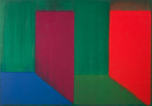
John Hoyland. 7.11.66, 1966. Acrylic on canvas, 84 x 120 in (213.4 cm x 304.8 cm). © The John Hoyland Estate. All
rights reserved, DACS 2017. Photograph: Colin Mills, courtesy of Pace Gallery.
Six of the seven canvases in the show strongly suggest architecture, landscape, or both. In the overtly architectonic 7.11.66 (1966), an enormous green field is dominated by two large wall shapes, one red, one red-violet, which unflinchingly reference one-point perspective. These walls symmetrically divide the picture into two equal spaces, both without a roof or rear wall, giving the impression not of enclosed rooms but of an expansive exterior landscape. This is a picture that the artists around Greenberg could not have made. Hoyland, as an outsider to that group, was not only free to explore perspectival space nested within a colour field, but his European-ness made it a very natural avenue for him. As much as I admire Greenberg and the artists around him, I have always felt that the quasi-religious rhetoric of purity adapted from Kant was a problem, and have often wondered what the colour painters could have come up with without feeling the weight of that restriction. This impressive Hoyland canvas answers that question quite neatly.

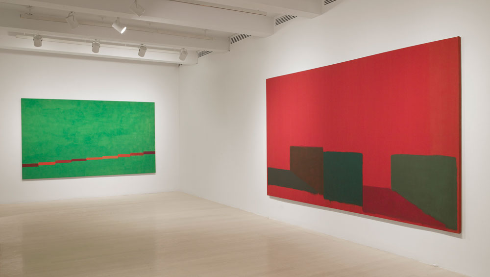
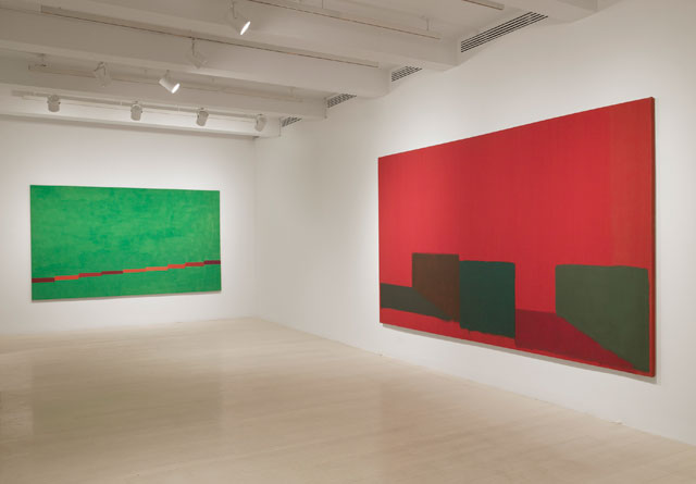
Installation view of John Hoyland: Stain Paintings 1964–1966, 32 East 57th Street, New York, September 15 – October 21, 2017. © The John Hoyland Estate. All rights reserved, DACS 2017. Photograph: Tom Barratt, courtesy Pace Gallery.
The colour throughout bears comment, both in terms of the palette and the application of paint. The staining technique famously embeds the pigment into the canvas, and the result is a surface that has no reflectivity whatsoever. Where Hoyland differs significantly from Frankenthaler, Noland and Louis is in the sheer number of layers of stain he applies, the result being intensely saturated hues and also passages of opacity that were not common to the Americans’ work. The sum total of all of these factors creates a condition that phenomenologist David Katz referred to as “film colour”,1 wherein the colour becomes disengaged from the surface to which it belongs – it seems to float in an indeterminate place between the canvas and the eye of the viewer. This colour sensation, analogous to light itself, is at odds with the architectural forms to which Hoyland nominally attaches these colours, and the tension between these two readings is one of the things that makes the pictures exciting to look at. I am highlighting no picture in particular as an example because this pertains to the entire exhibition.
It is also important to point out that the field in five out of the seven paintings in the show is green. If you comb the full catalogue of major American colour-field paintings, you will find relatively few such examples, and I think the reason is quite simple – large green fields specifically call to mind landscape, and the explicitly referential was what the Americans were trying to avoid. Again, Hoyland’s European sensibility is on view; it was taken as an article of faith throughout the history of European painting that its relationship to nature should be kept foremost in the painter’s mind. Of the show’s green canvases, the magisterial 7.65 (1965) was my favourite; it is the only vertical on view, and at 10ft (3m) tall it looms like a forest. The handling of the edges here is quite brilliant: Close value primaries and secondaries (a colour device seen throughout the exhibition) frame the left and bottom, while the top and right are left completely open. The picture thus feels wedded to its specific shape and size while simultaneously expanding beyond its boundaries without limit.
It would be impossible to talk about these paintings without the attendant discussion of Greenberg and the American painters around him – but I think it would also be wrong to view Hoyland as a secondhand version of those artists. He took what he could use from that group, left behind the more cumbersome aspects, and applied a distinctly European outlook and approach. The result of the bargain Hoyland struck is that, 50 years later, the paintings don’t look dated in the least – something that cannot be said of some of the contemporaneous American paintings. I highly recommend this show to anyone who really cares about painting.
Reference
1. The World of Colour by David Katz, published by Kegan Paul, Trench, Trubner, 1935.