by JANET McKENZIE
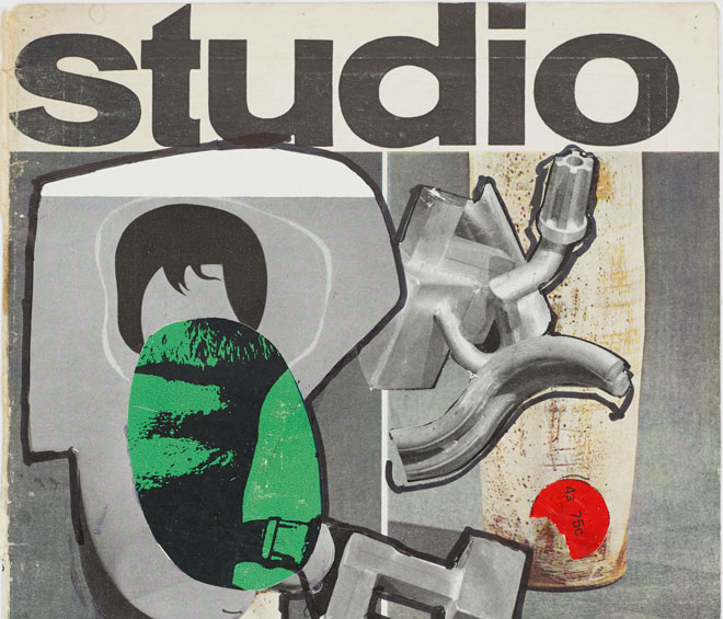
London-based artist Neil Gall has a new body of work on show at the Henry Moore Institute. The Studio: Cover Versions comprises about 70 collage works in which the artist cuts into copies of The Studio magazine, manipulating the imagery and typographies with his own drawings. The work was prompted by a substantial collection of back issues of the magazine given to him by his former secondary school art teacher, Ruth Lough. She, in turn, had been introduced to the magazine by her art teacher, Dr Dickson, who would bring copies into the art class at her school in Edinburgh in 1946. The Studio left a huge impression on her. She says: “Our world was small, restrained, relying mainly on verbal input, and the magic of books. Books, held in the hand, were cherished by staff and students alike, and devoured cover to cover.”1 The Studio offered an unusual and inclusive mix of ancient and modern art with idiosyncratic special editions and yearbooks; it was emphatically international. In 1964, it was relaunched as Studio International and once again became an important voice for international art. This year marks the 125th anniversary of the founding of The Studio.
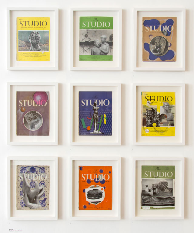
Neil Gall. The Studio cover versions. installation view, Henry Moore Institute.
To mark its centenary in 1993, The Studio Trust collaborated with the Victoria and Albert Museum on the exhibition High Art and Low Life: The Studio and the Arts of the 1890s. Clive Ashwin, honorary librarian and archivist of Studio International, in his essay The Founding of The Studio, which appeared in the exhibition’s accompanying catalogue, High Art and Low Life: The Studio and the fin de siècle, wrote: “In April 1893 a new art magazine entitled The Studio appeared in British newsagents. Subtitled an Illustrated Magazine of Fine and Applied Art and costing sixpence, it rapidly established itself as one of the most enduring and successful art periodicals in the English-speaking world. Its influence was felt not only in the UK, but on the continent of Europe, in Scandinavia and in the USA, and virtually all art periodicals founded in the ensuing decades owed some debt to this pioneer of art journalism. The reasons for its success are not immediately obvious – certainly not from the perspective of a century later. The Studio was not conspicuously radical in outlook, ignoring many of the foremost art trends of the 1890s. The early issues are not ravishingly beautiful objects to see or handle, certainly in comparison with some of the publications that were to follow. It was not even particularly about art: most of its content covered aspects of craft, design and architecture.”2
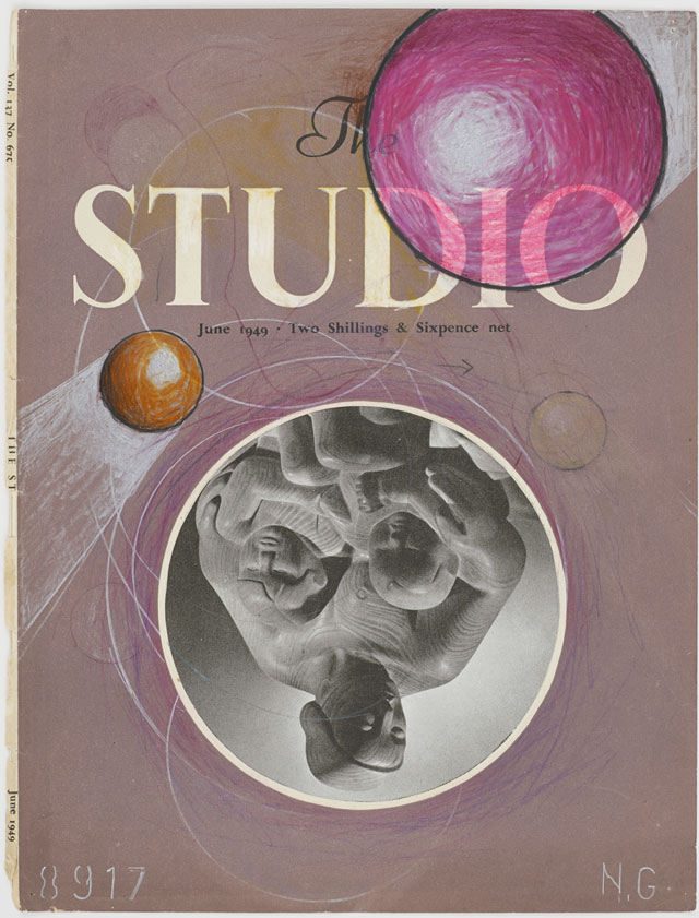
Neil Gall. The Studio, Grinling, 2017. Collage. © the artist.
The international flavour was an important factor: the founder, Charles Holme (1848-1923) travelled widely and had trading interests in Asia, particularly with Turkestan, India, China and Japan. He had a passion for Asian artefacts and was a founder member of the Japan Society. He was so successful that he retired at 44 to devote himself to founding The Studio. The first editor Joseph Gleeson White (1851-98) had grown up outside London and Ashwin attributes this fact to the wide appeal of the magazine’s early readership: “In order to achieve and maintain a mass circulation, an art magazine had to speak to the condition of readers who by definition did not live in the metropolis or within easy reach of art galleries and fine design and architecture. Under White’s editorial direction The Studio was to bring information and debate on art to small provincial towns and the countryside as well as to the capital, to the amateur, the student and the enthusiast as well as the professional.”3
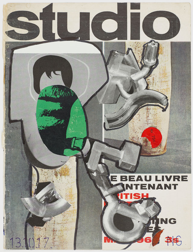
Neil Gall. The Studio, Spoleto, 2017. Collage. © the artist.
The gift of the back issues of The Studio appealed to Gall (b1967). Having trained at Gray’s School of Art, Aberdeen, he has evolved a practice that is centred on drawing. The relationship between drawing and sculpture underpins all his work, so The Studio covers that featured a great deal of sculpture were, he explains, “image-generators”. They have enabled him to explore the dualities inherent in the magazine issues through the sculpture in the 1940s, 50s and 60s particularly, between figuration and abstraction, between painting and sculpture and between black and white and colour. Gall admits to finding the magazine covers irresistible for drawing. Cutting circular windows and holes and the subsequent layering of them creates a kind of window or portal through which to explore the art of these postwar years.
The new body of work is an act of “renewal” and occupies the context described within contemporary drawing critique as a pivotal aspect of the creative process. This creative process evolves from personal experience, formal education, and a dialogue with art from the past. Research can be oriented to a specific, or it can be a private dialogue, with art-historical phenomena. It can be short-term or a life-long endeavour.4 Jon Wood, head of research at the Henry Moore Institute in Leeds, in his essay Cover Versions, cites German-Jewish literary critic and cultural historian Walter Benjamin’s essay Unpacking My Library: A Talk about Book Collecting. Wood observes: “First published in 1931, this short text is one of the most intimate accounts of the passions of book collectors, offering fascinating insights into the deep personal bonds between collectors and their books, and their love of them as material objects. That the essay was inspired by Benjamin’s experience of unpacking boxes of his own books and contemplating them ‘not yet on the shelves, not yet touched by the mild boredom of order’ is crucial to this, allowing the author to ruminate on them beyond the library with its indexes and systems, and instead as containers of other kinds of memories and desires”.5 It is a poignant observation with which to mark the 125th anniversary of The Studio.
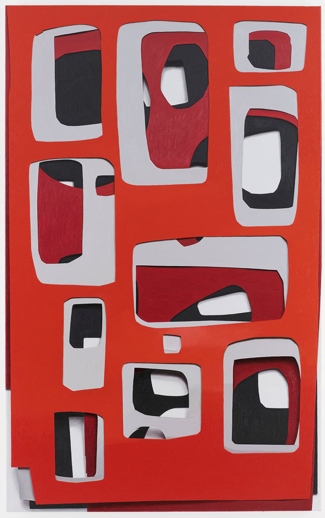
Neil Gall. Crafty, 2016. Oil on canvas, 112 x 70 cm. © the artist.
Studio International visited the artist in his studio in north London where, in addition to the current show at the Henry Moore Institute, he is preparing for a major show, Covers and Counterfeits, at the Metropolitan Arts Centre in Belfast.
Janet McKenzie: I have been to see The Studio: Cover Versions exhibition in Leeds and here we are in your London studio and I have realised that, in reproduction, your three-dimensional drawing looks very different from the way it looks in the flesh. Your methods have developed over the years and they include the repeated cutting of circular windows, like spyholes. Your drawn work is made up of circles and layering. After seeing The Studio: Cover Versions, I wonder if they might they be understood to be a lens or optical device to focus on aspects of art history?
Neil Gall: In The Studio collages, yes, I do see these spaces as openings, as some kind of apertures that allow a meditation on history. Sometimes, it is very literal. In Augustus Peeps (2017), for example, the trompe l’oeil torn paper reveals an image of Augustus Johns staring out. It is history looking back at us, quite funny and spooky at the same time. In the paintings, I think the openings or cuts prompt a more visceral response: our mind knows perfectly well it’s only a painted hole, but your gut is saying something else, that it really is a tear through to the wall, a puncture, or a way through to another dimension even.
JMcK: The drawing on the wall that carries yesterday’s date is superb. Can you tell me something about it? How long has it taken?
NG: A drawing like that takes about a month. It is a slowly built-up thing. By chance, also on the wall are the back covers of The Studio; they are like a sketchbook, throwaway image-generators. Next to this drawing, it is quite clear to see the formal relationship in The Studio covers between the dots and holes, elements that add some of the energy. You can see some of the sculptural elements that exist in the drawing.
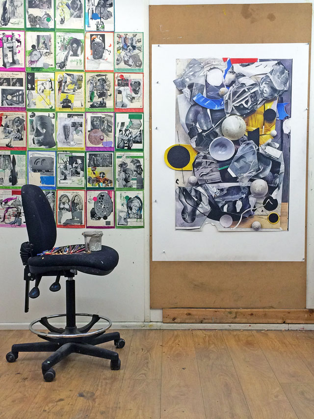
Neil Gall. Studio view, London, April 2018.
JMcK: It’s very three-dimensional.
NG: This is the 3D maquette, in low relief. The sculptural forms in the drawing are pieces of sculpture that have been illustrated in The Studio and it has now permeated all my main work. It started as a side project that was a bit of fun.
JMcK: Was it intended to be at all subversive?
NG: I’m fond of the magazine, although occasionally I’ll poke fun of it because there are sometimes pieces, not editorial content or the reviews, but adverts that were overtly racist – Sketches in Black or White advertising conté pencils with a golliwog character wearing a hat and smoking! I’ve chosen to collage it, so I’m slightly flagging up that there were such things going on. As a prism through which to view our history, it is relevant and we can learn things about how artists’ careers can go up and go down, for example. It’s not so different from today. What is interesting is that it is called The Studio. An art magazine starting out would not be called that today. It’s a post-studio world we live in where artists don’t always have studios. It’s full of adverts for art materials, which is a completely archaic idea now. Can you imagine that today, in Frieze? It would more likely be an ad for Burberry. In the fantasy world of post-modern critical theory, it’s a post-studio world.
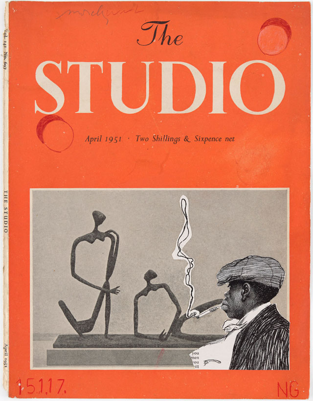
Neil Gall. Sketching in black or white, 2017. © the artist.
JMcK: The covers you have chosen are distinct in their muted palette: reds, blues, greens and greys. The magazine, however, was predominantly black and white.
NG: The covers from the 1950s like this one, were very matte, like school jotters. It was the main colour in the magazine and it was tempting to deface it, draw on it. When the Studio International covers became glossy, there was less temptation to engage with them in this way. Then my art dealer, Aurel Scheibler from Germany, came and saw these on the studio wall and thought they were great. Within weeks, some works were off to the Cologne Art Fair and some Studio covers were included. What was interesting was that one of those was dated 1946 and it was one of the earliest volumes that I was given by my secondary school teacher, Ruth Lough. If you think of her as a school pupil in Edinburgh getting the magazine and, then, 50 years later, having passed it on to me, it is going to the Cologne Art Fair. Cologne had been the heartland of German industry in the 1940s, and now it is going to Germany as an artwork. When my German art dealer, who then would have been our enemy, visited my studio and responded positively to the work, it felt like a vindication.
JMcK: In Australia, like Scotland perhaps, the magazine was one of the few means through which young artists learned about the wider world. Arthur Boyd and his contemporaries made a beeline to the state library of Victoria when the new edition of Studio was due. It was the only contact with the outside world, the only magazine the library had a subscription to that was international. Can you tell me about the drawing you finished yesterday and the relationship between your drawing and your sculptures?
NG: One of the reasons there were a lot of sculptures reproduced on the covers of The Studio is that sculpture reproduces better than painting in black and white. A painting, no matter how good, is very boring in black and white, yet a sculpture when it is well lit immediately has volume. Sculpture in reproduction is often better than the real thing.
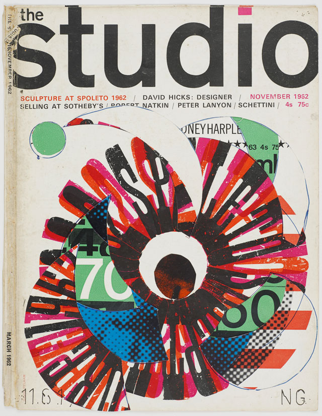
Neil Gall. The Studio, Pin-up, 2017. Collage. © the artist.
JMcK: Does that also explain your fascination and repeated use of ping-pong balls bound together with black electrical tape, which could be described either as sculptures or spatial drawings?
NG: There will be eight cast resin or bronze sculptures in Belfast. I've always been interested in sculpture: in fact, I almost chose it as a main area of study over painting while doing my degree at Gray’s in Aberdeen. In Scotland, you do your foundation within the four-year degree course and I remember it being a tough decision.
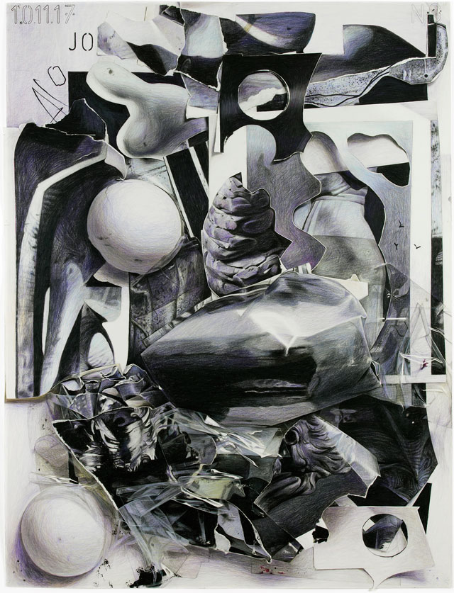
Neil Gall. Against Nature, 2017. © the artist.
JMcK: You seem to want to confuse the senses of the viewer?
NG: There’s a lot of artwork made from materials that are not traditional materials – detritus, found objects. It’s a well-trodden area of practice. It’s exciting making something from nothing, replicating it in another medium, whether it’s a detailed drawing or replicating it in bronze. There’s a sense of ownership. You are more engaged because of the forces of time. It’s sort of magical because you don’t do these things lightly. It’s easy to do something quickly: it doesn’t have any kind of meaning until you own it.
JMcK: In the drawing Untitled (2018), which has yesterday’s date on, the inside of an eggshell, which is so perfect and beautifully rendered is pitched next to an object that is cut, which is quite savage, possibly destructive, as if you have taken a blow torch to a surface. What is the meaning of the cut circles?
NG: As an artist, you are almost trying to find a new kind of beauty.
JMcK: It’s a rhetorical question because this is a superb, intriguing drawing, full of curious surfaces and materials. The dichotomy lies in surfaces that are so different: juxtaposing something that is perfect and knowable – the egg – with forms that are defaced and inscrutable. There are aspects of the drawing that resonate with Giorgio Morandi (1890-1964) or Giorgio de Chirico (1888-1978).
NG: The egg shape is appropriated from a shaped canvas by Lucio Fontana (1899-1968); on a formal basis, it is concerned with finding space on the flat picture plane. I explore things formally and I even describe myself as an abstract painter. The ping-pong balls are obviously bodily, bulbous forms; the tape is detritus. When my children were young (18 years ago), I used balloons and plasticine. It is a way of understanding a form – mapping is describing or locating form in space and identifying the dynamic it creates. Spatial dynamics and the energy it unleashes pave the way for huge possibilities. The drawing on the wall is the final in a series of four large drawings. They are large, coloured pencil drawings and two will be in the Belfast exhibition. The new one on the wall is actually the first to feature colour. The others are not quite black and white: they have hints of mauve, Payne’s grey, various blues, stains of ochre and browns. I think you are right to evoke Morandi or De Chirico. I certainly would hope there is a little of that kind of quiet, unsettling surrealism that both those artists epitomise.
References
1. Thinking Again by Ruth Lough. In: The Studio: Neil Gall, published by Domobaal editions, London, 2018.
2. The Founding of The Studio by Clive Ashwin. In: High Art and Low Life: The Studio and the fin de siècle, Studio International Special Centenary Number, Volume 201, No 1022/1023, published by The Arthur M Sackler Foundation for the Arts, Sciences and Humanities, New York, 1993, page 5.
3. Ibid.
4. See: Contemporary Australian Drawing by Janet McKenzie, published by Palgrave Macmillan, Melbourne, 2012, pages 18-20.
5. Cover Versions by Jon Wood. In: The Studio: Neil Gall, op cit.
• Neil Gall: The Studio – Cover Versions is at the Henry Moore Institute, Leeds, until 2 September 2018; Covers and Counterfeits is at the Metropolitan Arts Centre, Belfast, until 29 July 2018.