Sainsbury’s Centre for Visual Arts, University of East Anglia, Norwich
24 March – 2 September 2018
by VERONICA SIMPSON
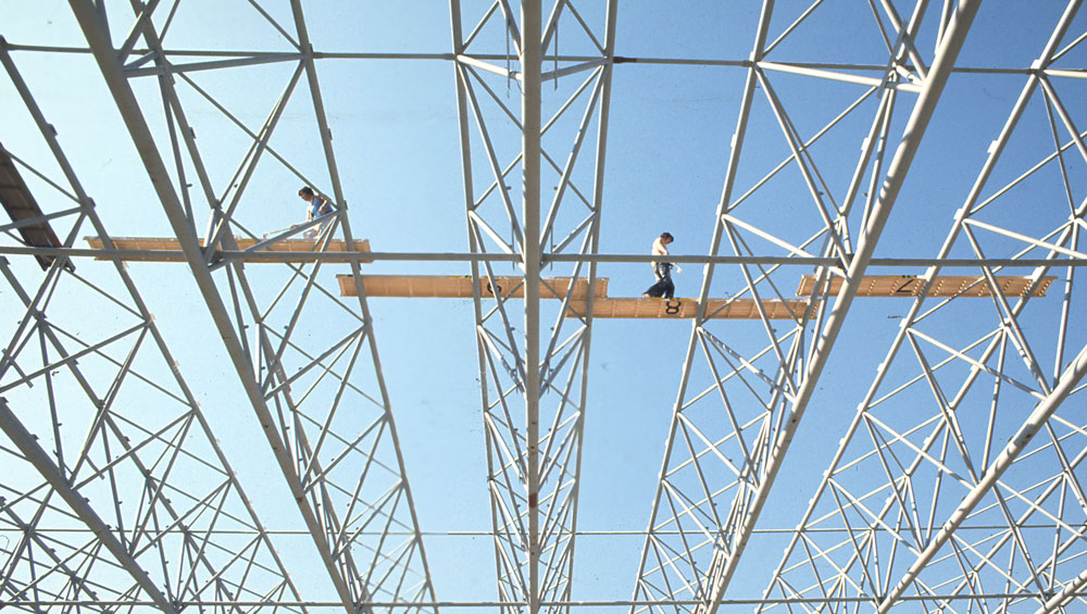
An unusual quality of light and weightlessness characterises the Sainsbury Centre for Visual Arts at the University of East Anglia. Standing inside this vast, 1978, steel-frame, prefabricated shed, it feels like being enveloped in a soft, cuboid cloud: a silvery sort of daylight filters around the shuttering pinned to the porous metal frame, while bigger slabs of light penetrate deep into the building from huge glazed walls at either end; its distinctive, cloud-like sensibility is intensified by the thick, grey, wall-to-wall carpeting that mutes all sound – even conversation - to a soft, dreamlike murmur.
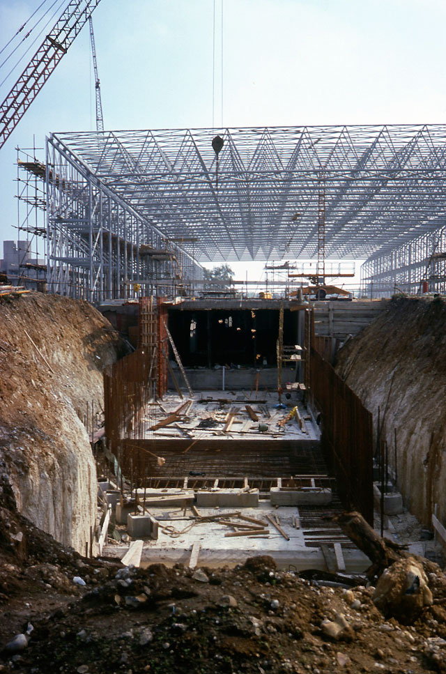
Sainsbury Centre construction, 1975-1978. Photograph: © The Art History Photographic Collection, University of East Anglia, Michael Brandon-Jones.
Designed by Sir Norman Foster and his wife Wendy (née Cheesman), soon after they had set up Foster Associates, in spirit, this structure is light years away from the slick, commercial, steel and glass skyscrapers and temples to technology churned out by the now global practice – the UK’s largest - of Foster + Partners.
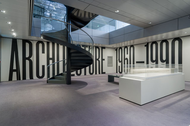
Installation view, Superstructures: The New Architecture 1960–1990 at the Sainsbury Centre for Visual Arts, Norwich, 24 March – 2 September 2018. Photograph: Andy Crouch.
Hospitable, flexible, playful, pragmatic, this building lands light on its feet and in the landscape: a testament to the spirit of experimentation in which this, and other key buildings of the era, were created. And it is those experiments in prefabrication, in shaking up the concrete solidities and spatial certainties of modernism in favour of a new kind of architecture that embraced replicable, rapid-assembly, modular construction and flexible usage that this Superstructures exhibition celebrates. Although the movement was dubbed “high tech”, that title has been rejected by the leading practitioners, especially Foster and Richard Rogers (who had set up in practice together, even before qualifying, as Team 4, along with Cheesman and Roger’s wife Su, née Brumwell). As Rogers says in his book A Place for All People (2017): “Norman and I were modernists, but were inspired by the amazing heritage of early industrial buildings, from the world’s first cast-iron bridge at Coalbrookdale in Shropshire, to the incredible lightness of [Isambard Kingdom] Brunel and [Joseph] Paxton, who used iron, steel and glass – the hi-tech materials of their day – to create great station sheds, bridges, glass houses and crystal palaces.”
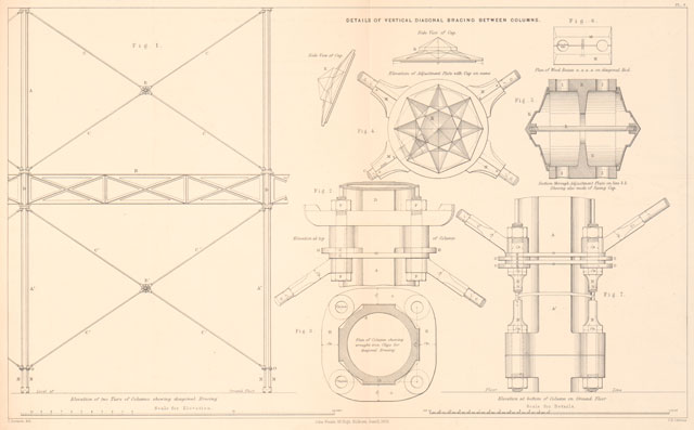
Crystal Palace: details of bracing between columns. Photograph: © Royal Commission for the Exhibition of 1851.
The exhibition may start with a model of the Sainsbury Centre – so that we can enjoy the frisson of standing in the real thing while looking at its first, conceptual incarnation – but the narrative here really begins with that era of Brunel and Paxton, with some elegant lithographs of Paxton’s Crystal Palace. Constructed in Kensington in 1851, it was dismantled in 1854 to be reassembled in south London (although, sadly, it was destroyed by fire in 1936). Thanks to co-curator Abraham Thomas’s past experience as director of architecture at the V&A – and his knowledge of what wonders lie in its and other people’s archives - there are many fascinating drawings, lithographs and photographs here. One gem is a framed grouping of pencil, pen and ink and watercolour renditions of one of Paxton’s unbuilt structures, from 1855. The Great Victorian Way is a 10-mile stretch of covered city that sealed houses, streets, railways and shops under its continuous glass and steel frame.
Other gems from the golden age of Victorian engineering include pen and ink drawings by architect Charles Fowler (1792-1867) of his Hungerford Market scheme (completed in 1830, demolished in 1862), and a dense cyanotype of the Queensferry viaduct for John Fowler’s Forth Bridge (constructed in 1882-89) – the first major UK structure to be made of steel.
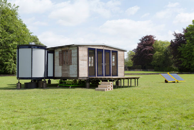
Jean Prouvé House, France. Photograph: © Galerie Patrick Seguin and Rogers Stirk Harbour + Partners.
But, pretty quickly, we move on 100 years to the optimistic, science-centric, space-race spirit of the 1950s and 60s, an era when cutting-edge practitioners were scheming how to integrate technology into architecture in ways that would make buildings more adaptable, expedient, extendable, flexible and disposable. Jean Prouvé, with his pioneering, “demountable” modular structures, is a key player. So is R Buckminster Fuller, who is represented here with two patented designs, for the Dymaxion Car (1937) and the Laminar Geodesic Dome (1965), and a chatty letter from Foster, addressing him as “Bucky”. There is also a mesmerising clip of film from Frei Otto – Modelling with Soap (1960s) – generated as part of his research into tensile structures, and eerily prescient of the undulating acrylic canopies that he draped from steel cables at the 1972 Munich Olympics.
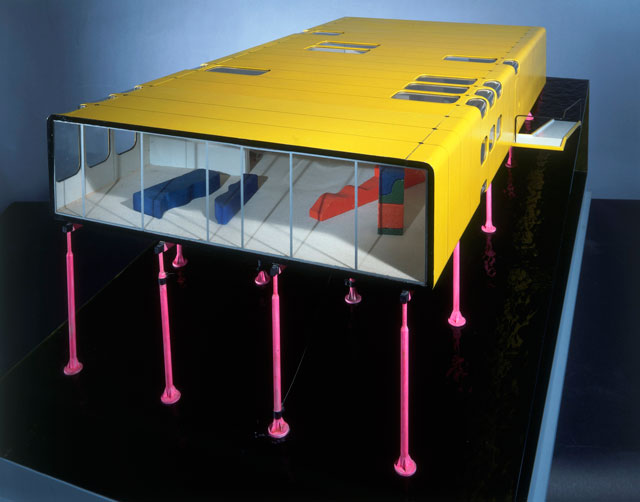
ZipUp House. Detail colour presentation competition model, scale 1:20. Photo: © Rogers Stirk Harbour + Partners, Eamonn O'Mahony.
Although the key British protagonists – Foster, Rogers and Nicholas Grimshaw – dominate the exhibition, Thomas and his guest co-curator Jane Pavitt, head of the school of critical studies and creative industries at Kingston University, wanted to present this movement in its “broad international context and influences”.
One of the most significant groups at this time - somewhat underplayed here - is Japan’s metabolists. With radical ideas about urban design as well as mass housing, there are just four drawings here, by Arata Isozaki, including his Clusters in the Air project, which allowed housing pods to be attached to tall structures, like leaves on a tree, with the idea that these could be multiplied to create an urban “forest”.
The early part of the exhibition relies heavily on paper exhibits, although there are some striking models, including one of the Messe-Leipzig Glass Hall, (1995) by architects Ian Ritchie and Volkwin Marg. This winter garden exhibition space, still standing, is the largest glass hall in the world. Glass panels are attached to its steel exoskeleton to create an uninterrupted interior of 350,000 cubic metres.
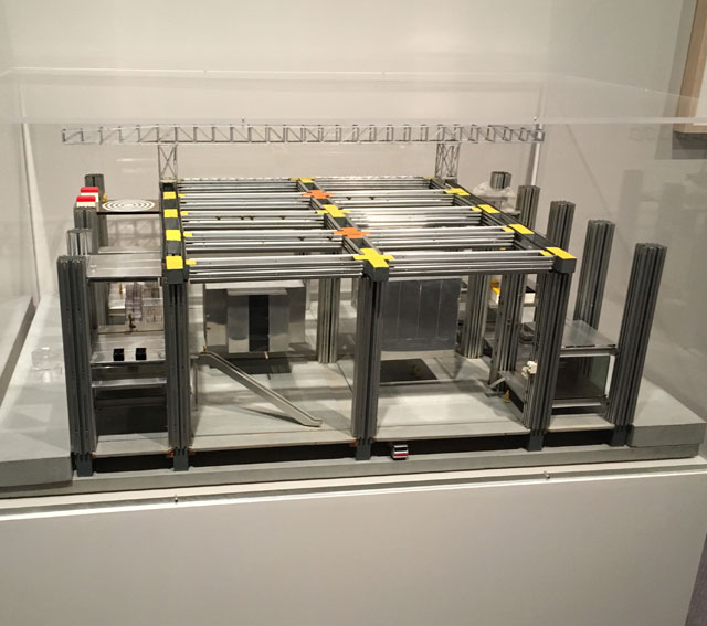
Cedric Price. Fun Palace Model, 1964. Wood, metal, glass, plastic, paint. Photograph: Veronica Simpson.
There is, of course, a large plan and model for Cedric Price and Joan Littlewood’s legendary Fun Palace, a hugely influential proposal for an interactive complex where educational, culture and leisure activities could cross-fertilise. Price’s proposal for a Potteries Thinkbelt (1963-67) is also featured, suggesting that England’s neglected ceramic factories could become a hub for engineering and technology (how very ahead of its time), with train cars repurposed as mobile lecture rooms, gantry cranes as temporary enclosures and industrial containers as housing pods.
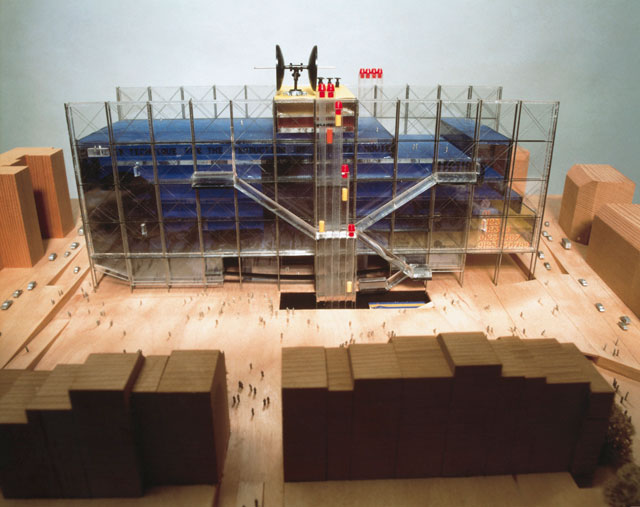
Centre Pompidou. Context model, competition stage, illustrating the double layered facade,
scale 1:50. Photograph: © Rogers Stirk Harbour + Partners.
For Thomas, the two anchor architectural projects are the Sainsbury Centre and Renzo Piano and Richard and Su Rogers’ Centre Georges Pompidou, completed in 1977. They both channel a huge dose of Littlewood and Price’s Fun Palace sensibility, in their notion of cultural hub as adaptable, permeable, social space. One of the delights of having the real artefact around us (albeit upstairs from the exhibition) is seeing how well the open gallery area in the Sainsbury Centre works – sculptures and paintings are placed in clusters, together with seating and desks, inviting groups to inhabit this free-flowing space as they see fit.
.-Black-ink-and-colour-letratone-on-paper.jpg)
Pompidou Centre Section with colour-coded key of parts and functions (1975). Black ink and colour letratone on paper. Photograph: Veronica Simpson.
But flexible, permeable cultural buildings that looked more like sheds were not always fashionable; in 1996, the Independent newspaper dubbed Foster “the architect the tabloids most love to hate”. There are many proposals of this era that didn’t get built, for example, Rogers’ proposed extension to the National Gallery – a 1981 competition entry that failed to win over either client or public, and which looks uncannily like the Lloyd’s Building (1986) that he designed subsequently. Shown here in diagram form, it is suddenly, wonderfully clear that the domed glass roof at the centre of Rogers’ Lloyd’s Building has been inspired by Crystal Palace – in fact, it was described in the Guardian by Jonathan Glancey as “Paxton’s Crystal Palace, crossed with a North Sea oil-rig”. Times and tastes change, thankfully, and in 2011, it was given a Grade I listing.
While one of the fascinating aspects of this show is seeing the buildings that didn’t get built, another is being introduced to buildings that didn’t last more than 20 years, such as Foster’s Fred Olsen amenity building: the first British building to be wrapped in a glass skin, it was slotted between two warehouses, with a roof that spanned a single, column-free space. Completed in 1970, it had been demolished by 1988. But expendability was part of the point – buildings that are easy and cheap to assemble, in theory, can be disassembled like a giant kit of parts, as and when taste and necessity dictates.
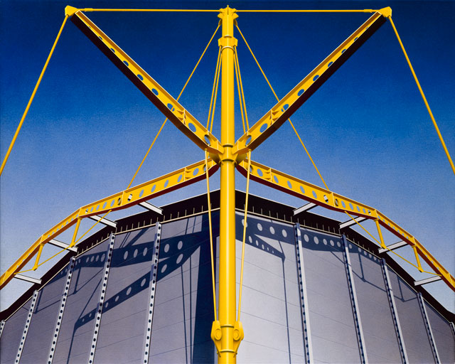
Ben Johnson. East Mast with Gridline Beam and Outriggers, 1986. Acrylic on canvas © Ben Johnson.
But most of the structures represented from the 80s onwards are still with us. The factories, for example: Rogers’ Fleetguard factory in Quimper, France (completed in 1981), and his Inmos Microprocessor Factory in Newport (completed in 1987); or Foster’s Renault Distribution Centre in Swindon. Constructed in 1982, the yellow skeleton of this car warehouse and showroom became part of the corporate brand. As a welcome break from the plans, drawings and models, both the Renault factory and Inmos are lovingly rendered here in oils, by Ben Johnson.
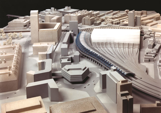
Architectural model of the International Terminal Waterloo, London. Photograph: © Grimshaw.
While factories may have been an obvious fit, when it comes to large transport hubs, these Superstructures also had their moments: Foster’s Stansted airport is represented, with a large, sprawling model – although the transparency and clarity of the original is now cluttered with security barriers, endless duty-free shops and purveyors of fast food. There is also a model of Grimshaw’s wonderful Eurostar terminal at Waterloo, its pioneering frame nestling into the track curve, but now sadly decommissioned; nearby, there is a group of large painted wooden and metal moulds for the joints that made this building possible.
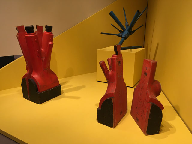
Wooden and metal moulds for International Terminal Waterloo. Grimshaw Architects. Photograph: Veronica Simpson.
Strangely, it is towards the end of the exhibition that Foster’s Willis Faber & Dumas building in Ipswich is displayed. Probably the job that won Fosters the Sainsbury Centre commission, it was the UK’s most innovative corporate space of the 70s, with its own swimming pool in the basement and a rooftop restaurant. It was, as the blurb tells us, “intended as a democratic environment fostering a sense of community” – but the swimming pool has long been covered over to cram in more desks and chairs. It takes the stewardship of a good client to give these buildings longevity, preserving the spirit in which they were made, even after the architects’ priorities may have shifted.
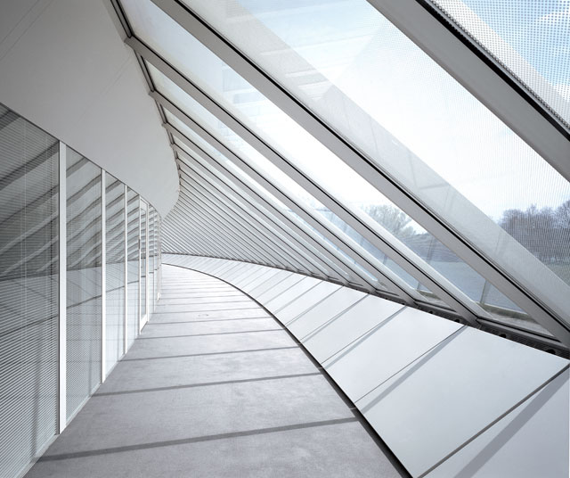
Sainsbury Centre Crescent Wing. Photograph: © Richard Davies.
And the Sainsbury Centre proves just how well these buildings can last, with the right amount of care and attention. Its exterior skin was completely replaced in the 80s, which may be one of the reasons why it is still looking so good. It has also been substantially expanded: the Crescent Wing, partially underground, opened in 1991 (with new office and storage space, technical workshops, a temporary exhibition area and conservation facilities); another extension opened in May 2006, linking the two sections internally and providing additional gallery and education spaces. Foster, famously, demanded that no other practice be allowed to tinker with his building. And to its credit, the Sainsbury family has complied. Which means that we start and end the exhibition in the best possible environment – a thriving, living, architectural artefact.